
Blauw. Ceci n’est pas une couleur
Preparing for the opening of their duo show at Spazio Nobile, Piet Stockmans and Frederik Vercruysse discuss their treatment of light and colour
From Belgian Limburg to Antwerp, two men meet at the heart of a space-time that belongs to them: Piet Stockmans and Frederik Vercruysse. With abstraction that is an art that is free and liberated from stereotypes, the two creators preserve and transcend, each in their own way, the detail, the setting, the treatment of light and colour: a striking whiteness, a cobalt blue with deep nuances and densities, a sense of elegance, of folds, of tension, of flatness, of twists that filter the material, throwing their shadow or illuminating the matter with a sudden clarity.
On the occasion of this two-person exhibition, Piet Stockmans and Frederik Vercruysse converse around the theme “Blauw. Ceci n’est pas une couleur”. Stockmans, master of porcelain and inventor of his famous Stockmansblauw, and Vercruysse, talented architecture and interior design photographer, inhabit the space through artistic installations and tactile and visual assemblages. The three successive rooms of the Spazio Nobile gallery are thus occupied by unique works or limited editions from these two protagonists with a singular sensibility.
Giving form to the object, the landscape, a space, bringing the inert to life, conjuring up an image, an object or a setting with a soul, is a process the two artists pursue naturally. The alchemy between the two creators draws the gaze towards a new way of perceiving the applied arts, design and photography. The mindset in which the exhibition was developed is to insert the visitor into a particular universe that moves beyond the reality of porcelain or photography.
The genius of white clay
“53 years ago, I came into contact with porcelain. I couldn’t have imagined how it would occupy my entire existence… yet it has been my medium now for more than 50 years. I never really had a taste for porcelain itself, rather for clay, plaster, water, kneading, sanding, shaping, rubbing … but not so much for the porcelain that makes up the finished product, with its rather traditional story. If I had found myself, at the beginning of my career, in 1963, in a paper factory, I would have made similar works, and I would have hung the books on the walls,” recounts Piet Stockmans.
The late and renowned curator of Gent’s SMAK, Jan Hoet, described Stockmans as “the porcelain man”. His artisanal expertise enables him navigate between art, design and industry without worrying about the borders between the disciplines. What interests him is the concept and the search for meaning. Renewing the medium using a technical and in-depth knowledge, turning porcelain into an artistic substance, simultaneously sensual and diaphanous.
Focussing on presence
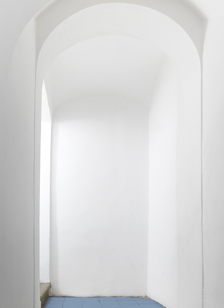
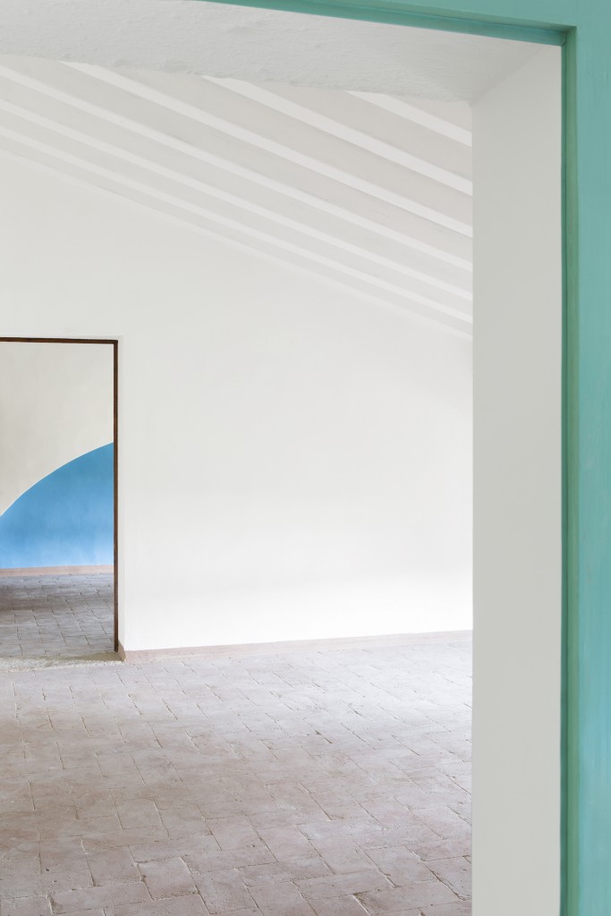
While architecture is omnipresent in his work as a photographer, Frederik Vercruysse explores photography as a composition, building on rectilinear forms, shadow and light, and a colour palette that is very close to that of a painter. He translates this perspective as much in his still lifes as in his photographs of architecture, landscape, interiors that appear as tableaux vivants, microarchitectures and miniatures with an abstract aesthetic.
His images reveal a presence and a search for balance, harmony, silence. It is up to the observer to feel and to create this total experience of the image, which thus becomes open to free interpretation. Although Vercruysse focuses on positioning, the distance he gives us between the images, the rhythm and the cadence of the perspective, he also takes into account the spontaneous relationship between his photographs and the steadfastly strong and delicate pieces of Piet Stockmans.
Flat light, swaths of colour
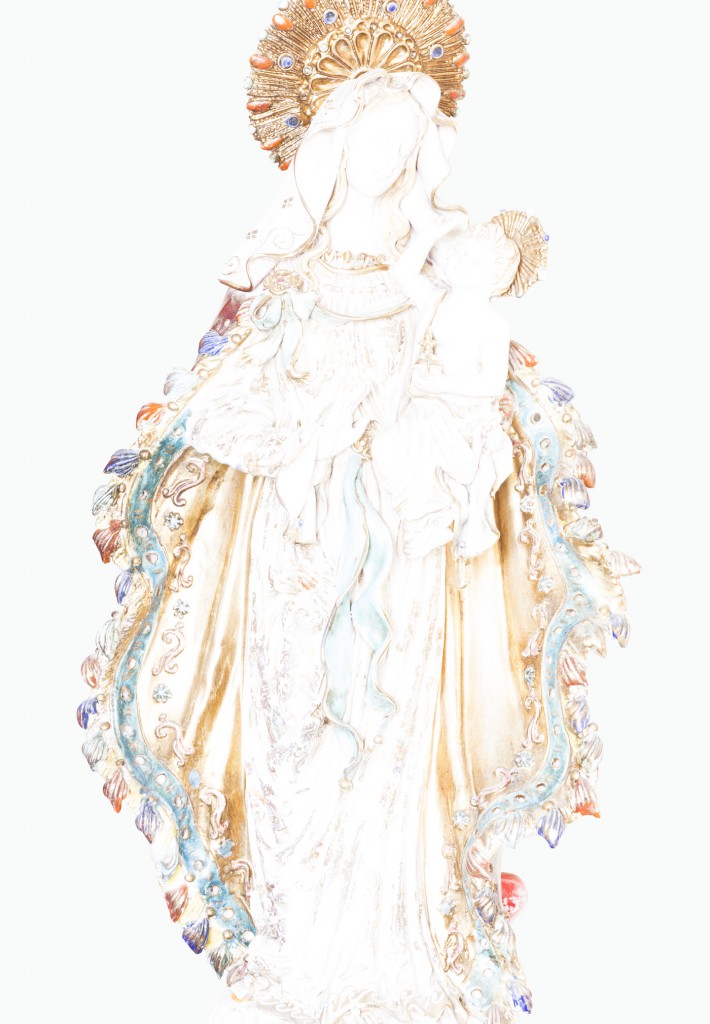
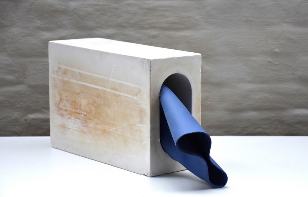
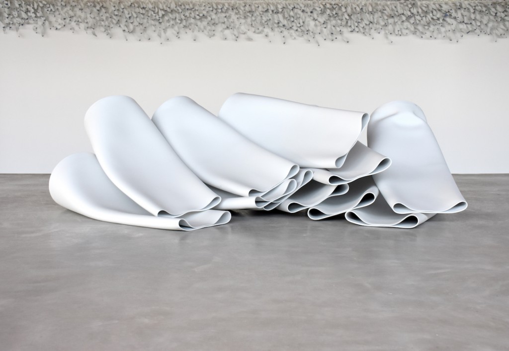
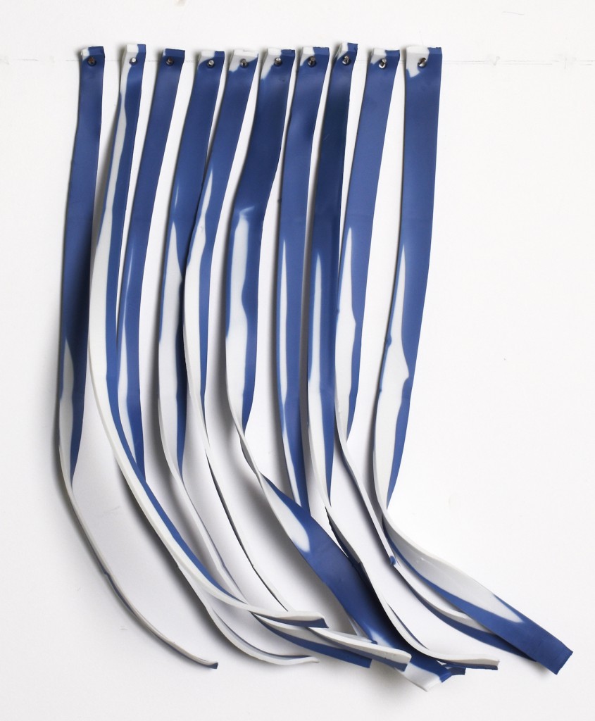
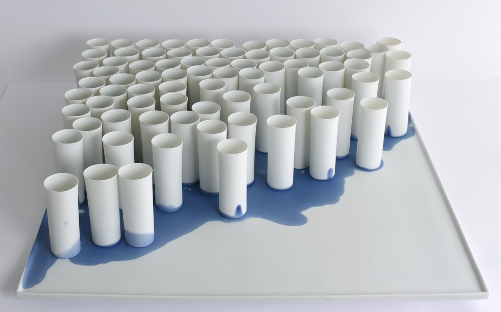
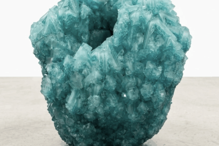
This exhibition explores a mode of representation that is close to the art of the Flemish or Italian Renaissance but that, rather than emphasising the subject, instead focusses on its abstraction using lines, colours and shapes. The rendering of Stockmans and Vercruysses’ white and matte surfaces evokes tempera painting, the Italian frescoes of Fra Angelico or Piero della Francesca, as in Vercruysse’s Maria, in which the overexposed face of the Madonna with child dissolves in the light. Vercruysse combines old techniques with his own unique and innovative processes, and treats photography as a painter would: thin layers, soft and very bright colours, and blurred contours emphasising the intrinsic transparency. The visual impact is strengthened, as with the works of Piet Stockmans, who uses the whiteness of kaolin – white clay – to make the cobalt blue vibrate, unenamelled to bring out the surface luminosity, the delicate aspect of the porcelain. The blue combined with the whiteness, in a biscuit – a soft or hard porcelain -, cooked without glaze at high temperature (from 1200 to 1400 ° C), accentuates the three-dimensional quality of the sculpture.
A geology of the image
The photosensitive paper, the mould from which the shapes emerge that then shrink in the firing, these are all white surfaces on which an image could be printed, a more or less liquid paste poured, or the immaculate space preserved. These support surfaces allow a regular and compact rendering, textured or animated with a movement, the stroke of a brush. This sense and this capturing of the original material and of the composition are common traits to Stockmans and Vercruysse.
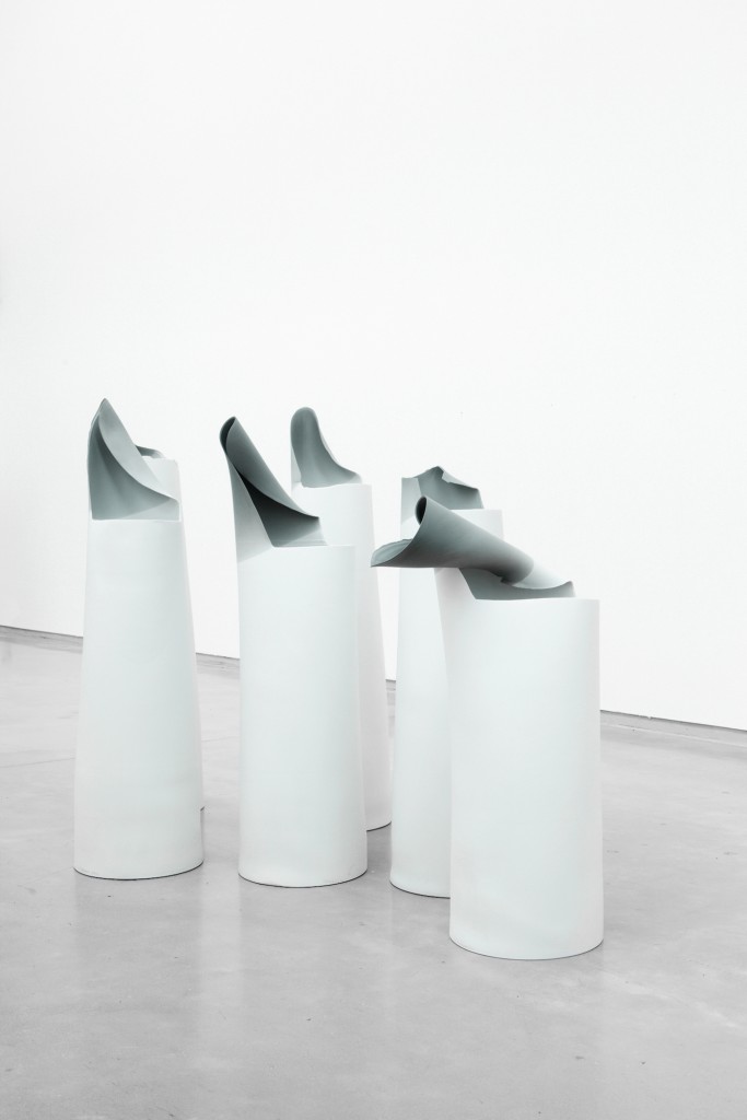
Each uses repetitive lines, such as the Plexiglas-covered Porcelain On Paper, boxes holding thin porcelain plaques, flat or folded, Stockmans’s books in relation to his installation of 400 elements in Stockmansblauw porcelain, and the GV Window photographs of Vercruysse. There are also the abstract forms, open to the imagination, the layers and successive planes that lead to the controlled freedom in the mould or the framing of the image. An invitation to a voyage within the visible and invisible, simultaneously tactile, visual and poetic. Stockmans uses the shrinking of the porcelain by keeping it in its mould in several of the pieces exhibited – including the Square Plate and Dish, the Round Dish, the Wounded Vase, The Poor Remnants, the Wind Lights and the Soft Blue Oval Vase, while Vercruysse abstracts the subject by keeping only the colour and contours.
In this geology of the image, Stockmans and Vercruysse also share that culture of minerality which is the focus of Spazio Nobile’s exhibitions. By reducing ornamentation in their essential and existential approach, the two creators give form to the idea of « Blauw. Ceci n’est pas une couleur ». More than a pigment, it is a primary colour that oscillates on the border between shadow and light: the ultramarine of cobalt, from sky to sea, from the still image to the porcelain piece. The communion occurs: Stockmans’s Tower in Blue, Tower of Babel and Examples of a Landscape are variations on the theme of life, human fragility and entropy.
Blue: an artistic medium?
Mystery and a feeling of gravity, the shadows expand, the light diffuses across the surfaces of the works, colour floods the material, opaque or translucent. Swaths of colour, flat and low-angled light. The composition is paramount and primordial. The lines are frontal, rather like portrait photography.
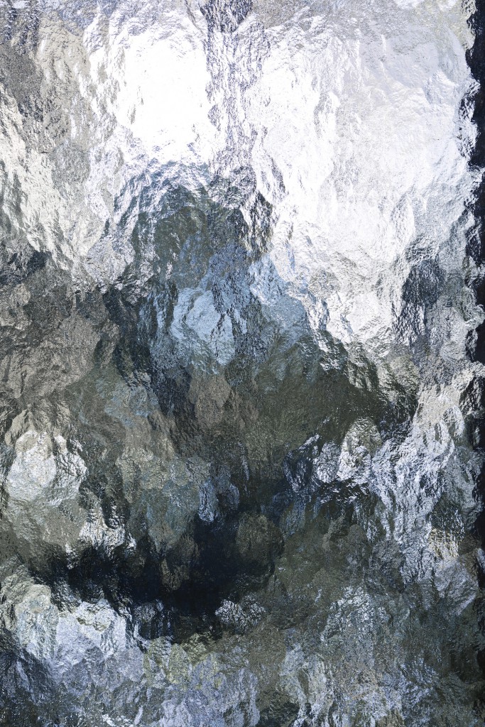
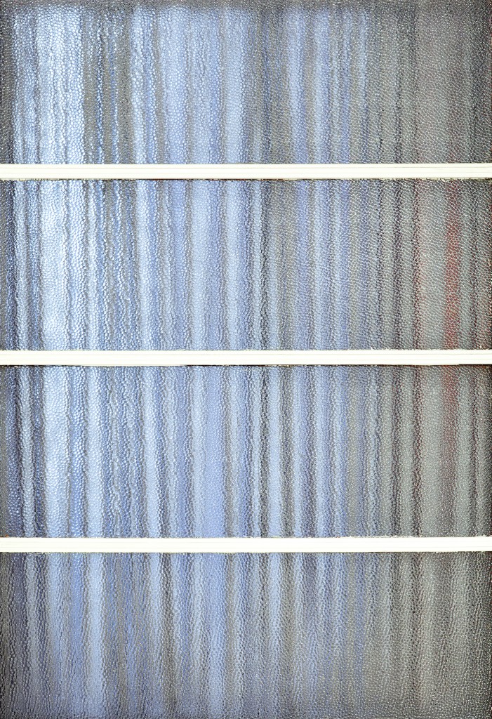
The blue blends with other colours, and is made palpable through the frosted glass. Vercruysse abstracts the composition by reframing the images on the rolled glass through which can be seen the colour. The blurred translucidity, the presence of coloured shadows, the absence of decoration, bring the aesthetic to the forefront. The control of the rays of light preserves the intensity of the colour, while creating a sensitive, intimate, oceanic construction, which he himself calls « Atlantic ». The same holds true for the Vivaio / Blue Moon diptych that he decomposes and punctuates graphically. Fattoria / Blue Tiles, GV Window, Pool Blue, Garden, End of the Day, Yellow Tape and Paint Pot are all abstract variations on architecture and on colour that fades and revives in the light. The blue delineates the spaces, creating the illusion of volume, as with Stockmans’s vases with collapsed collars. The spectator is left free to appropriate the work.
Blauw is on display at Spazio Nobile from September 29, 2017 until February 4, 2018
SAVE THE DATE
Vernissage
28.9.2017, 18.00 – 22.00
Conference by Piet Stockmans
A Highlight of Design September
19.9.2017, 20.15 — at Flagey, Studio 3
The Fallen Vases Installation by Piet Stockmans
23 – 24.9.2017 — at Brussels Design Market
Sunday Brunch
15.10 – 19.11 – 17.12. 2017 & 14.1.2018 – 28.1.2018
(during BRAFA Art Fair) 12.00-16.00
Collect – Saatchi Gallery London
From 22 to 25 February 2018, Spazio Nobile will take part in Collect – The International Art Fair for Contemporary Objects, at the Saatchi Gallery, London, presented by the Crafts Council UK, with a solo show of Piet Stockmans.

Articles you also might like
Art Brussels opens its doors today for its 42nd edition. The annual contemporary art fair takes place at Brussels Expo and includes 138 international galleries plus a host of special events, exhibitions and prizes. Read for more details.
Spazio Nobile is pleased to present The Lunisolar House by Taiwanese artist Pao Hui Kao in the Horizons section of Art Brussels. In this mesmerising piece, Pao Hui Kao invites us to reimagine the home as a delicate threshold, a shelter shaped by light, breath, silence and vulnerability, rather than a fortress. Using humble yet transcendent materials such as folded tracing paper and rice glue, the artist has created a space that is both architectural and meditative: a sanctuary without walls; a chapel without doctrine; a horizon where fragility is transformed into a new form of strength and beauty.

On April 21st, Simon de Pury hosts a round-table discussion at the Villa Boghossian with Tiqui Atencio, Cathy Vedovi and Diana Campbell Betancourt. Simon will be introduced by Lise Coirier.
PAD Paris returns to the Tuileries for the 28th edition of this collectible art and design fair. The fair is on view between April 8-12, 2026.