Glenn Adamson: Curating Attention
Glenn Adamson tells TLmag how he honours the versatility of design through his work as an independent curator and author.
Glenn Adamson honors the versatility of design through his work as an independent curator and author. An art and cultural historian and an authority on craft and its history, Adamson served as director of the Museum of Arts and Design (MAD) in New York City from 2013 to 2016. Prior to that appointment, he was the deputy head of research and head of graduate studies at the Victoria & Albert Museum in London from 2005 to 2013. Adamson spoke with TLmag about his curatorial practice, his past and future exhibitions, and New York’s presence in today’s design world.
TLmag: What is your curatorial approach?
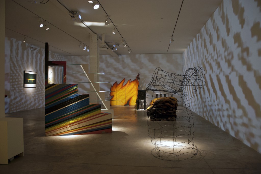
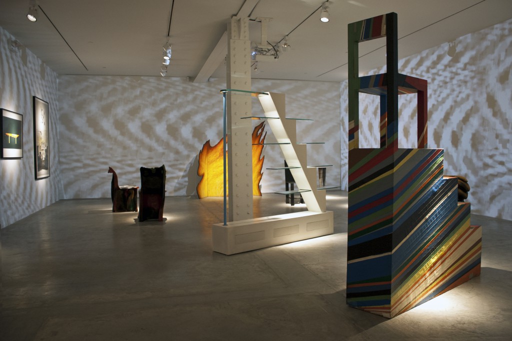
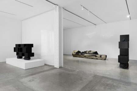
Glenn Adamson: I think you have a tremendous advantage as a design curator, paradoxically, because the material is not considered sacred. The fact that it’s usually—at least to some extent—mass-produced and also doesn’t necessarily present itself as a text to be read, as a painting would, gives you a lot of range as a design curator, an opportunity a fine art curator rarely has. Take the Static exhibition I just did at Friedman Benda in New York. If you were to do that installation with a heavy overlay of audiovisual treatment for a series of fine artworks, it would probably seem quite shocking. Whereas in the case of the design objects, it not only seems appropriate but even enhances the logic of the objects. In fact, it feels a little bit like an artistic gesture in its own right. In other words, most exhibitions that you see in museums have an exhibition design created for artworks, and when you are a design curator, you can reverse the polarity. You can use design objects to create something like a work of art. I felt like I had discovered a secret when I first worked that out.
TLmag: When was that?
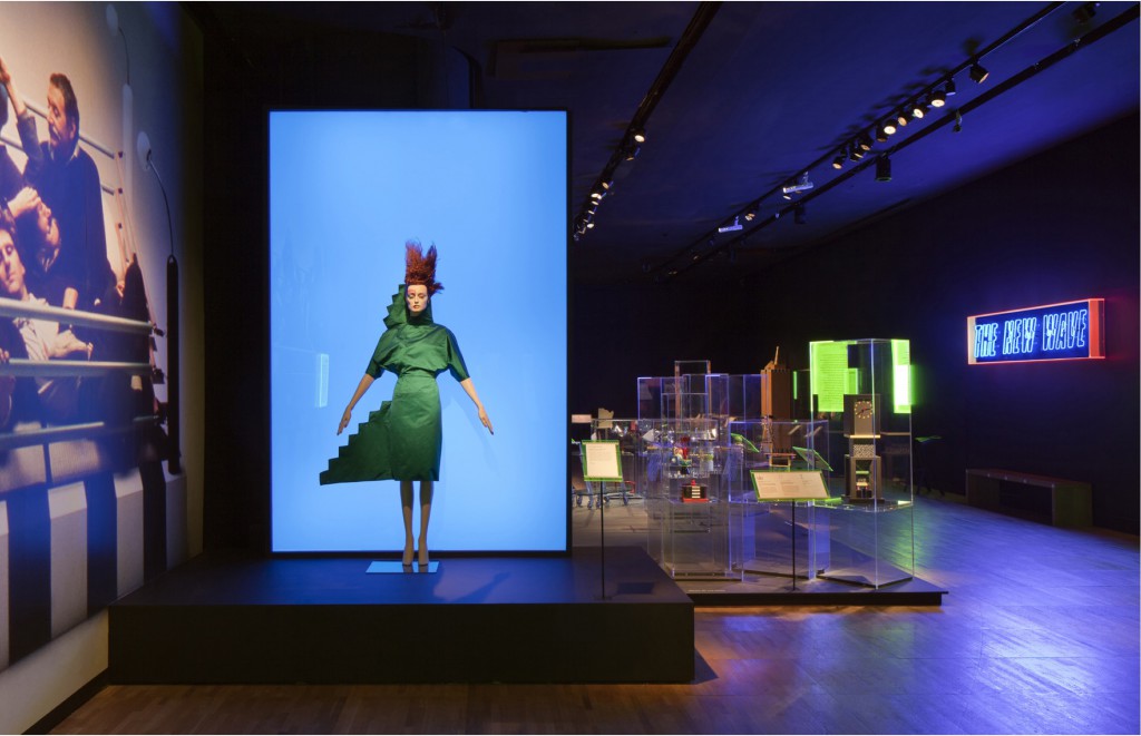
G.A.: When I was at the V&A. The V&A has a tremendous ability to do ambitious exhibitions with very high production values. They also have a wide-ranging collection, so you can unite lots of different materials in one place. In the Postmodernism: Style and Subversion 1970-1990 exhibit that I co-curated there a few years ago, we brought together furniture, ceramics, fashion, works of fine art, architectural models and more. There is something scenographic about that multiplicity of material that I really responded to at the time. It seemed like we were given the chance to curate in a much more creative and content-rich way.
TLmag: In that regard, design is very flexible, and it seems like a lot of galleries and museums are pushing for a more integrative approach to their design exhibitions.
G.A.: In a lot of art museums, the old joke is that the decorative arts curator just chooses the sofa to go under the painting. And that’s obviously where you don’t want to be, but it also points to the advantage you have as a design curator, because it means that you are in real space and you are speaking people’s language—everybody lives in a designed environment every second of their lives. For example, we’re sitting here in a café that is highly designed and expresses a certain set of ideas; design exhibition is not that unlike a café. You are drawing people’s attention to objects in a different and heightened way. The other big idea for me is that curation is really about attention. The medium you work in as a curator is attention, and we live in a so-called “attention economy,” in the sense that what people pay attention to is itself a form of value. So that’s the Twitterverse, which, for better or for worse, controls people’s attention. It is a fantastically relevant and challenging thing.
TLmag: What is design in New York like right now?
G.A.: Well, design in New York and design in America are two very different things. Design in New York is quite international. I’m going to Faye Toogood’s opening tonight at Friedman Benda—that’s design in New York. You have Carpenters Workshop Gallery, and you have Jason Jacques Gallery showing French art nouveau with contemporary ceramics. The galleries here aren’t numerous, but they’re very cosmopolitan in their outlook. Then the museum scene is obviously incredibly rich, with at least four museums that are firmly dedicated to the material: MoMA, the Met, Cooper Hewitt, and MAD—and that’s only in Manhattan. And then there is the NYCxDesign festival, now happening annually and gaining momentum, not to mention the strong design schools. It’s an amazing design city, but on the other hand, American design is still very uninteresting compared to European design, because it’s still much more embedded in processes like contract furniture and corporate graphics and product design for companies like Apple. I think that’s what design is for most Americans. Most of the architecture is very much driven by profit considerations, and it’s rare that you get something like the new National Museum of African American History and Culture. That would be one project where you have a great architect—in this case, the British architect David Adjaye—who is given an incredible opportunity to make a piece of successful statement architecture. That happens very rarely here, whereas in Europe, it’s a regular occurrence. American design is a victim of its own success, and it has a very strong capitalist base. In Europe, on the other hand, a lot of design is funded by the government or happens through support from various groups like non-profits or art galleries. There is consequently a very different infrastructure for it that leads more naturally toward intellectually more ambitious design.
TLmag: What exhibitions are you working on at the moment?
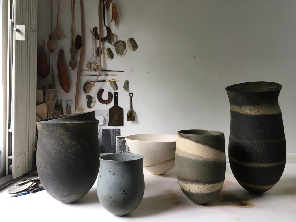
G.A.: It’s an exhibition called Things of Beauty Growing, about British studio pottery. It’ll be at the Yale Gallery for British Art, opening this September and then moving to the Fitzwilliam Museum in Cambridge next year. What’s extraordinary about this exhibition at Yale is that we are putting these pots in the setting of the Louis Kahn building—the last building he designed—an opportunity to juxtapose these very warm and rather modest organic, clay objects against the backdrop of this Brutalist but ineffably classical architectural setting. I think it’s going to be absolutely stunning. Just the combination of materials will be fantastic—the clay against the concrete, the wood and the wool carpet. All of those materials are both raw and refined at the same time. Personally, I always try to create an exhibition where the gallery experience is extremely palpable and almost tactile. I want it to be something you don’t just see, but experience with your entire body.
