Body Language – Dutch Invertuals
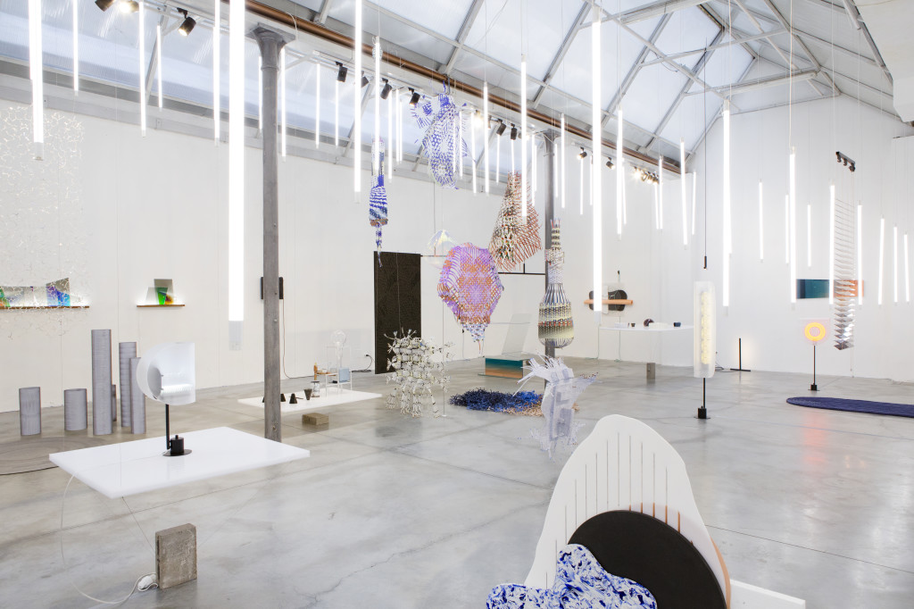
It’s hard to deny that Dutch design has long driven the more experimental-cum-avant garde factions of the industry but that doesn’t mean it hasn’t rigorously redefined itself time and time again. Suspended, illuminated, animated, layered, interactive, translucent and formally sublime, this year’s Dutch Invertuals‘ Body Language Milan Design Week showcase (14 – 19 April) paid tribute to this tradition by exploring the increased complexity of our virtual world. As technology continues to integrate into our life, it becomes invisible, allowing form to break free of function and reflect pure identity.
Curated by Wendy Plomp, this highly-selected offering – not tied-down by national identity or brand constraints – spotlighted some of the most promising talents working in or associated to the Netherlands: Aliki van der Kruijs, Alissa + Nienke, Arnout Meijer, TLmag22-featured Daphna Laurens, Dienke Dekker, Edhv, Germans Ermičs, Jetske Visser & Michiel Martens, Nina van Bart, NOMAN, Glass is Tomorrow Book-featured Philipp Weber, Thomas Vailly & Laura Lynn Jansen, Tijmen Smeulders and Victoria Ledig.
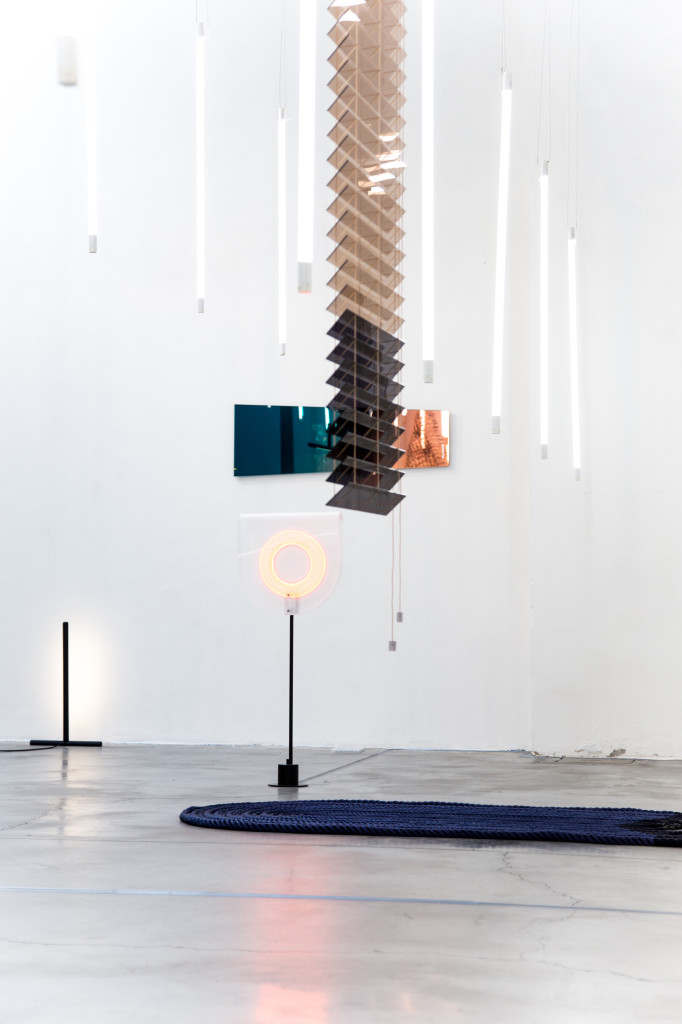
A simple but genius Flavin-like scenography contextualised the diversity of work on view.
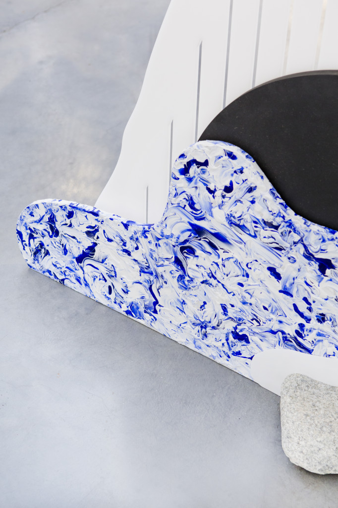
If This Than That by Nomad explored assemblage and how connected components can modify each other through dialogue. “For ages, people have envisioned the future as bleak and virtual. What they seem to forget is that we desire tactility. It is through physical objects that we forge our identity.” – NOMAN
Borrowing the concept of biofeedback from medical science, Dialogue 1 by Alissa + Nienke blended process and environment into automatised wall-coverings. “We are curious to see where biofeedback will bring us, and in what way it will determine our future.” – Alissa + Nienke
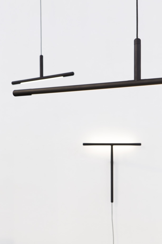
Adopted as an orphaned form, Inutile lamps by TLmag22-featured Daphna Laurens no longer sought-out function. “As operative parts become increasingly smaller, they will no longer dictate the appearance of products. Designers will be faced with the challenge of finding new relations between form and function.” – Daphna Laurens
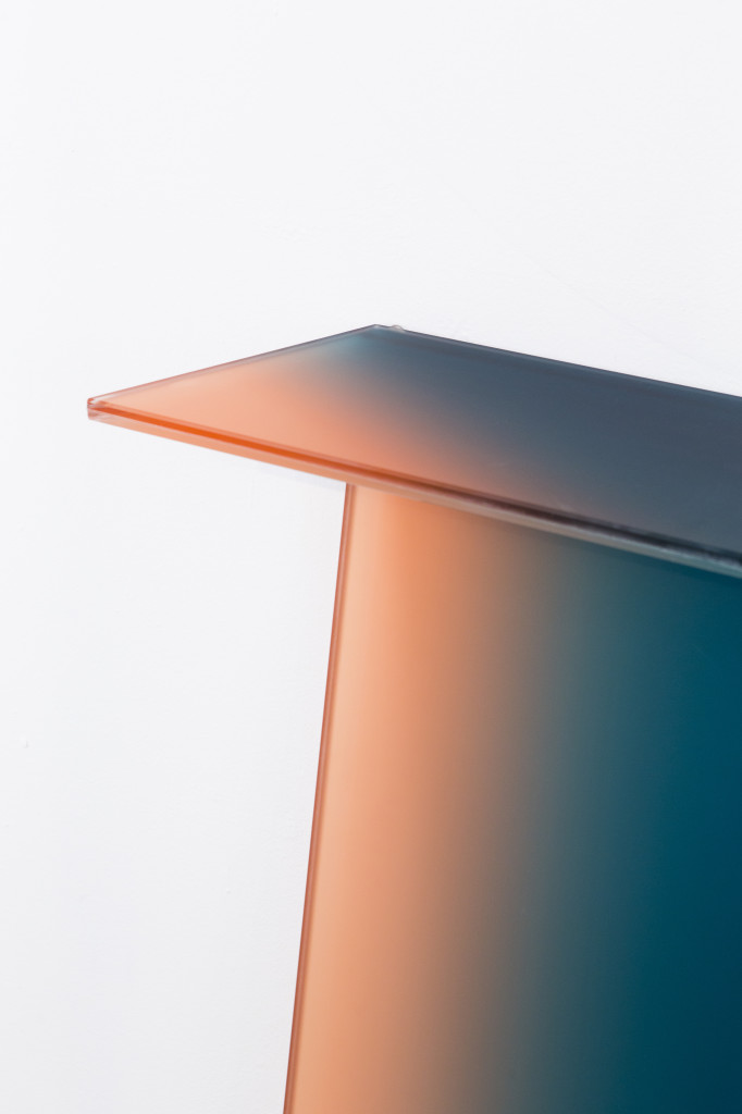
Dissolving the surface value of an essential phenomenon, Shaping colour by Germans Ermičs was a visual investigation of the interaction between colour and form. “Instead of finishing a product by painting it. I started from colour. By initiating a dialogue between shape and colour, I aim to unhinge the traditional roles in what defines a product.” – Germans Ermičs
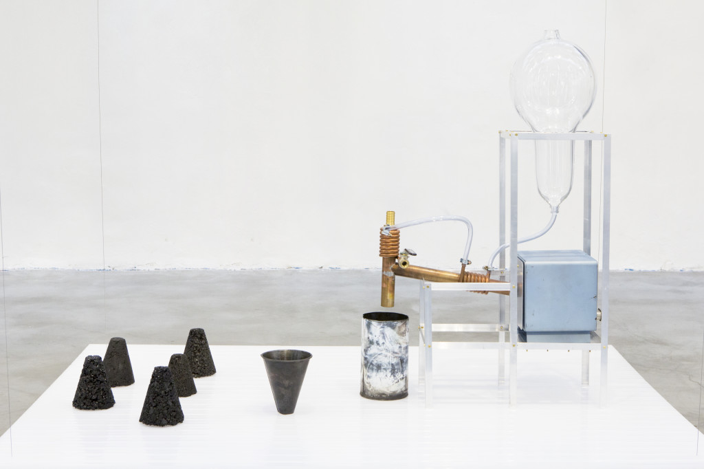
Anthacite by Philipp Weber reevaluated and brought to light a historically-important industrial production through a new means of process. “I think people are losing their trust in manufacturing methods. They no longer know how things are made. It’s my aim to bring awareness of the production process to the people.” – Philipp Weber
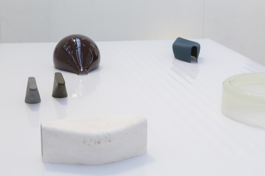
Shield, Floater, Boundary, Plateau by Tijmen Smeulders asked us to reconsider the sometimes anonymous yet pluralistic function of vessels in ethereal yet monumental form. “It has always been my method to question the fundamental qualities of objects. When it comes to juxtaposing the physical to the virtual, it’s the physical objects that keep us in touch with the world around us.” – Tijmen Smeulders
Exhibition view.
all images © Floor Knaapen
