Studio Wieki Somers: Translating Traditions
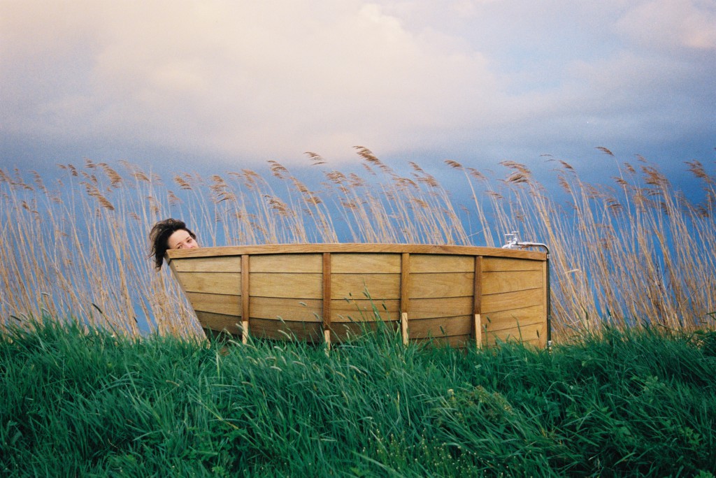
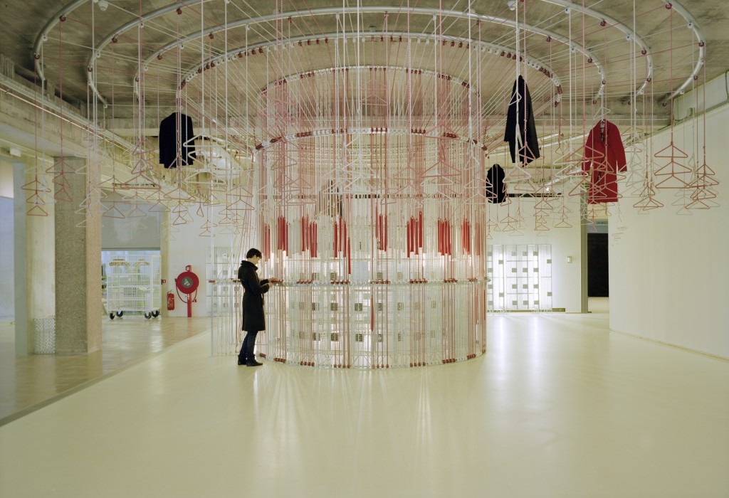
From a collection of lamps inspired by Japanese Samurai flags to a coat rack that transforms into an animated, carousel-like experience and a bathtub that offers the fantasy of travel, the imaginative world of Studio Wieki Somers imbues objects and installations with a sense of awe. For nearly 15 years, designers Wieki Somers and Dylan van den Berg have developed a body of work that is poetic, experimental, layered and timeless. Whether they are making functional objects meant for daily use or museum installations, Studio Wieki Somers captures the beauty and power found in our daily rituals, environmental oddities and ancient cultural codes. They collaborate with manufacturers around the globe and exhibit regularly with the Galerie Kreo in Paris. Their recent project for Arita, Tea Sets, was nominated for a 2016 Dutch Design Award.
TLmagazine: Can you talk about the structure of Studio Wieki Somers and your collaboration with Dylan van den Berg? How long have you been based in Rotterdam?
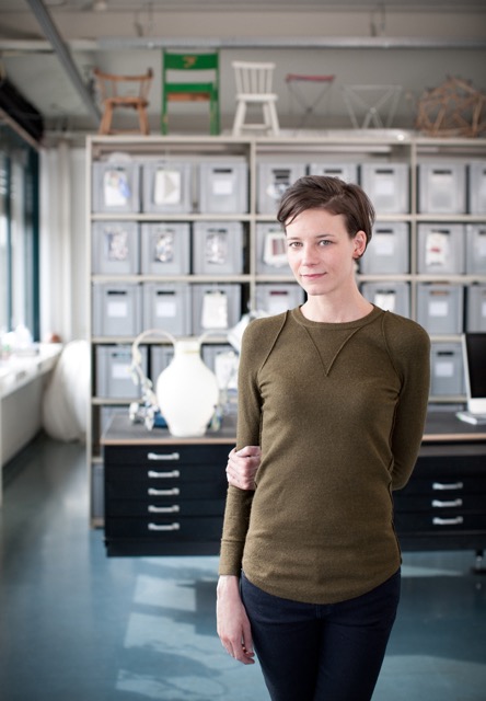
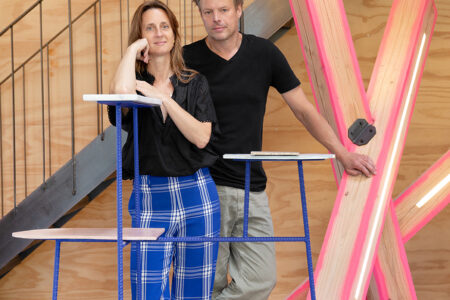
Wieki Somers: Dylan and I have been collaborating since we graduated from Design Academy Eindhoven. I graduated in 2000 and Dylan graduated in 1998. In the beginning, we worked on separate projects. In 2003, we moved to Rotterdam and decided to work under the same name. Dylan prefers to work behind the scenes but he is fully present in the research and design process. Our collaboration is a continuous dialogue. Our studio team’s synergy is a big influence on our work.
A few years ago, we moved into a large studio located in an old customs building on the Rotterdam harbour. The workshop is on the ground floor and the offices are on the first floor. Upstairs, you can look out over the port and watch all the activity, with boats coming in and out, massive cranes, shipping containers and so forth. Our neighbours are artists, architects and urban farmers. We have a sense of freedom and space in the city that is precious.
TLmag: How do the Dutch landscape and environment affect your work? I’m thinking about your Frozen in Time collection (2010), which is literally inspired by a real-life environmental event, but I’m also thinking about your general working practice and process.
W.S.: Design is a mirror of the times. We are continuously fascinated by the hidden meanings behind everyday situations. Sometimes, we are struck by an actual environmental event like the ice storm that resulted in our Frozen in Time collection. On March 2, 1987, there was a downpour of freezing rain followed by a sudden bitter cold spell in the north of the Netherlands. It left a 2 cm thick layer of ice that covered the entire landscape. Life was literally brought to a standstill. Suddenly, everything was linked by a layer of ice. It froze time for a moment. In photographs, it looks as though the landscape were one giant still life. I was completely inspired by that magical moment. It motivated me to make a series of objects in which nature appears to have come to a standstill. We used UV-sensitive resin for the project. You can see this material as being like a durable form of ice. If you dip part of an object into the resin and then place it in the sun for a couple of minutes, it hardens and the individual elements ‘melt’ together into a product.
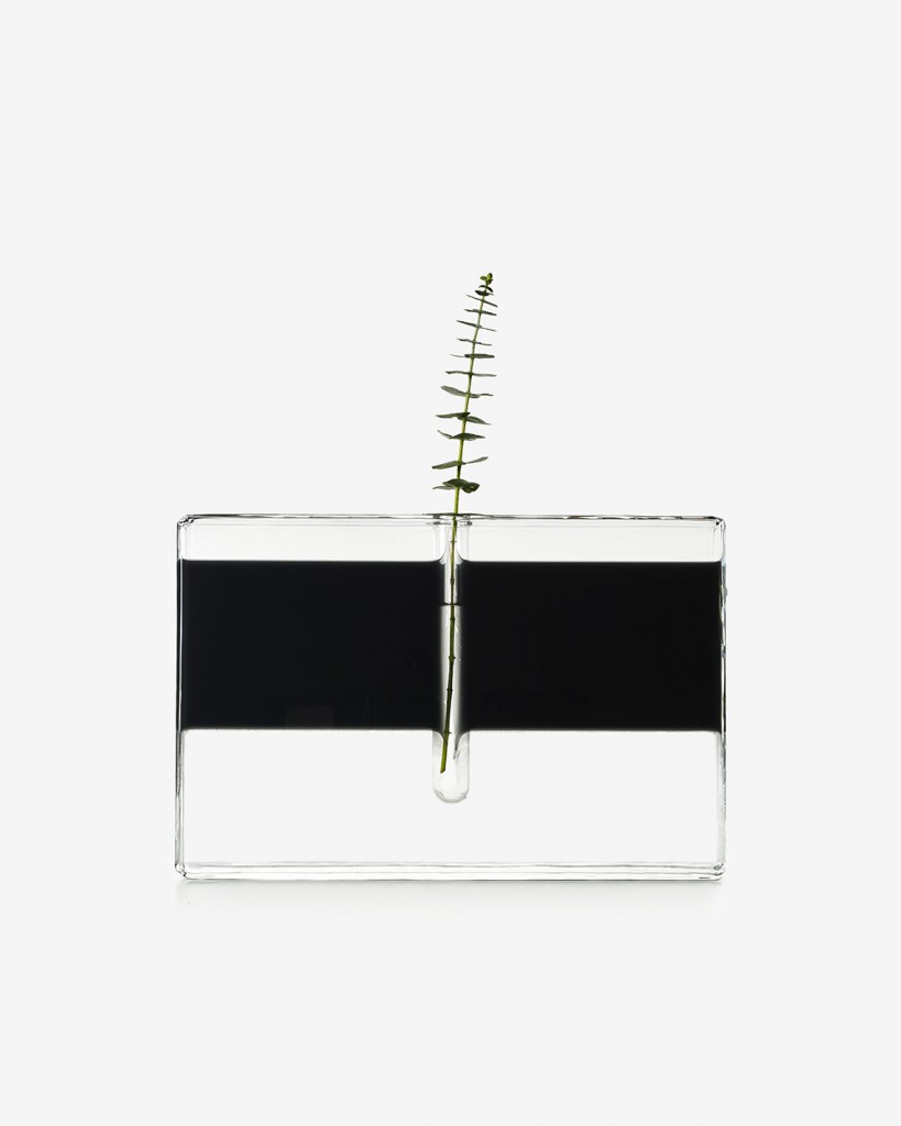
One of our more recent projects, Still Waters (2015), is also about the relationship between man and nature, as well as concerns about climate change. It is a collection of five glass vases, each of which represents a stage in the water cycle and/or is a reflection on this ambiguous relationship. We collaborated with three manufacturers and combined different glass techniques such as blowing, casting, sealing, grinding, fusing, sandblasting and slumping. The aim was to keep the water footprint as small as possible during the production process. As a designer, you have to adopt a conscious way of looking, thinking and working that strengthens the connection between people and products. We can’t save the world but we can draw people’s attention to values and things that they perhaps no longer see.
TLmag: Mitate, the series of lights that you presented at Galerie kreo in 2013, was partly inspired by the Japanese word mitate. The term refers to a specific way of perceiving objects whereby you imagine them as something else in order to instil new meaning and experiences in them. How did you go about developing a collection around this idea? Do you try to bring this idea of encouraging alternate readings of objects into your other projects as well?
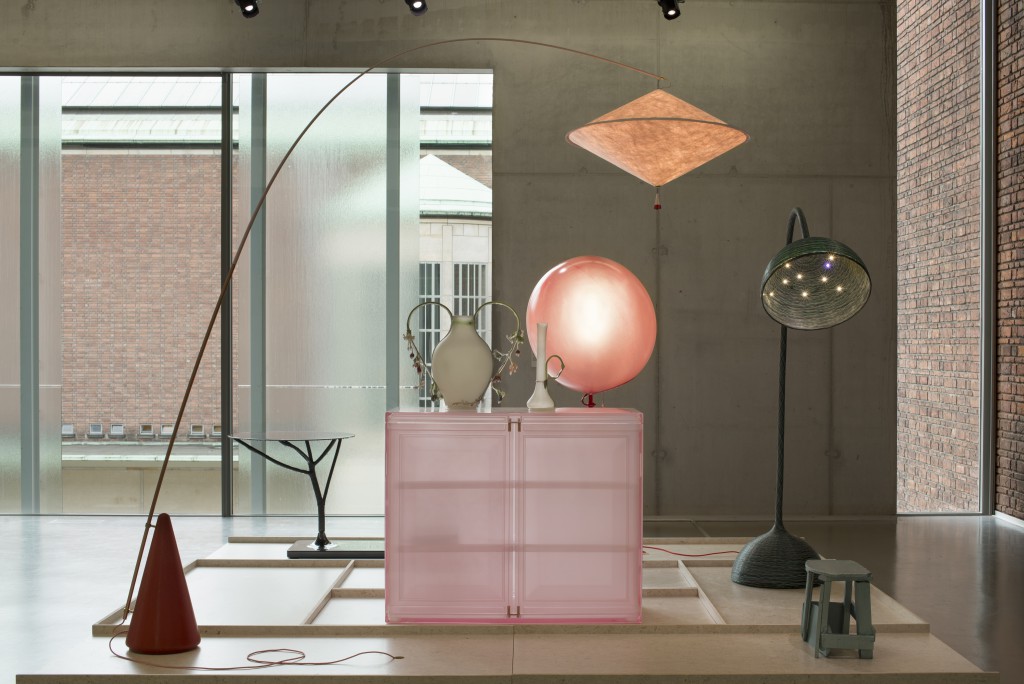
W.S.: The Japanese word mitate means to look at an object in a different way than that which is intended. It means seeing an object as something else so that you experience it in a completely new way. The lamp collection Mitate is based on this concept, as is most of our work. Mitate allows users to discover various hidden layers of meaning and these combinations sometimes have surprising effects. There are some similarities with our own way of working. We try to uncover the hidden qualities of ordinary objects, thereby inviting people to see their everyday reality with fresh eyes. It is my belief that when products have different meanings and layers, multiple interpretations are possible. The products can then retain their ability to fascinate for a longer time.
The series was inspired by Samurai culture, whose ideas and aesthetics still have a great influence on Japanese culture. We visited Samurai houses in Japan and came across illustrations of 16th century Samurai flags at a museum. Their intriguing designs identified different clans and served as a means of communication. We decided to create a contemporary equivalent of these flags by translating them into light poles, in other words, a family of lamps. The collection consists of seven light poles, a reference to the seven principles of Samurai.
TLmag: Japanese culture, crafts and history have inspired some of your other recent collections as well. Among them are the Arita Tea Sets from 2016 and the Aoyoma lamp series, which was inspired by the streets of the Japanese neighbourhood by the same name. Can you talk about your visits to this country and the influence of Japanese culture on your work?
W.S.: Japanese culture, traditions and customs are very inspiring. I’m thinking, for example, of the way that the Japanese have developed their landscape, their ambiguous love of nature, the refined quality of their designs, their detailed craftsmanship, their celebration of the seasons, their insistence on not leaving anything to chance and their awareness of their customs and environment. Our own working methods share many of these same aspects.
TLmag: In your work and your creative process, what is the function of technology such as innovative materials and fabrication techniques? How do you go about selecting the materials for a given project?
W.S.: Finding the right materials has always been an essential part of our research. A good idea is not interesting in and of itself. It is the physical material that determines whether or not the product is good. The material’s tactile qualities, personality and inherent characteristics contribute greatly to the message we want to convey. That is the case with the UV-sensitive resin we used in the Frozen in Time collection and the various materials we used in the Mitate collection. With Mitate, the high-tech and intricate craft techniques combined to alter the ways in which the lamps diffuse or reflect light. More recently, the 2016 Arita Tea Sets featured the iconic ‘Koransha blue’ glaze and patterns inspired by ancient decorative techniques that use metal stencils to spray motifs onto the surface. Our palette is diverse. We work with different materials depending on the project. Of course, the most important thing is for the materials and techniques we use to be durable.
TLmag: What are some of your current and upcoming projects?
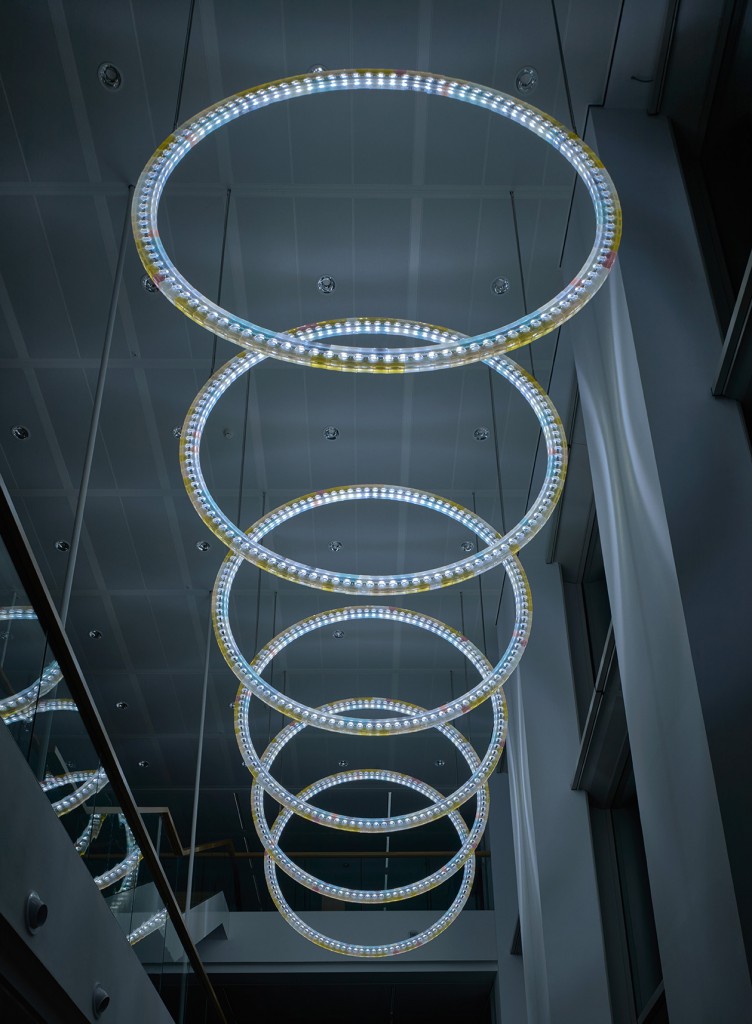
W.S.: We just designed a site-specific light installation called Time Circles for the new Robeco office building in Rotterdam. The installation consists of twelve circles that light up from east to west through three windows. The twelve resin-based circles represent the sun and the moon. They display time in an abstract way, alluding to the round-the-clock activity of the stock market. A circle lights up every hour, beginning with the first circle on the east side at 7 am. The second circle lights up an hour later and so on and so forth. At 7 pm, the cycle is repeated in the opposite direction. The outer circle takes its colour palette from the sun while the inner circle has moon-like colours. During the day, the sun shines into the building and at night, the moon illuminates the interior. The circles grow fuller each month because they are synchronised with the lunar cycle.
We are planning an exhibition with Galerie kreo in 2017. We are also pleased to announce that Out of the Ordinary, our solo exhibition at the Museum Boijmans Van Beuningen, was very well received. Now the exhibition will travel to other locations beginning with mudac in Lausanne, Switzerland, from 25 October 2017 until 11 February 2018.
