Screen Time: Vitra, Urquiola and Fabrica
During this Milan Design Week, several exhibitions asked visitors to interact with furniture through a screen. What does that add to the in-person experience?
The sprawl of Vitra’s Typecasting exhibition during this year’s Milan Design Week was mighty: 200 pieces worth of archive and new proposals occupied the large space used to hold a high-stakes game of Basque pelota. But due to understandable logistical issues —many items are museum loans that came with exhibition limitations—, visitors were prevented from browsing directly through this Encyclopaedia Vitranica of sorts, separated from the furniture by a massive yellow cradle. For fans of the Swiss brand, it was a case of so-close-yet-so-far-away.
Curator Robert Stadler provided two ways around the issue for those who took issue. The first was an observation tower that allowed visitors with a phone in hand to take the ultimate things-organised-neatly photo —rather useful, considering the designer’s tongue-in-cheek grouping of the pieces into the nine lifestyle categories, from Beauty Contestants to Compulsive Organisers, that gave the exhibition its name.
A second one was much less visible but far more meaningful: on the far right of La Pelota stood an island with four computer operators, with a series of mirrors carefully placed behind them to reflect their screens. There the men, having been previously briefed by Stadler, took turns to explore the crevices of the chairs, bookcases and sofas through the hyperzoom lenses in the cameras placed above the space. Their live exploratory work could be seen on the large screens placed high in front of the bleachers area, looking for the details and personality insights that further fleshed out their typecast-able qualities. “The hyper-eye, this camera eye is much stronger than ours, and it shows you details that you might not even have noticed if you could go in,” Stadler explained. Thus, he wrote down instructions for the cameramen to focus on things like the back of George Nelson’s 1956 Marshmallow Sofa, a side seldom seen as the unit is almost always placed against a wall.
And yet one couldn’t shake the feeling that it was the equivalent of attending a concert by a songstress lauded for her live performances, but focusing on the screens instead of the stage. But then again, isn’t there a reason why some live shows are made for television, to the detriment of those presented with the live experience? If some designers posit that the digital screen can reveal much more about objects than the critical naked eye can —and Stadler himself described the experience as visiting a film set—, how can that benefit the user-exhibition interaction?
Patricia Urquiola and Federico Pepe had a proposal. At Le Dictateur, the duo held a VR installation that asked users to consider the extended life of an utilitarian piece beyond the immediate. The 10-minute video experience saw a herd of furry pink chairs joyfully popping around digital sets that would make Alejandro Jodorowsky very happy. “We have approached this project with curiosity about another type of reality, in which objects, architectures and landscapes develop freely in a time-space without our material logics,” Urquiola said of the aptly titled Don’t Treat Me like an Object. “In this dimension, objects have complex emotions and reactions, based on non-biological intelligence.”
With these two proposals, it is disheartening but at the same time positively puzzling to think that the purported soul of an object can better be seen through a screen. As much as designers are calling for our social interactions to move away from the screen and back into the joy of live presence —Stadler himself presented a four-seater prototype for Vitra with that same purpose—, the screen is in turn becoming the only way to mould live presence into something much more profound. As a cosmic joke, the digital lens is being touted as the best aural reader for the exhibition experience.
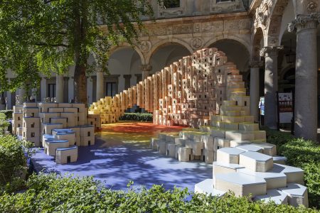
Fabrica is in on the joke already. Paradigm, their exhibition under Reciprocity Design.Liège at Ventura Centrale, could have been mistaken as a case of material and texture explorations in the name of Pierre Frey. Instead the installation sets, made of carefully composed textiles and glossy ceramics and spongy bits, only revealed their true depth after they were photographed. “The photogenic quality of objects is increasingly important in the design process, with the image becoming almost more valuable than the objects themselves,” said Sam Baron. “This exhibition offers intriguing narratives between the second and third dimensions.”
Just like makeup meant for HD TV looks odd in real life, the lighting and spatial configurations that seemed strange in person in the Laver installation revealed their value as soon as they made it to the screen, with every curve in the fabric, every shadow between the ceramic squares and every dip in the sponges coming alive. The rich composition that made it to my Instagram account was definitely not what was there on site.
Indeed: just as we thought we had reached the limits of Instafriendliness with the likes of the Museum of Ice Cream, actual usefulness is brought into the picture.
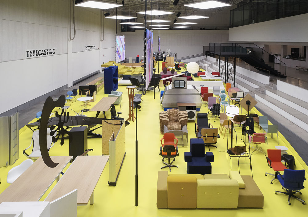
Notice the small island of computers: where the yellow ends, another layer begins.
Image courtesy of Vitra
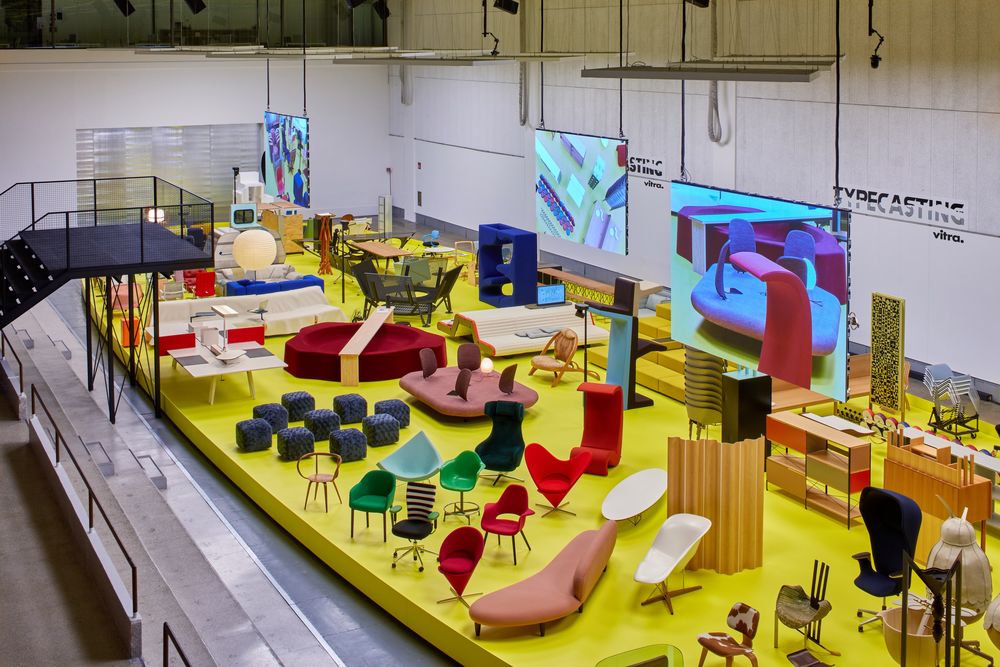
On the screens, Stadler's "hyper-eye" in action above La Pelota.
Image courtesy of Vitra
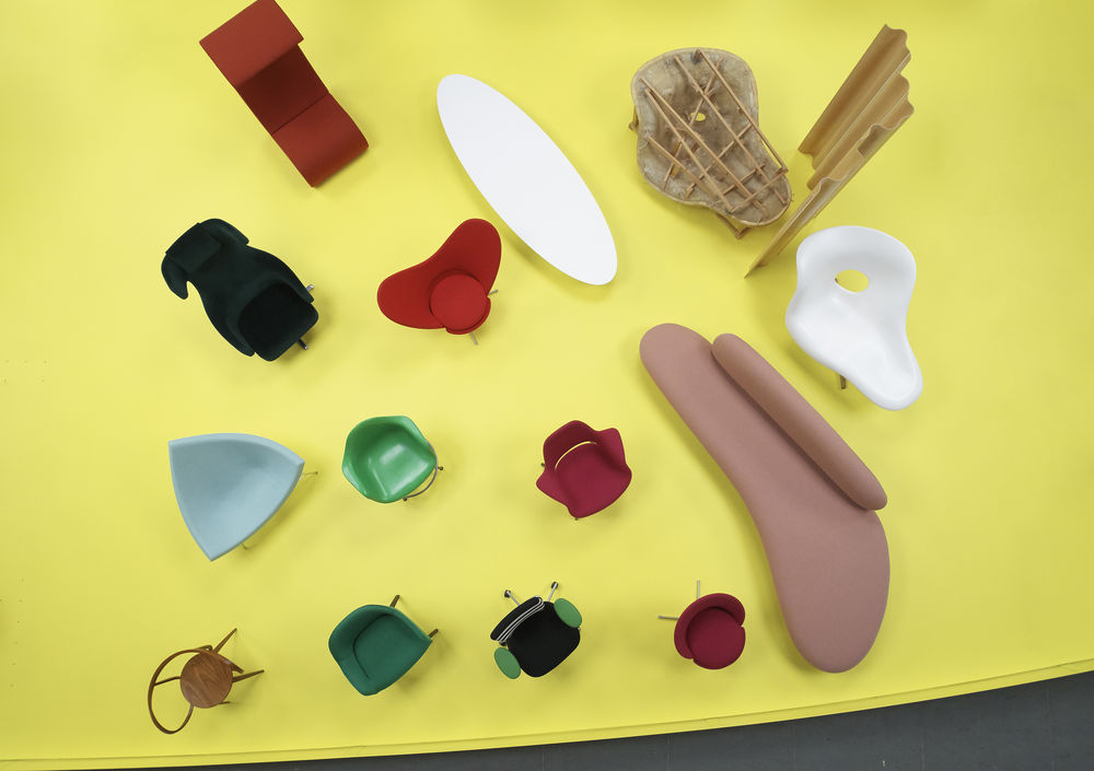
Here are Vitra's Beauty Contestants, "objects with fluid lines and strongly recognisable, sometimes anthropomorphic silhouettes."
Image courtesy of Vitra
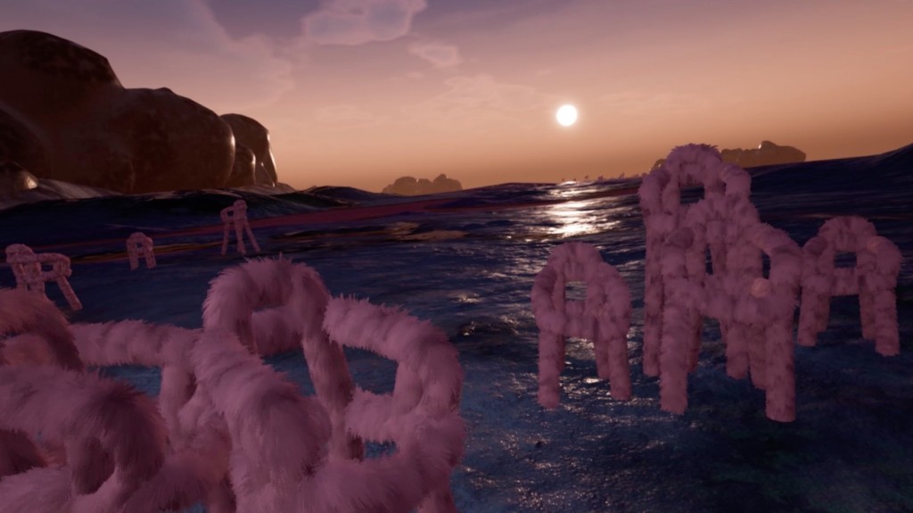
In the installation, objects stop being merely matter form and function, and are reconfigured as entities with feelings, predictive, interactive and empathetic skills --like the ability to giddily ride off into the sunset.
Image courtesy of Urquiola & Pepe
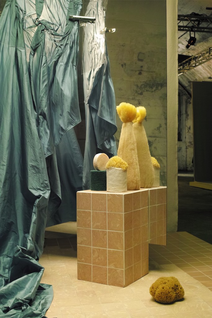
Fabrica's Laver installation, inspired by contemporary image culture.
Image by Rab Messina


