Autoban
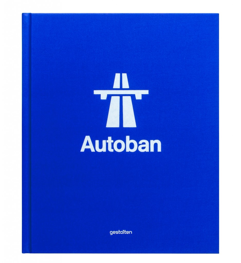
Star designers in their own country, Seyhan and Sefer, founders of Autoban, have been putting Turkish design back on the international map for almost a decade. A recently released monograph, published by Gestalten, traces the origins of their success.
« Otoban’a cikalim ! »*
* “Let’s head for the highway” was, for years, Seyhan and Sefer’s magical catchphrase: for them it meant “let’s escape”. “Let’s free ourselves, clean our mind and clear our vision. Let’s take the easy, steady way to head to somewhere new.” They were drawn by the idea to drive somewhere together. More than this, they loved the visual systems of highways: the forms, the graphics, the typography and universal design aesthetics”. For them, Autoban (derived from the Turkish Otoban) symbolised it all. Founded in 2003, Autoban’s story is quintessentially rooted in this feeling of freedom, of driving in the same direction towards a brighter horizon. But where did this German touch and highway metaphor come from, one might be tempted to ask. If their success seems exceptional today, when they first met, in 1995, Seyhan and Sefer had little else apart from their ideas, a few tools and some sleepless nights to make their dreams come true. The couple had a solid grounding in German architecture when they graduated from Mimar Sinan Fine Arts University in 1998, with a diploma in architecture and design. “The university used to be filled with German architects back in the 1950s: our teachers were educated by them and still conditioned by their strong philosophy. We were taught as ‘children of the Bauhaus’ and gained a lot from it,” the duo recalls. Five years down the road, in 2003, Seyhan and Sefer had grown closer. Impatient and eager, their energy was directed towards the same goals and the power of collateral thinking was equally beneficial to them. It was time to look for a name and a studio: “We put together a list of the strangest names. We were sure of one thing though: we were not going to use the words Design Studio and wanted our name to resonate beyond borders. We already had in mind that we wanted to reach out to the international design scene, be heard and understood as well as share a common language”, Seyhan recalls. A friend, who obviously knew about their secret motto « Otoban’a cikalim ! » came up with a suggestion. “Why don’t you call your selves Otoban?” At first they were perplexed; they soon looked up the English word in the dictionary – which was too difficult to pronounce in Turkish – and then lo and behold ‘Autobahn’ popped up. It seemed obvious to them that by using the German name a link would be established between their work and Bauhaus influences… a perfect fit. In addition, they remembered how much they loved Kraftwerk’s album Autobahn (1974): “Signs are a language of their own; they don’t need to be translated. They are efficient. Their message is stronger than words, you just have to follow the icons”, they explain. Seyhan and Sefer decided to personalise the word Autobahn without the ‘h’. “We knew the road ahead would be as fast as in real life; that we would have to make many choices and be careful enough to always follow the rules. We knew our path would further be defined by the choice we were about to make. We were ready to drive fast”. Autoban was born.
A unique vision, two strong personalities
If Seyhan learnt to walk when she was ten months old and read numbers when she was four, Sefer was busy breaking his toys into small parts for the thrill, afterwards, of reassembling them, to their original perfect state. A born leader, Seyhan was always ‘quick as a highway’ always ready to implement new ideas and open-minded. As for Sefer, he was perceived as a (practical) daydreamer always absorbed by details and problem solving. His roving eye even captured details of furniture that he saw in the movies. In response, little Seyhan played with Lego, building bridges or crushing appliances to understand how they worked… that was when she wasn’t devouring books – she spent all her pocket money on books and tried to finish one a week – or asking too many questions in class. Her curiosity and reactivity were already annoying. Sefer is the embodiment of patience. Like a chiaroscuro, they obviously complement one another. Based on trust and understanding, their organic partnership has enabled them to balance creativity, commerce and culture over time, under (practically) any circumstances.
Layers of textures and influences
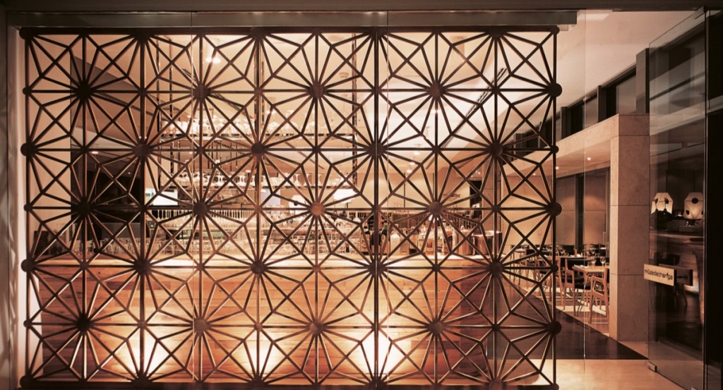
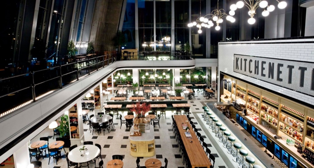
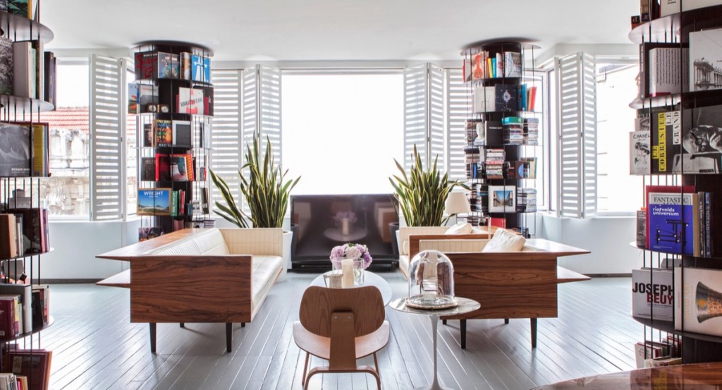
In Autoban’s unique language, the relation between structure, form and material is crucial. From locally crafted iron railings to colourful slabs of marble or custom-made Delft-blue ceramics that harks back to its Chinese origins for a restaurant in Hong Kong, materials have a way of composing sets. Telling a story. But what they highlight first and foremost are layers: “We were always interested in layers. They are the living memories of an existing building. So any project starts with questioning existing layers and creating new ones. The combinations are infinite”, Seyhan and Sefer confess. Bridging the gap between two epochs, their studio unfolds, behind the historic façade of a 1830s Union Française building, in the form of a beautiful, marble-floored townhouse. In the main studio, the beautiful wooden framework has been kept intact, highlighting the exquisite windows. Books on Adolph Loos and Carlo Scarpa, Carlo Mollino but also Anish Kapoor or Gerhard Richter line the shelves. If Seyhan and Sefer quote Charles and Ray Eames as their greatest influence, one can also discern Scandinavian influences in their work, from the process to the form. Looking at the Bergere, designed in the very early years of their practice, the use of plywood recalls the experiments Alvar Aalto led in Finland decades before. Woody – a leather upholstered chair supported by structural wooden lines – is yet another example of this influence: the expertly crafted chair is produced with meticulous attention to detail by local artisans. This insistance on revealing both the past as well as timeless patterns must be part of Autoban’s creative DNA; it’s as if they made it compulsory to highlight historical layers and add new ones. “Today, we still work around, create and question the layers before starting to design. Then we challenge them to add depth and perspective to the space,” Seyhan explains, while walking to her home, a stones throw from her office. Inside the narrow passageway that leads to the front door, she explains that this building accomodates artists’ studios, film directors as well as Uykusuz, a comic book that literally means ‘never sleeps’ in Turkish. She likes the emulation and the effervescence of Tuesday evenings when the weekly comic book is being put to bed. Past the door, an old electric panel she recovered makes a first statement, adding layering, and texture, to the dark entrance. The rest unfolds with muted elegance: the roughness of old walls, the intensive detailing, the use of patterns to increase the perspectives, the anachronisms of the old merging with the new, the contemporary artworks facing well-crafted timeless furniture… everything is there, in perfect Autoban style.
« Autoban – Form. Function. Experience », by Robert Klanten, Marie Le Fort, ed. Gestalten. Available online or in the best bookstores.
