Haute Couture & Lifestyle Vision: Bringing a Sense of Harmony
Experimentation plays an important role in Studio MVW’s creative process. While materials, textures and surfaces are constantly researched and tested, the designers are also interested in exploring the possibilities of luxury in the 21st century — what this concept means in our contemporary lifestyle and how it is signified in our daily surroundings.
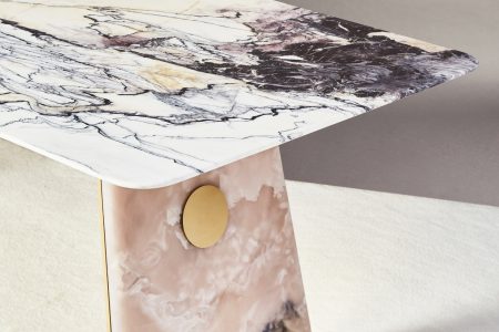
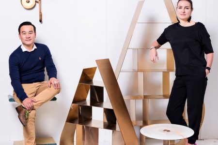
For Studio MVW’s Virginie Moriette and Ming Xu, true luxury is defined through interiors that convey a sense of well-being, beauty and harmony, but which also reflect elements of nature along with an honest approach to how the space will function for its users. It is innovation with a poetic touch. The flow of water, curvilinear forms, the unexpected patch of greenery, and artistic lighting all bring a new level of grandeur and warmth to the space as much as the noble materials that perfectly decorate the space.
Wuhan Sales Office and Aesthetics Museum (Wuhan): Envisioning a New Kind of Luxury through Earthly Elements and the Surrounding Landscape
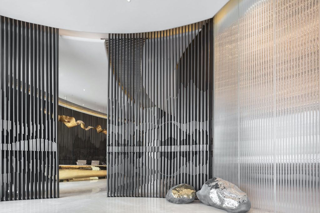
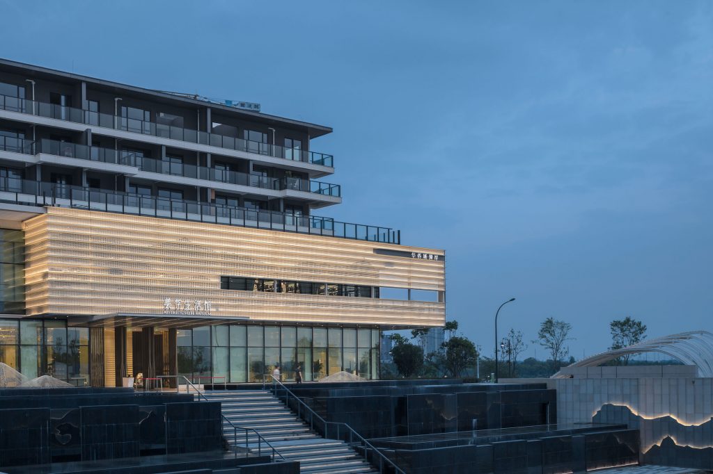
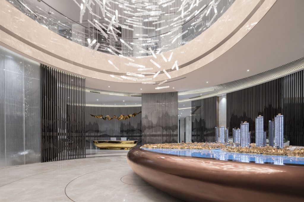
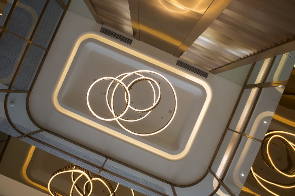
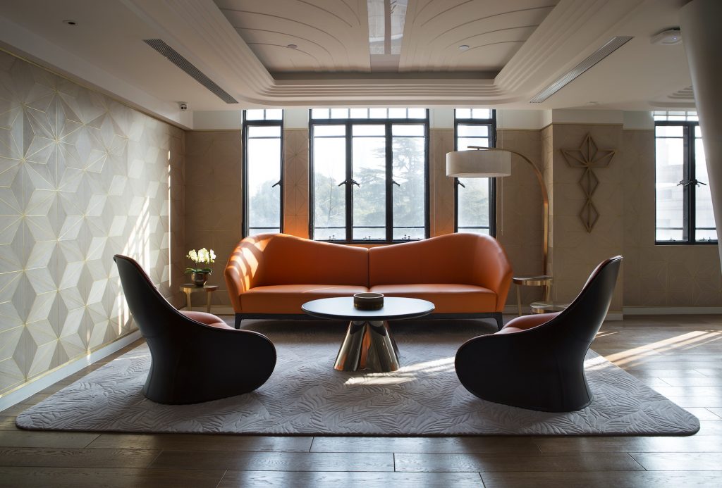
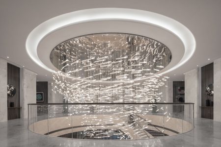
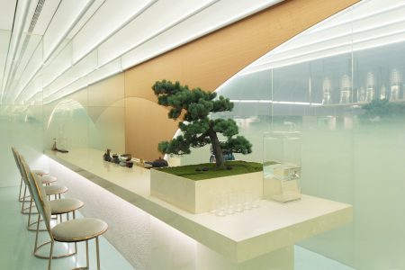
Feeling the energy and appreciating the qualities of a particular site is a fundamental first step in any architectural project. This connection underscores how much the surroundings impact the designer’s work and initial reflections from the very start. In the case of the sales office designed by Studio MVW for OCT (Overseas Chinese Town Enterprises), in Wuhan, Western China, the setting was a clear inspiration. Located next to a famous lake and lush forest, the 3000-square metre sales office was designed to let the surrounding nature in and to create a connection with the elements, especially water, which acts as a unify – ing motif throughout the building. The ground floor immediately immerses guests in an aquatic, weight – less-like atmosphere with its boat-shaped reception desk and bar, as well as its spiral staircase, chandelier and droplet-like lighting fixtures echoing water elements. Partitions bring rhythm to the space while generating ripple effects that conjure up the image of ricochets on a pond along with feelings of peacefulness and harmony. One of the most interesting aspects of the sales office is its ability to create a new type of luxury through the combination of shapes and materials. One of the requirements at the start of the project was to imagine a very luxurious space that would accurately reflect the high standards of the company and its services. In order to do that, Virginie Moriette and Ming Xu opted for a very contemporary expression of lavishness based on understated essentiality. This choice translated into simple, free-flowing, organic shapes and curves combined with the noblest, natural materials such as marble and stone, among others. The result was an assortment of subtle variations and details which are a delight for discerning connoisseurs and produce the impression of a uniquely comfortable, perfectly measured opulence. On the second floor, Studio MVW’s work combines luxury with another notion, that of a club, also at the core of the project. The designers developed this idea through three key spaces, all in line with the natural lushness of the ground floor. A negotiation room, divided into different areas by bookcases, opens onto the landscape, providing a beautiful view of the lake. It is complemented by a stunning Blue Landscape painting – another example of the interplay between nature and culture, between landscapes and artefacts that can be found throughout the building. A multipurpose room designed to accommodate art exhibitions, cocktail receptions or events reiterates the design of the entrance. Finally, three rooms compose the VIP area, which is defined by the delicateness of its shapes and colours – lavender, pastel green, grey, and old rose – and by the originality of its wall reliefs – holes in aluminium wall panels that let natural light in during the day and create a beautiful landscape that turns into another picture at night. Like a photographic exploration of negatives, that choice breathes dynamism into the space and embodies the idea of a living nature, as does the backlit drawing of a natural stone in the bathroom or in the blue calligraphic landscape paintings seen in the bathrooms upstairs and in the bar.
Uni Vinson Headquarters (Shanghai): Wellbeing and Timeless Beauty Infuse a Contemporary Workplace
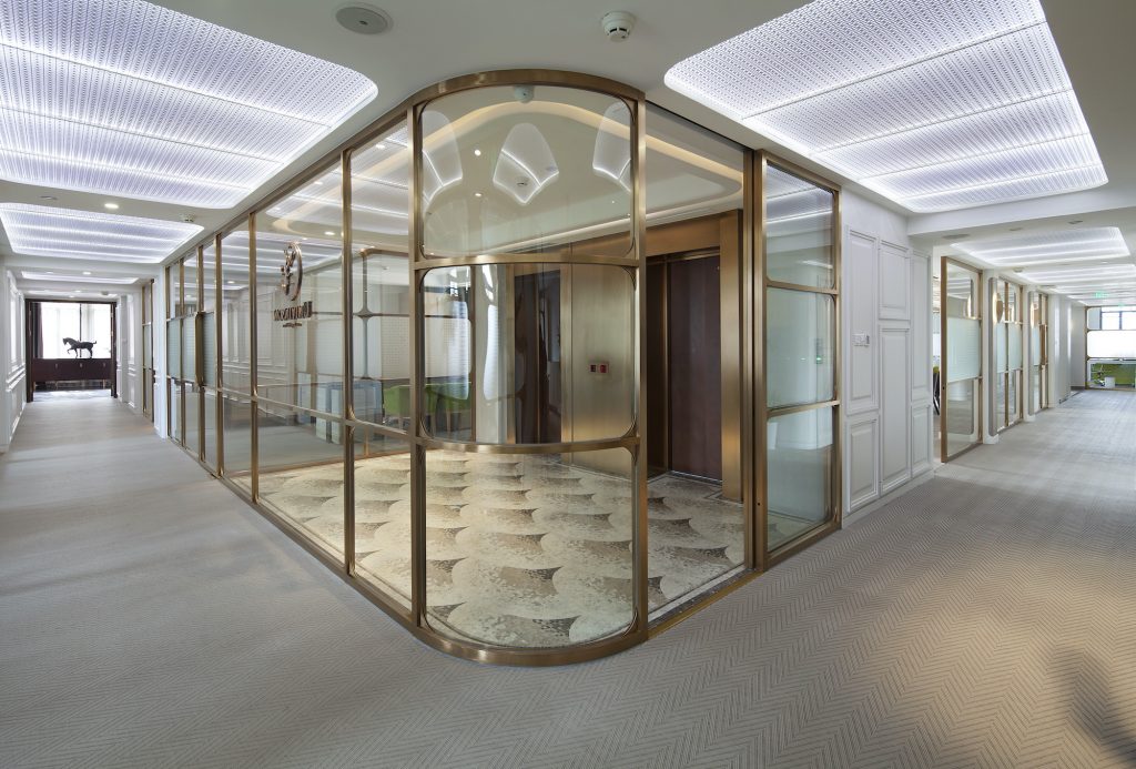
The beauty of architecture, at its core, is the ability to match function and form in the sole choice of a shape or a material. In the case of office spaces, combining function and aesthetics is even more crucial, in the sense that not only do such spaces have to accommodate the specific needs linked to the company itself but, from a more general perspective, also have to improve employee wellbeing and productivity. In the case of cosmetics company Uni Vinson, the objective was also to express a notion of timelessness, which is a fundamental component of the firm’s identity. For this reason, Uni Vinson asked Studio MVW to breathe new life into a classical building, the Shanghai Bund Source Y WCA, and to crystallize its 2,000 square metres of new office space into eternity. To achieve this exciting challenge, Studio MV W opted for a very organic, flowing design to create a soothing atmosphere throughout the space. This approach is visible from the entrance, where the architects opened up vertical volumes by partly demolishing the ceiling in between the 3rd and 4th floors. The new double-height space creates a feeling of fluidity, which is reinforced by a staircase clad in pure white Corian and complemented by a brass handrail and mirrored walls. The few existing structural columns, which were originally square, were also reshaped into organic forms evoking plants emerging from the ground, while the light fixtures are reminiscent of biomorphic, vegetal forms. The vegetal theme was also developed in a more literal manner through the creation of a different indoor garden on each floor, each of which improves work conditions in its own way. The third floor, for instance, features a bright relaxation space inspired by the 19th-century European greenhouse. “The impression of a garden is so real that we almost envision the gardener…”, the Uni Vinson teams declared, confirming the architects’ knack for fruitfully introducing nature in an otherwise very urban environment. The general sensation of openness and free-flowing spaces is enhanced by the choice of shapes – from the round glazed window connecting the garden and the conference room to the reception desk, which is shaped like a cloud or a flower, to materials such as smooth marble, glossy brass, Terrazzo, perforated aluminium panels, overstitched leather and sculpted Corian, and a colour palette composed of white, beige, brown and grey. But the notion of fluidity goes beyond the visual or tactile aspects to permeate the functional dimension of the space, from the conference table engineered to collect all wires and plugs to the desk separations made of frosted glass and ensuring intimacy without closing off the space. A perfect arrangement of areas organically linked together, and a very contemporary, sophisticated interpretation of infinity
DX Residence (Shanghai): A 21st Century Home Embraces Modularity, Beauty, and Calm
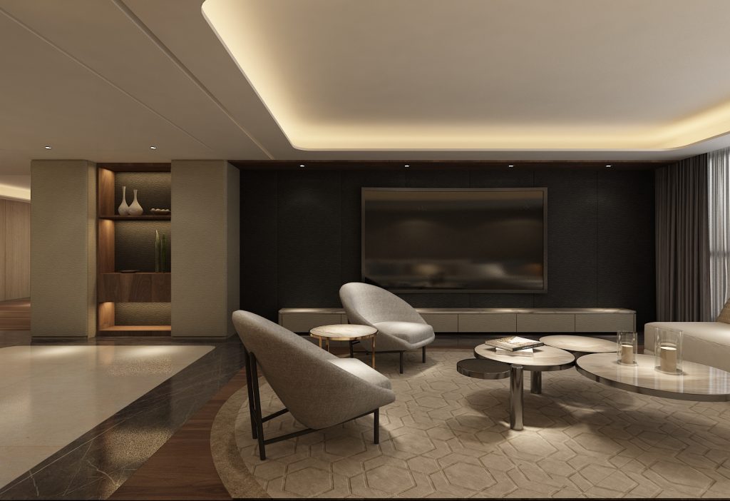
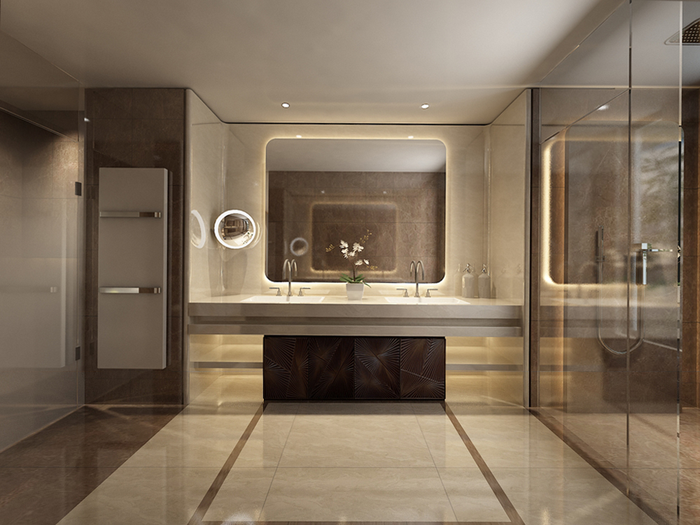
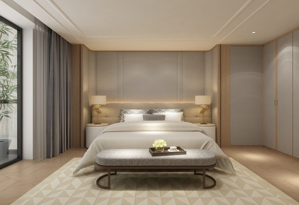
Imagining a home is, of course, a very different mission from designing public, open spaces. When they were asked by a young actor to create the interior design of his home, Virginie Moriette and Ming Xu knew the direction would be given less by an abstract concept than by their client’s tastes and lifestyle. Located in a high-end residency complex in Shanghai, the home was developed around a few key principles: comfort, modularity – through a vast space that can be customized according to the owner’s needs and wishes – and a refined mix of measured luxury. The layout features a central living room that is organized around a large couch to comfortably watch movies and relax, a master bedroom and additional guest bedrooms. A feeling of spaciousness and peacefulness is conveyed through clever arrangements of shelves and alcoves showcasing the owner’s collections of art, teapots and bonsai without ever creating visual distractions. What is striking about the DX Residence is its honesty in translating the tastes and personality of the owner, while avoiding any rigid stylistic formula. The space, which combines clean lines and neutral tones with noble, high-end materials like marble, never falls into a strict, minimalistic category or in a too obviously expensive and luxurious style. Rather, it plays on contrasts to develop its own aesthetic, giving pride of place to softness, warmth and personality. These qualities are also seen in the custom furniture design by Studio MVW. DX Residence illustrates a very contemporary take on luxury – one that redefines true comfort through spaces which not only reflect a person’s individuality but also enables the client to feel aligned with their inner self
This article is part of TLmag Special Edition: MVW Studio.
Cover Photo: Wuhan Sales Office and Aesthetics Museum // The large, perforated wall panels in the VIP room, made with natural materials, create a sense of intimacy while visually anchoring the space with its dynamic imagery.
