Nature As Connection
Studio MVW presents Hospitality Redefined by Future-Forward Concepts and the Natural Elements
The importance of blending innovation, technology and the natural landscape to create a better world is becoming crucial. Whether it is in the products we consume or the places we gather, channelling the power of nature – its shapes, forms, textures– and bringing them indoors, creates a sense of balance and a feeling of positive energy that is felt by the people who use the space. Using this as a base from which to design innovative and future-forward spaces infuses them with a sense of timelessness – not overtly trendy but harmonious and unified. From creating a small biosphere within a contemporary dessert bar in the heart of Beijing to reviving an ancient temple house in the tea region of Hangzhou or a social club surrounded by nature in northeastern China, hospitality has found new meaning through these perfected designs by Studio MVW.
Aoyama Dessert Bar (Beijing): A Futuristic Interior that Mixes Tradition with Innovative Concepts for a Dynamic and Timeless Setting
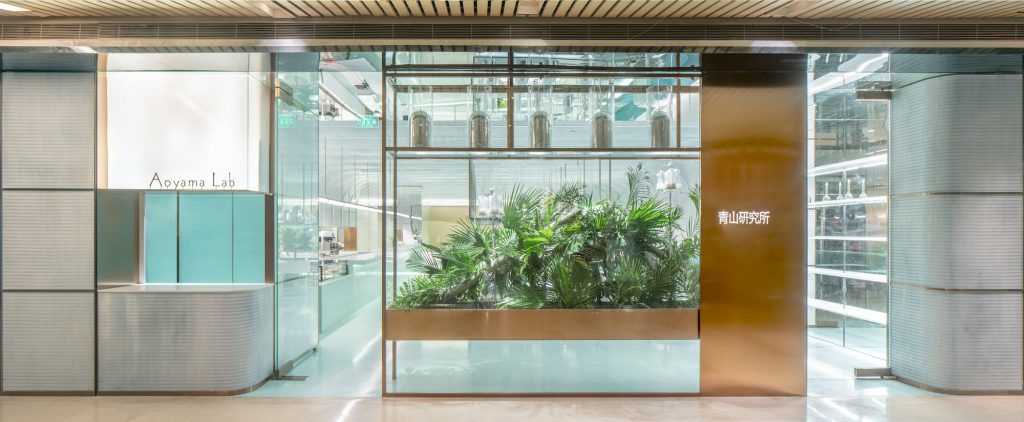
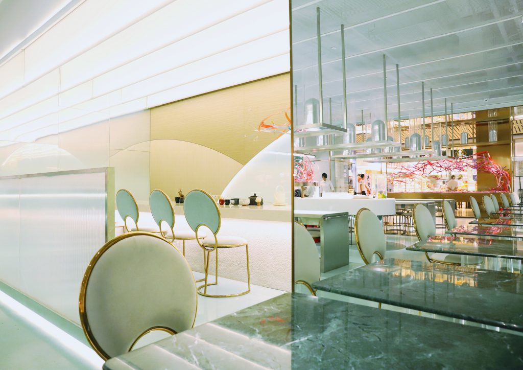
Studio MVW’s Aoyama Dessert Bar in Beijing is a perfect illustration of how much architecture can contribute to the launch of a new concept. By turning an idea into something tangible, design choices enable individuals not only to physically experiment with it but also to incorporate it into their culture. For the creation of this new type of bar that sells very contemporary, sophisticated desserts based on Japanese recipes, Studio MVW was asked to develop a space around the notions of nature, experimentation and traditional Asian codes. The investigation of these three aspects led to a creative solution that makes the most of that blend and brings about an undeniable wow effect. From the outside, the bar looks like an intriguing, hi-tech oasis. It is enhanced by the transparency of the façade whose mesh cladding also conjures up the lightness and refinement found in the architecture of the thinly layered desserts sold in the bar. Inside, the first striking element is the choice of celadon as the key colour – both an evocation of nature and of Asian aesthetics – combined with mesh that intensifies the visual impact of the organic, space-age, almost Kubrick-esque outline created by the walls and ceiling. The space is divided into two areas: the front part where people order and buy desserts, and the back area which is a more exclusive space dedicated to tea drinking. The use of natural materials like stone and wood complements the rounded shapes and smooth Corian surfaces, introducing a sensorial dimension into an otherwise ultramodern space, resulting in a comfortable, welcoming laboratory. The science-inspired aesthetic is also visible in the hanging lights in the front space as well as in the glass console showcasing a tree or in the plants exposed within transparent blocks, like a herbarium from the future. The impression of purity created by acrylic walls, mirrors and sleek surfaces evokes a cutting-edge museum of natural history, a place to experiment and invent tomorrow’s life. In that sense, the architecture developed for Aoyama Dessert Bar exemplifies an interesting way to go beyond a purely commercial concept and to elevate the discussion by creating a universal, poetic frame around it.
Lu Ming Tang Flagship & Tea House (Hangzhou): Poetic Elegance for a for a Skincare Brand Steeped in the Holistic Traditions of Tea
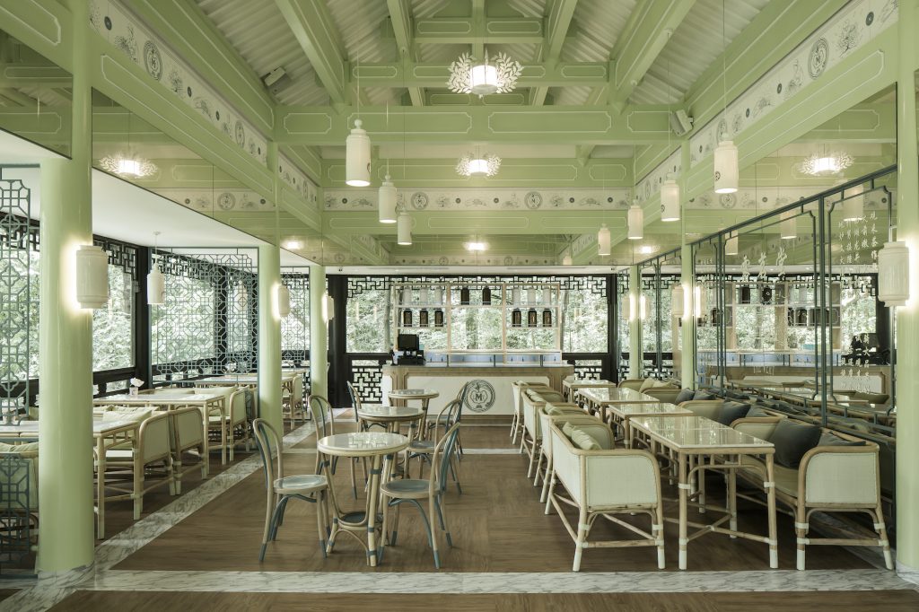
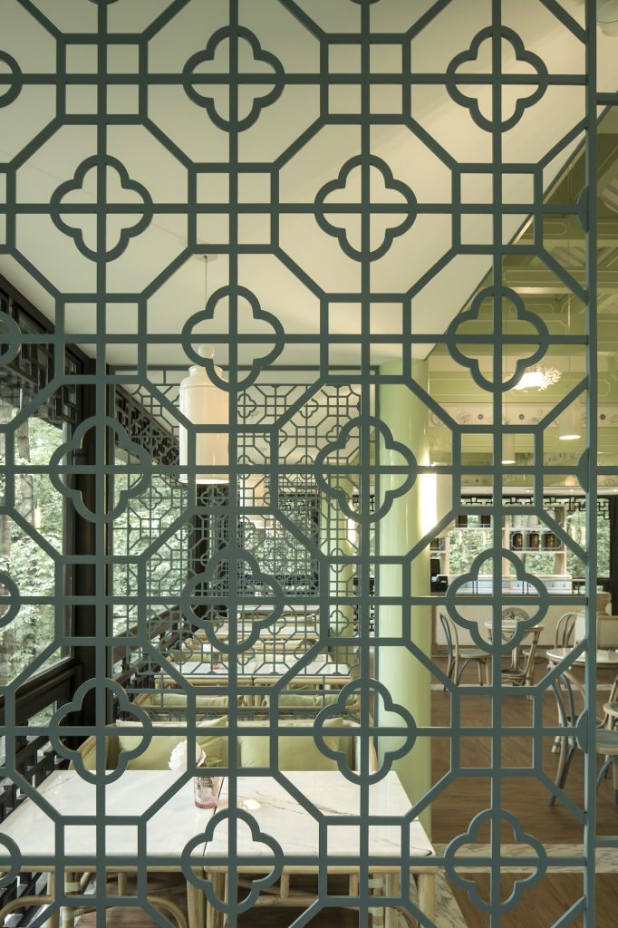
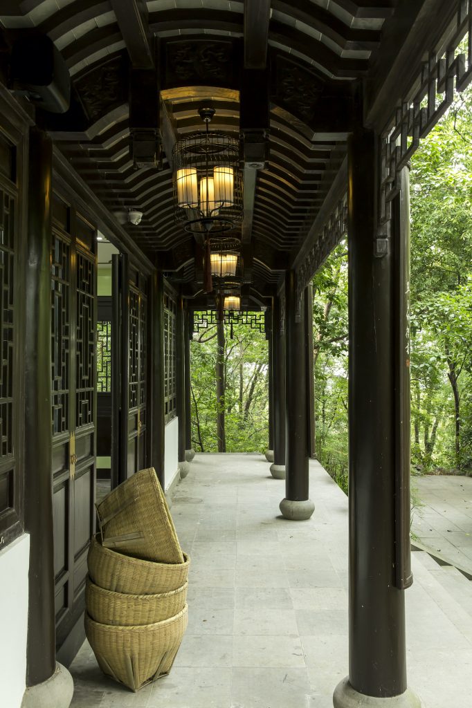
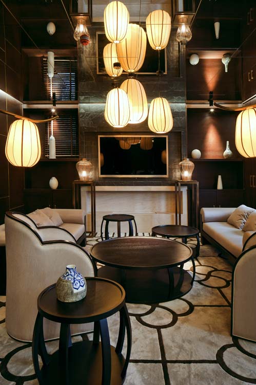
For an architect, imagining the first flagship store of a newly created brand is always a stimulating challenge. Successfully translating a universe defined by words and visual elements into a 3D experience can only be achieved through careful thinking and close collaboration with the commissioners of the project. With Maison Lu Ming Tang, the French skincare brand’s first tea house and store, the challenge was further heightened by another factor: the choice of a former Qianlong Imperial Library as the setting of the brand’s home. Nestled in the UNESCO-listed Longjing (Dragon Well) tea mountains of the Hangzhou region, the temple house, which dates back to the Song dynasty, was the place chosen by Emperor Qianlong to write poems and calligraphy celebrating the virtues of tea during the Qing dynasty. Yu Shu Lou, as the building is called, was undeniably the perfect place for a brand harnessing the natural powers of Longjing tea to revitalize urban skins, as well as an exceptional opportunity for Studio MV W to express both its understanding of Chinese tea culture and its French sense of elegance. The exterior architecture of the library, including its beautiful wooden door panels, was retained, with Virginie Moriette and Ming Xu focusing on the interior design to breathe new life into the building. The ground floor, which hosts Lu Ming Tang’s flagship store, was stripped of dark wooden floors, revealing a superb traditional stone paving that was turned into a key element, giving the interior a beautiful and unique patina. Virginie Moriette and Ming Xu drew inspiration from traditional Chinese herbal apothecary cabinets to design the display counter, compartments and drawers, while the display stands are reminiscent of traditional tea leaf drying bamboo baskets. Above the counter, ceramic pendant lights shaped like Chinese tea caddies shed a soft light complementing and enhancing the subtle blue-grey colour of the brand’s logo, creating a soothing, delicate atmosphere. The staircase connecting the two floors makes the most of natural light through framed mirrors installed along its upper wall. The tea culture motif is developed through a series of porcelain, Chinese tea cup-style lighting fixtures hanging from the ceiling and custom-patterned tea leaf prints applied to the wooden steps. The staircase opens onto to the teahouse on the upper floor, which is also characterised by a very airy feel and a close connection to the lush greenery surrounding the building. Studio MVW salvaged a vaulted roof hidden under a low flat ceiling and turned it into a centrepiece which refreshes and enhances the new space through its tea green and white colour scheme, and its ceiling frescos combining illustrations and the Lu Ming Tang logo. Green partitions with modernized Chinese plum flower patterns introduce rhythm and create privacy for guests enjoying tea in what feels like an open tree canopy. Wooden latticed window patterns, marble, framed silkscreens, laser-engraved mirrors, lacquered pillars and custom-designed bamboo furniture inspired by the minimalism of the Ming dynasty and traditional French-style rattan outdoor furniture convey elegance and authenticity. As a building infused with tea culture and history, Yu Shu Lou could hardly have dreamt up a better future. There is little doubt that Emperor Qianlong’s poems will continue to float in the air and inspire Lu Ming Tang and tea lovers alike.
Yunlong Hui Private Club (Xuzhou): The Natural Landscape Inspires a Layered and Soulful Design
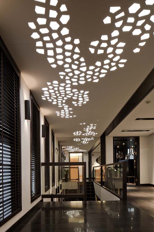
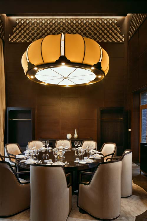
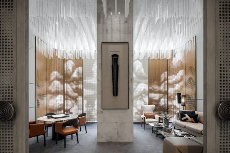
Located near Xuzhou in Yunlong Mountain – whose name originates from its nine dragon-like peaks – the Yunlong Club is another example of Virginie Moriette and Ming Xu’s penchant for the exploration of opposites and of the notion of balance. Here, nature and culture, inside and outside, eastern elegance and contemporary chic, past and present coexist to create a new type of cosiness perfectly in tune with the surrounding environment. The club is divided into three floors. A lounge and restaurant on the ground floor, and a reception area on the first floor, are visually linked by a clever use of transparent partitioning that conveys a sense of airiness and openness. This feeling is also present in the large floor to-ceiling windows connecting the restaurant spaces with the sunken exterior courtyard decorated with many green bamboo plants. The upper floor is occupied by meeting rooms and private dining rooms, all framed by a ceiling reminiscent of the original pitched roof from modern Huizhou architecture. The rooms are furnished with simplified – thus more suitable to commercial use – versions of Studio MVW’s classic Cotton and Louis Ming Chairs. The notion of integration goes beyond the geographic or topographic aspects to incorporate a strong cultural dimension, particularly perceptible in the use of materials. Bronze, which is associated with the craftsmanship and cultural heritage of the Chu and Han dynasties and notably with the city of Xuzhou, is extensively used throughout the club to reinforce its connection with its historical and local context. On the third floor, a bronze chandelier evokes the bells found in Ancient China while copper, which is used in the round barrel stools of the reception area and in the lamps of the bottom floor, infuses the spaces with warmth and gives them a very special patina. Another strong component of the club’s architecture is the recurring play on light and shadow. The windows in the reception area, which open onto a view of the South Lake, feature an “ink painting” of the mountains made of laser-cut aluminium plates that let in natural light during the day and becomes a modern landscape painting at night, as the light coming from inside turns it into a photographic negative. On the other side of the room, a digitally synthesized bamboo image covers the glass delimitating the staircase, echoing the themes of nature and light. Perforated panels on the ceiling of the top floor reiterate lighting effects and evoke a mashrabiya-like, modern artwork. Envisioned as a core element of the architecture, light is neither just functional nor ornamental, it is also used symbolically to convey the idea of a strong vital force, an energy coming from the past and projecting the space into the future. The traditional candlestick, which inspired the design of a specially made copper hanger, evokes permanence and change through the image of a flame – a felicitous choice for a club whose design is anything but frozen and materialises all at once the roots of yesterday and the energy of tomorrow.
This article is part of TLmag Special Edition: MVW Studio.
Cover Photo: Aoyama Dessert Bar // The combination of sleek surfaces and vegetal components creates a uniquely futuristic feel
