Pierre Yovanovitch: Ultra Modern Attitude
Interior designer Pierre Yovanovitch’s recent projects include a boutique for Christian Louboutin Beauté and exhibition designs for AD France. In an interview, he opens up his fascination to 20th century American design.
In line with American mid-century design, Pierre Yovanovitch offers up both a lecture and a lesson on the seasoned style of big names that’ve marked the history and present of modern interiors. Crossing the ocean, transatlantic design is currently having a great impact on the ‘old’ continent.
TLmag: Which designers are you especially fond of?
Pierre Yovanovitch: I particularly like American designers from 1940s to 1970s, Paul Frank, James Mont, Billy Haines, who was Hollywood actor turned designer, Terence Harold, Robsjohn-Gibbings, Paul Laszlo, Phillip Lloyd Powell, Harvey Probber, Tommi Parzinger, George Nakashima, Edward Wormley, Milo Baughman and Paul Evans.
How would you describe ‘American Style’ furniture? How does it find place in your interior design? What special pieces have you acquired for your collection or clients over the last year?
PY: For me, the scale and proportions of American design standouts from European design as the notion of space and volume are entirely different. Everything is big in America. I also find that there is more expertise in the United States. Often, designers are trained as craftsperson and know how to treat raw material. The design process starts there. American designers are more familiar with manufacturing constraints, as was Dunbar Furniture Company designer Edward Wormley. Their choice of material is pointed and fits in with my aesthetic and approach to interior design. Mid-century American designers knew how to overturn convention: steel, cork, ceramic, wood with numerous editions in variations of these material not necessarily found in Europe. Paul Frankl’s cork and oak coffee table is fascinating. I’ve also always had an inclination towards one of Robsjohn-Gibbings’ Mesa tables – the original inspiration behind the scenography I developed for AD’s first Intérieurs exhibition in 2010, at Artcurial in Paris. Rare light mahogany casts different shades while undulating, organic lines stack on top of each other – making this table sensual and beautiful. Assertive lines and strong personality are two other characteristics of mid-century design.
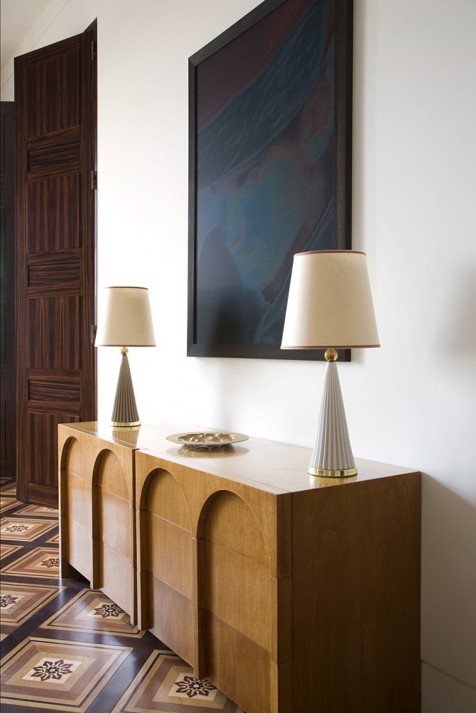
Robsjohn-Gibbings explored ancient Greek lines with subtlety and rigour, reinterpreting these references for the 20th century: arches, vaults and curves compensated for straight lines; in the image of the mythical roman Colosseo Quadrato. His commodes – produced in dark wood, marked proportions, and fluid geometry – work beautifully in any contemporary salon.
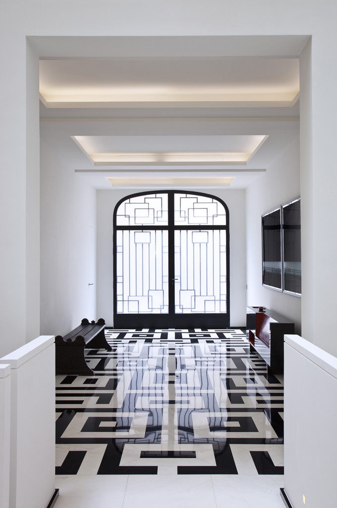
I’ve also kept-up with contemporary designers drawing inspiration for that era. James Mont used almost Chinese-like writing in cut patterns, resembling traditional designs and ideograms, curved tabletops and bright colours. Though not everything he creates holds the same quality, his ideas are pushed as far as they can go.
Paul Laszlo is one of my favourites: his drawings show great modernity, intelligence, colour balance and precision. Some pieces are quasi-sculptural while others, like metal frame chairs, resemble the Eiffel Tower.
Lamps by Marshall Studios or Atelier Heifeitz are pieces that I look for and often integrate into projects. My attraction to this period in American design corresponds to the interiors I create. I like the strength and authenticity of design with almost an architectural perfection, an apparent simplicity in the statement, personality, elegance, a touch of originality without ostentation or arrogance and an exactitude that is timeless.
How did you first discover 20th century American design?
PY: I travel to New York and Los Angeles regularly. At the beginning, my friend John Loring introduced me towards this typology. Through him, I discovered Wormley, his wood-inlaid and enamel table that follow in a kind of Tiffany’s tradition. Over time, I learned a lot at the galleries that support this type of design: Éric Philippe, Chahan Minassian in Paris, Donzella and Todd Merrill in New York, Reform, Noho Modern, JF Chen in Los Angeles. Finally, periodicals and literature have been essential sources of information, such as Ultra Modern Samuel Marx – Architect, Designer, Art Collector by Liz O’Brien.
Are you interested in contemporary American design?
PY: I know less about it but like what I do know. I appreciate Sebastian + Barquet’s New York-base collection, which doesn’t only show work by American artists: the recent exhibition on Belgian designer Jens Praet was of high calibre. R & Company’s Haas Brothers showcase was also fun and intelligent. •
The interview was originally published in TLmag 23, All that Jazz issue in June 2015.
