Solo House by OFFICE Kersten Geers David Van Severen
OFFICE has created an installation that draws on the firm’s Mondrian-inspired, city grid scenography and evokes the original residence in the Spanish countryside
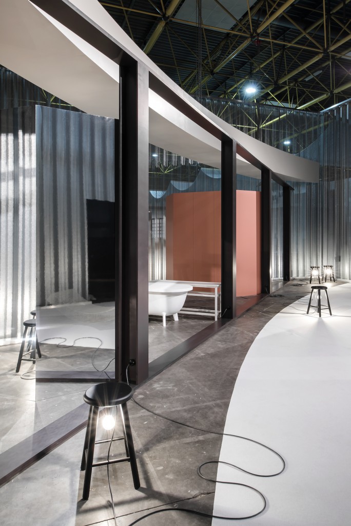
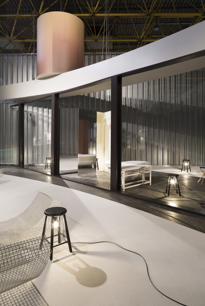
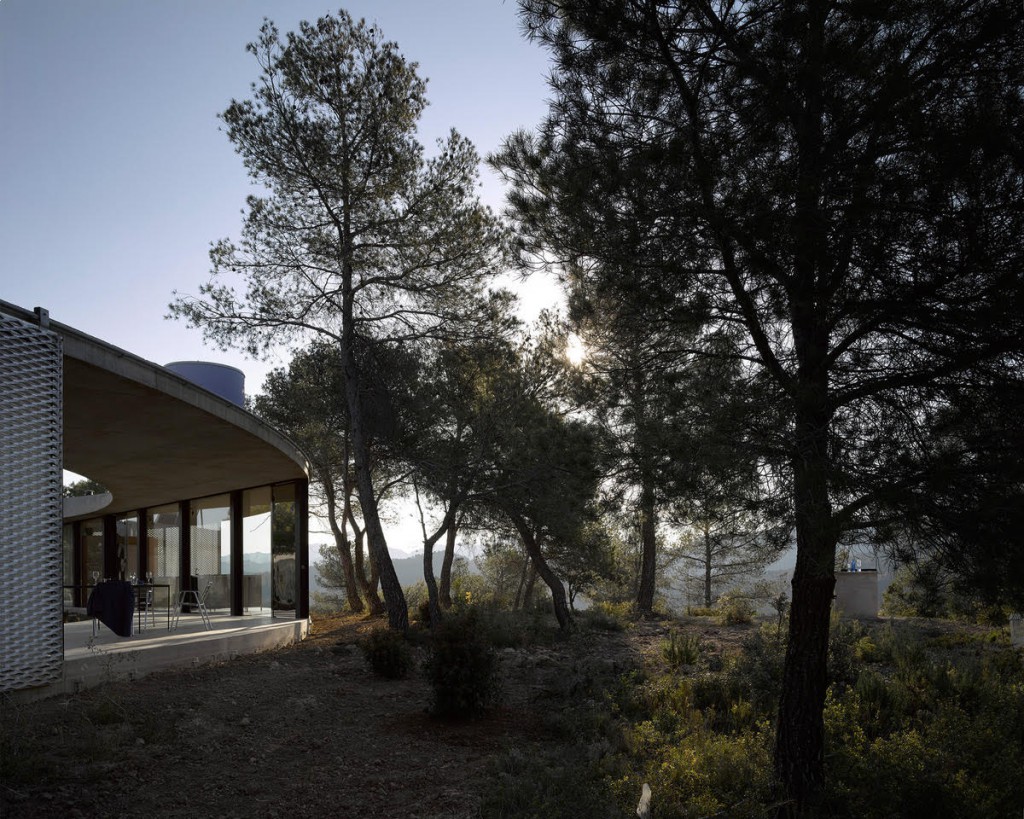
From an isolated plateau in Spain’s Matarraña forest to the fair floor at Kortrijk Xpo, Solo House demonstrates the best of OFFICE Kersten Geers David Van Severen’s holistic approach. The Brussels-based firm curated last year’s Biennale Interieur on the celebratory occasion of its 25th edition. OFFICE created an installation for the event that drew on the firm’s Mondrian-inspired, city grid scenography and evoked the original residence in the Spanish countryside.
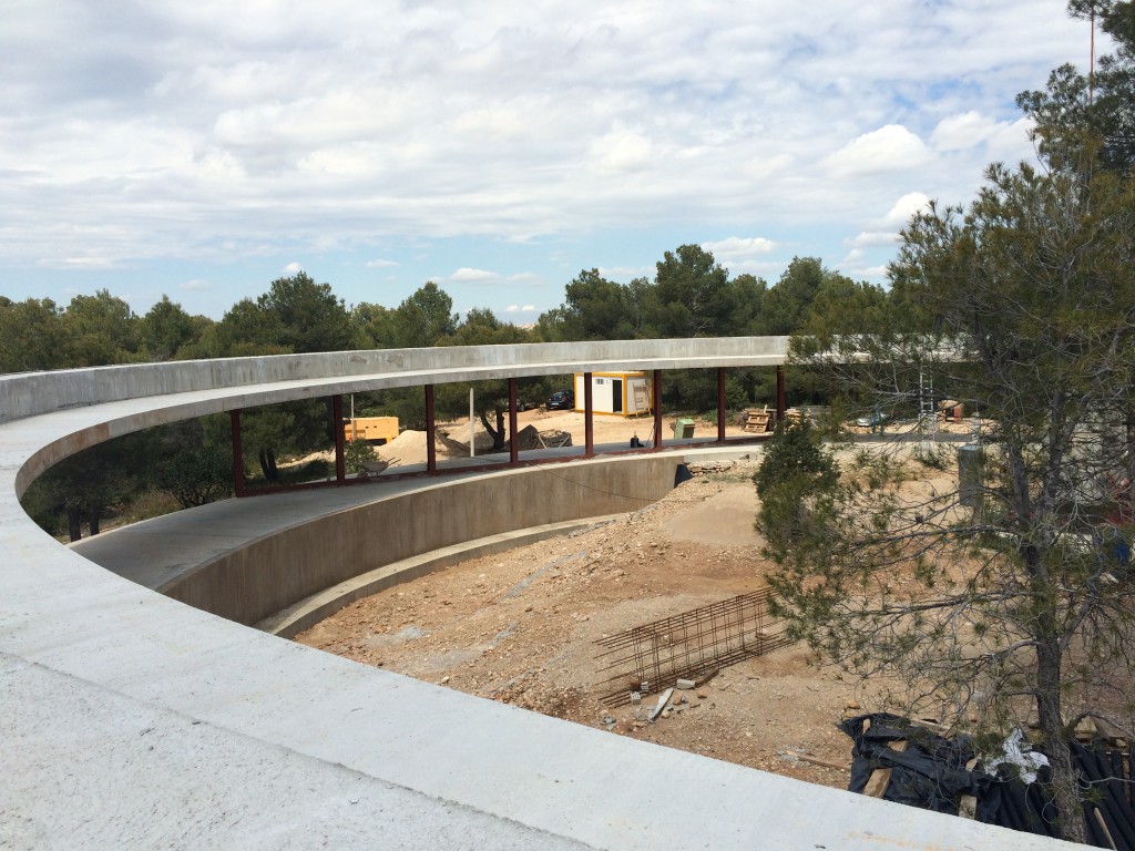
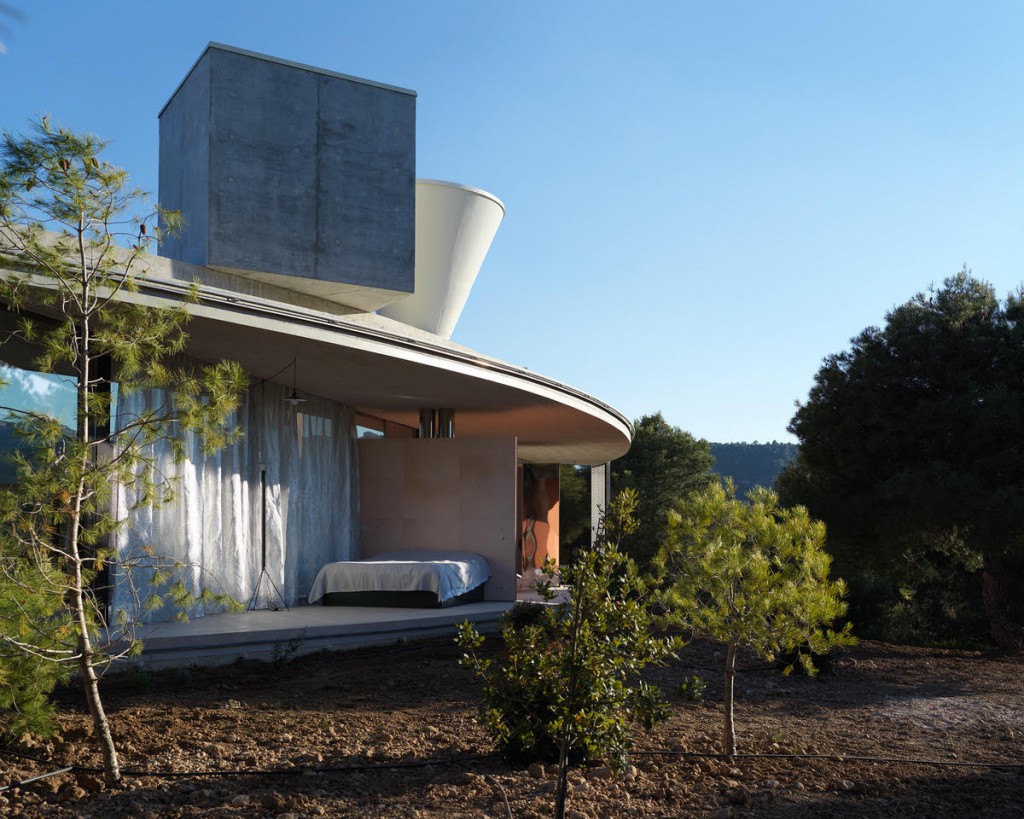
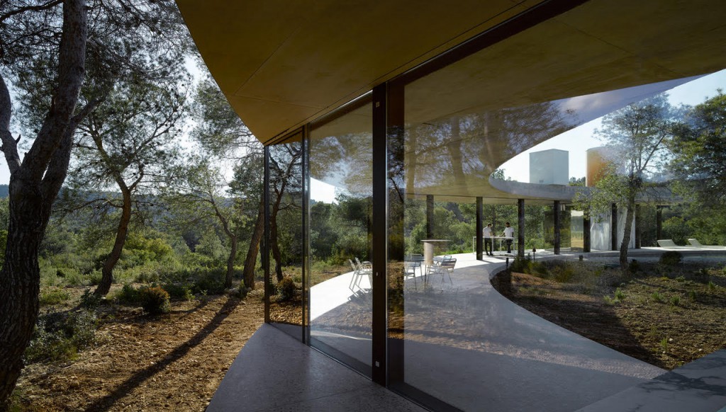
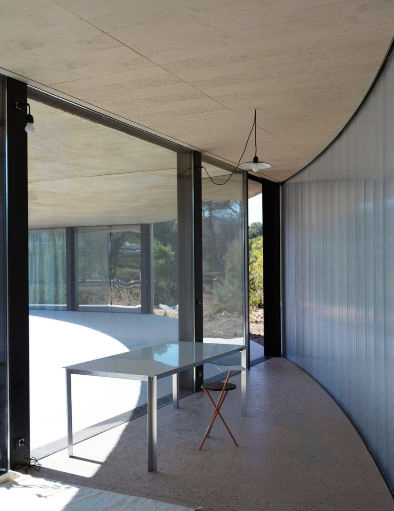
With porous glass walls, integrated technology and a self-sufficient energy system, the 45-metre-wide circular house takes advantage of 360-degree vistas from its woodland perch. With this attempt at ‘invisible architecture,’ OFFICE has employed the highly Modernist approach of transcending distinctions between indoor and outdoor living.
Nature is easily accessible as the modular rooms open up to suit different occasions. In a similar Modernist fashion, the house was built using only machines, achieving a level of intentional minimalism and uniformity through process.
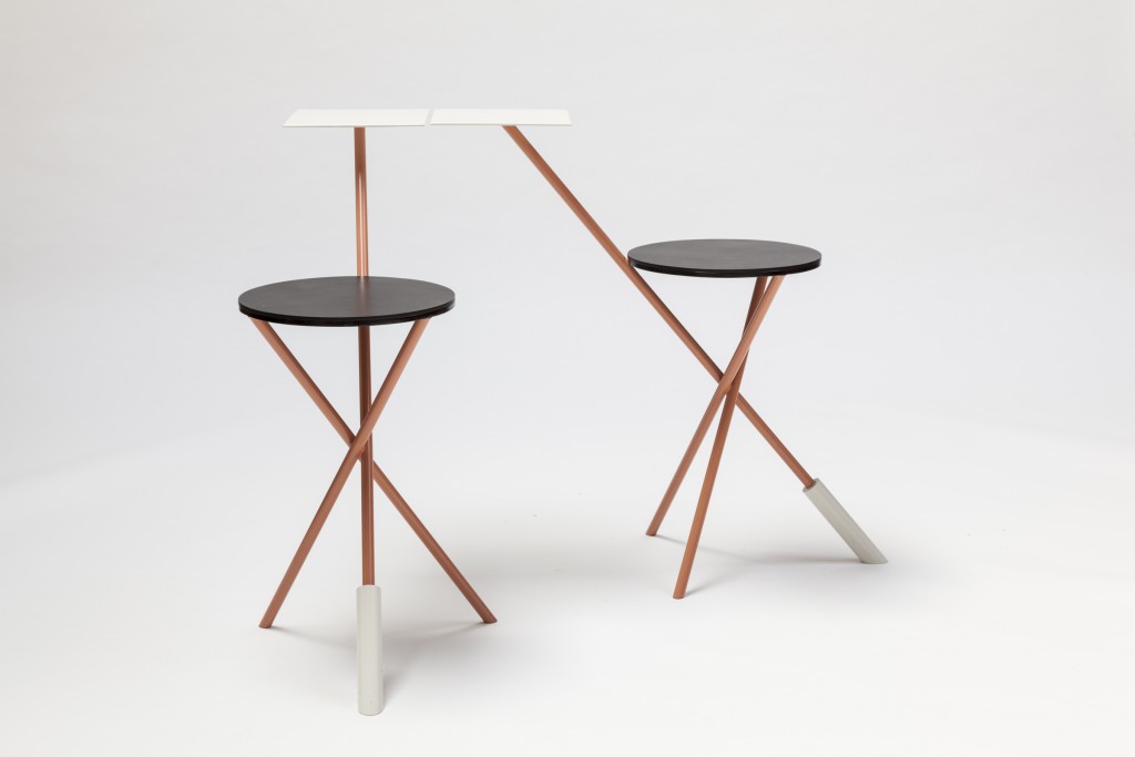
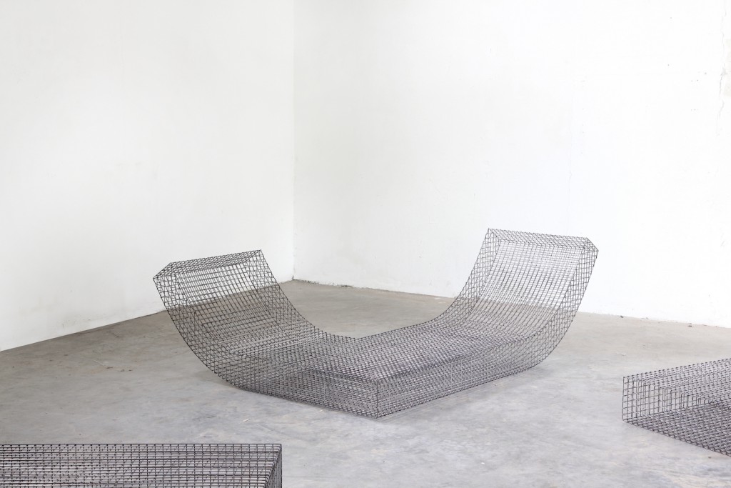
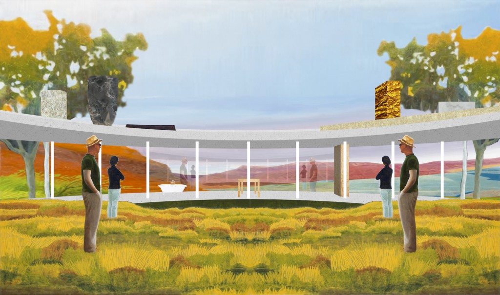
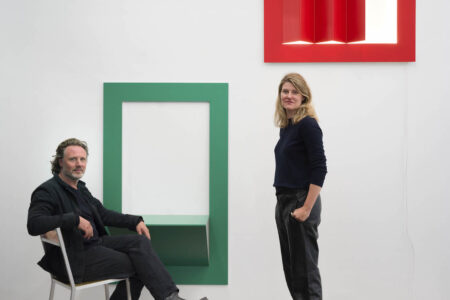
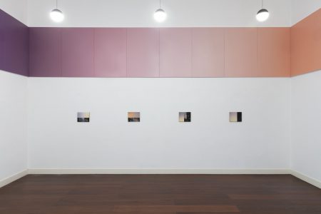
The Solo House installation is an architectonic, fragmented facsimile of the original construction. It was designed to respond to a different kind of wild jungle, that of the design world circuit. The base structure of Solo House features a monolithic roof, strategically placed columns and glass walls decorated with a host of furniture interventions by fellow Belgian designers Richard Venlet, Pieter Vermeersch and Muller Van Severen. The latter Ghent-based firm, which recently won acclaim for its take on craft-led neo-minimalism, designed a custom Solo Chair series that directly references the house. Muller Van Severen’s cubic, mesh chair employs this same sense of translucency and machine production. Its curvaceous form echoes that of the roof. In an effort to highlight different corners of the space, Richard Venlet retrofitted a rubber stool with a hanging lightbulb. Pieter Vermeersch applied different colours and textures to highlight various architectonic elements, creating a scenographic bridge to the rest of the installation. OFFICE invited these creatives to shed their own light on its seminal design, infusing it with their truly surrealistic yet ambiguous Belgian humour.
