David&Nicolas x Carine Gilson
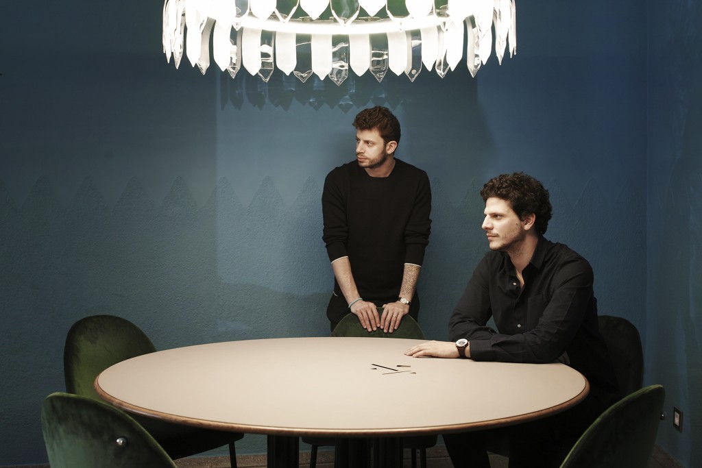
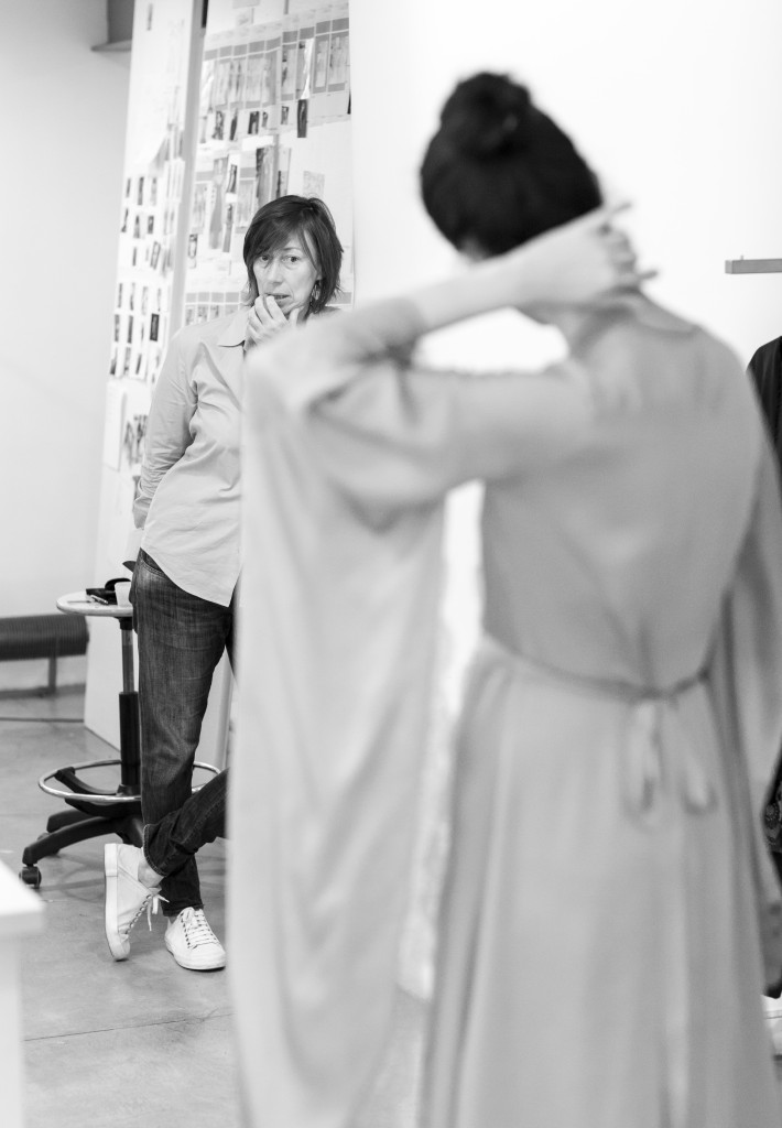
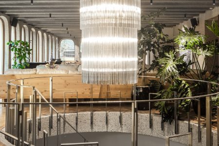
We caught up with David Raffoul et Nicolas Moussallem in Carine Gilson’s workshops, the Belgian designer for whom they have just created a flagship boutique.
We caught up with David Raffoul et Nicolas Moussallem in the workshops of Carine Gilson, the Belgian designer for whom they have just created a flagship boutique, the first in their careers. Nicolas is Lebanese. His associate, David, is Franco-Lebanese. The trademark of this tandem of architects based in Beirut: a dialogue between past and present, featuring beautiful materials and craftsmanship. Their influences: a sense of geometry very present in the Middle East, a European footprint linked to their fascination with Art Deco, and affinity for a certain “French touch” with electro-pop accents. This duo, represented by the prestigious Carpenters Workshop Gallery of Paris-London and New York, would not object to a comparison with Daft Punk.Their nuanced architectural reflection has, in any case, found a subtle echo in the new visual identity of a Belgian brand that has always placed timelessness and ultra-refinement at the centre of its approach.
TLmag : You have designed private apartments and restaurants, including Kaléo in Beirut, but this is the first time you have created a boutique. How did this work differ from your previous projects?
David Moussalem: This time, it wasn’t about bringing our identity to the fore, as can be the case when designing a restaurant. For this boutique, we wanted to express an emotion and offer an experience to each customer who enters the space. We aren’t decorators, but rather creators of spaces and furniture. Carine loved the idea of a modern take on a cabinet of curiosities. We loved the paradox; it was really exciting.
TLmag : Carine Gilson, why did you choose to work with these designers?
Carine Gilson : The decision evolved over time. Our first store concept was thought up internally. Delegating isn’t easy for us: we love to master everything. We needed architects who would see the project as a continuous exchange. This openness in their approach is what attracted me.
TLmag: What values to you have in common with Carine Gilson?
DM: We appreciate a job well-done, craftsmanship and an object that has been considered down to the smallest detail. The lingerie designed by Carine is very intimate. We translated this concept of intimacy through materials, colours and an emblem created especially for the site.
TLmag: An emblem separate from the brand’s logo
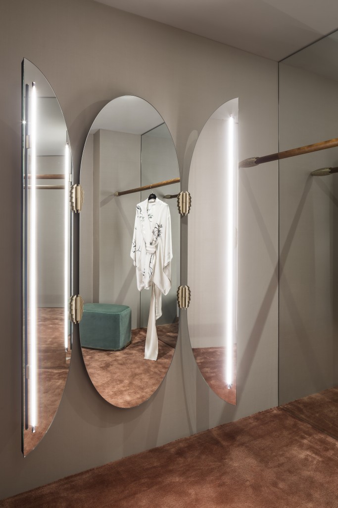
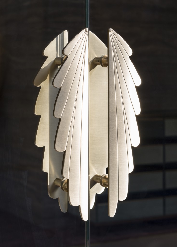
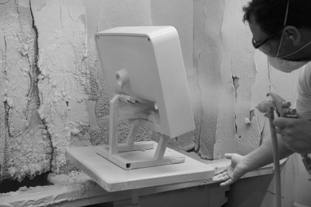
DM: Initially, we wanted to find a way to sign each item of furniture that we designed for the boutique. Out of this came the idea for the emblem, a stylised brass wing delicately placed on the mirrors, lamps, cabinets and sofas, and that can also be found as a doorknob or coat hook. Our workshops in Italy did the metalwork; the brass has been sculpted with infinite precision. The result gives the impression of lace. This architectural emblem also unifies the language of the space.
Carine Gilson: At this point in the development of the brand, it seemed important to be a little less discrete, to express our identity with strong gestures: a new logo, a reference space that can influence the layout of the two other boutiques, and this emblem that was created bit by bit throughout our collaboration.
TLmag: The boutique wants to feel intimate, feminine, surprising…How have you created these different emotions?
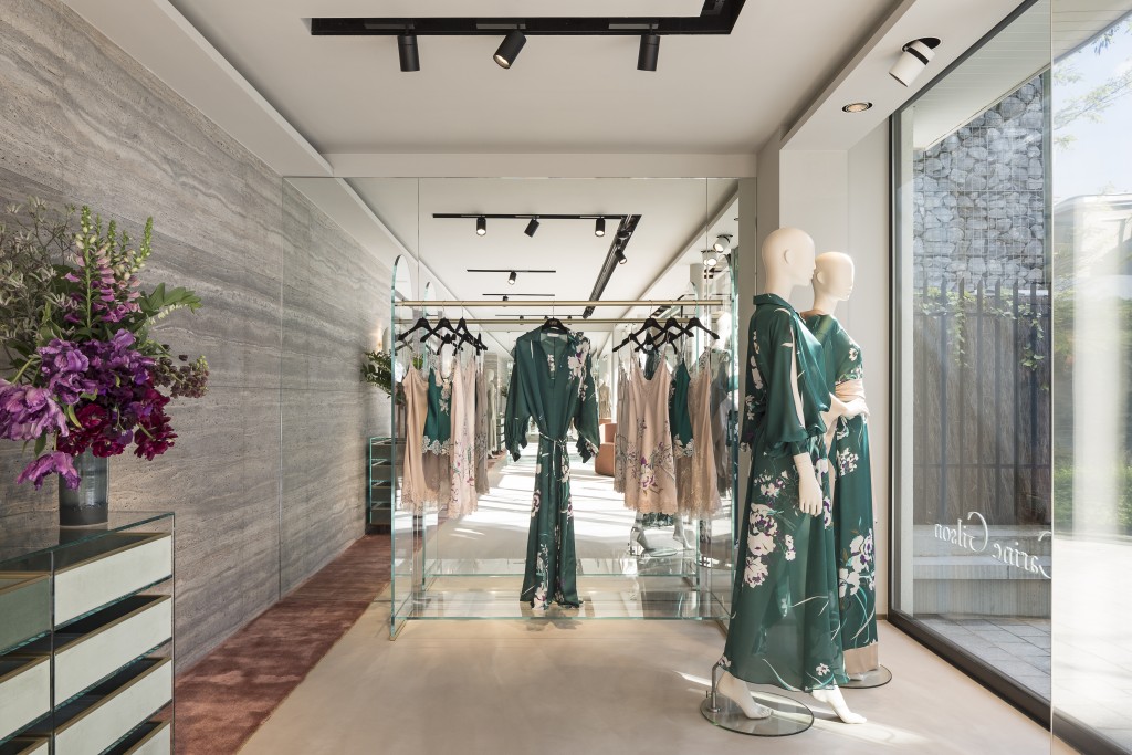
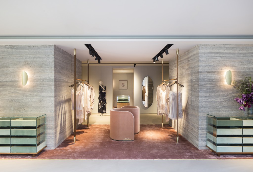
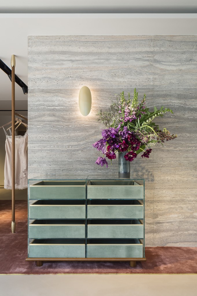
Nicolas Raffoul: We worked with a delicate chromatic palette that evoked earth, bare skin, blush. We wanted to retain a certain neutrality to allow the lingerie to take centre stage in the boutique. The customers must feel at ease, almost as if they were entering Carine Gilson’s apartment. The fitting rooms – large, 8-meter square boudoirs – with their non-standard format, resemble a living room. This boutique is a space that invites discovery. People want, we hope, to spend time there.
TLmag: You have integrated a travertine wall, whose coldness opposes the softness of the fitting rooms. This play of contrasts between light and heavy, opaque and transparent, seems to be an obsession for you.
NR: We also integrated glass to lighten the space and to enable dialogue with the velvet, marble or even the brass. When you enter the fitting room, the Mortex floor give way to a thick carpet. This boutique is a voyage.
TLmag: Speaking of voyage, in your opinion, is the approach to beauty the same everywhere? Can we speak about a single and shared vision of beauty that is applicable globally?
DM: For us, beauty is not global, it is contextual. Placing an 18th century piece of furniture in a Beirut interior would make no sense. There, we can instead consider wooden furniture with an imperfect finish. This wouldn’t be the case everywhere. For Carine Gilson’s boutique, we wanted to lean toward the idea of perfection.
TLmag: Some of the furniture created for Carine Gilson is part of a precise ritual. Can you explain that?
DM: Folding a silk kimono is an art. The movement is far from trivial. We placed the semainier Carine asked us to create for the boutique across from the sofa in the salon space. The customers can thus witness this ritual. The ceremony, like the scent of the wood and the feel of the velvet, stimulates the senses. We also designed a dressing room that holds Carine Gilson’s entire wardrobe for the season. It’s a showcase, an invitation to discover.
TLmag: You have also designed the interiors for Carine Gilson’s boutiques in Paris, then London. Was this another challenge?
NR: The idea, when you repeat the same concept in another city, is to offer the customer a voyage that is in line with the brand’s visual identity, but that also takes into consideration the configuration of the space. In Brussels, we mostly worked with ‘nude’ tones and a touch of celadon green. In another city, we could for example, change this colour balance. But there is no question for us of changing everything in order to fit into one or another market. In our opinion, it is a mistake to act this way. It would be tantamount to denying our identity and that of the brand.
TLmag: Carine Gilson, this international dimension in the architectural gesture is, in your case, paramount…
CG: Today, even though our collections are still made in Belgium, and we do not outsource any of the 8,000 pieces we produce each year outside the capital city, our lines are distributed through three of our own boutiques (in Brussels, Paris and London) and through luxury multi-brand stores in 14 countries. From the beginning of this adventure, we have embodied an exported Belgian luxury. So we had to reach beyond our Belgian roots to lean towards a sophistication that is more linked to the nature of the product, and its rarity. This specificity is what explains our international longevity. Our strategy is not a race, like a watch. It is about lasting for the duration.
