Glenn Sestig: Architectural Lines
Discussing recent projects with TLmag, Belgian architect Glenn Sestig reveals an architecture that is specific to the place and the moment.
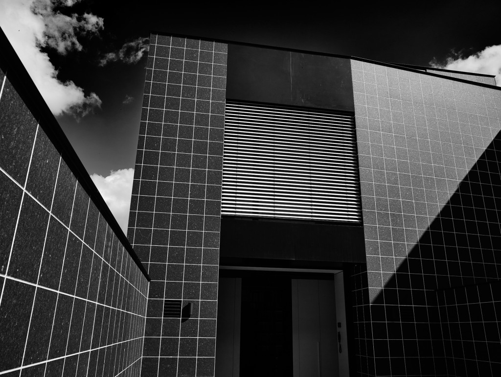
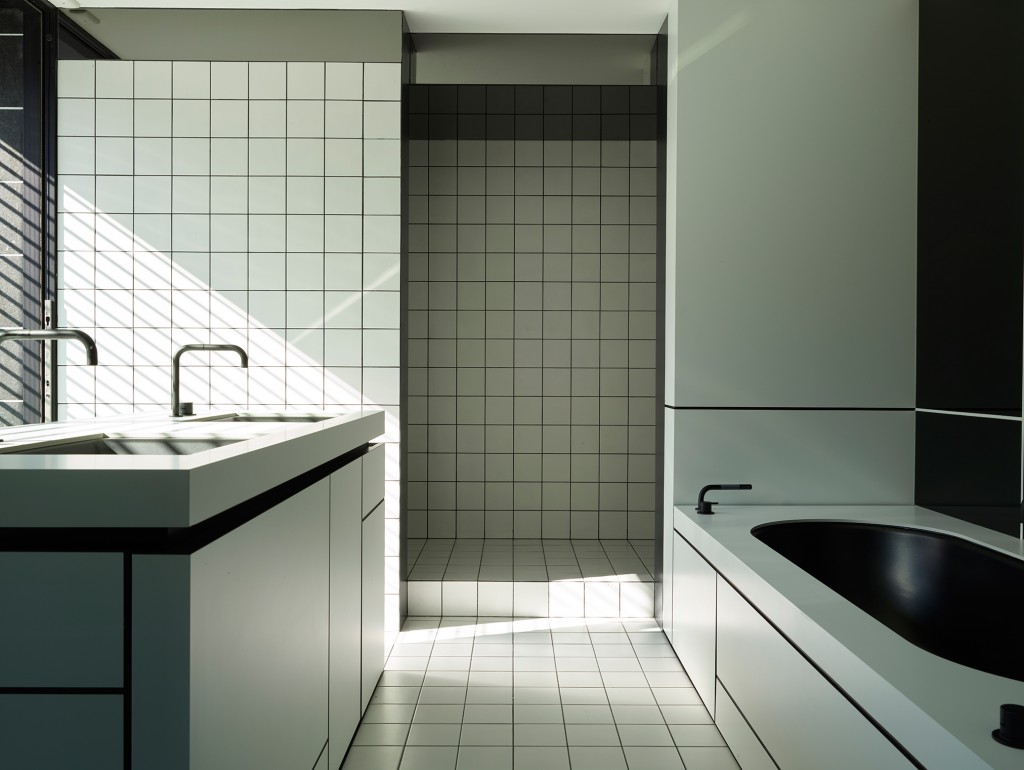
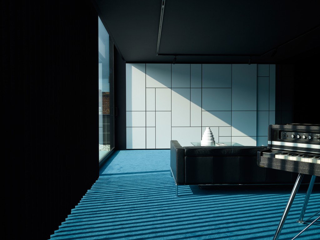
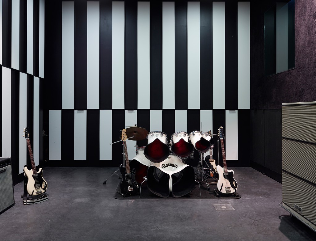
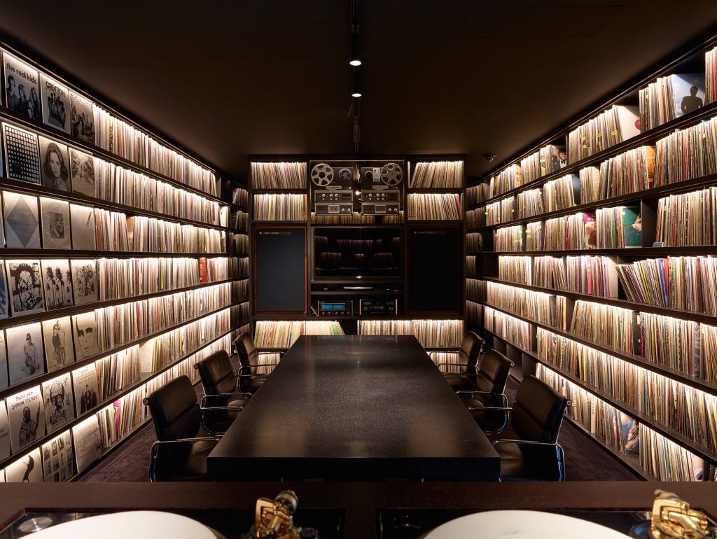
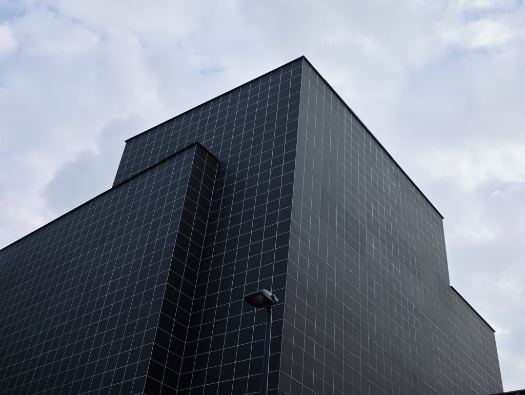
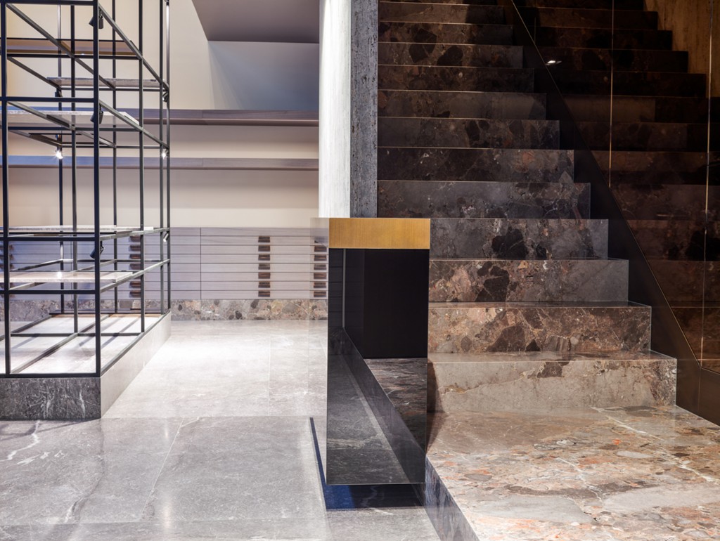
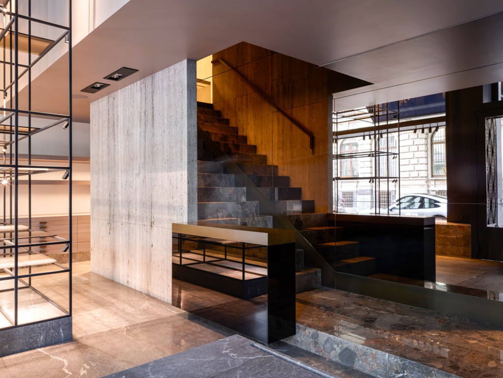
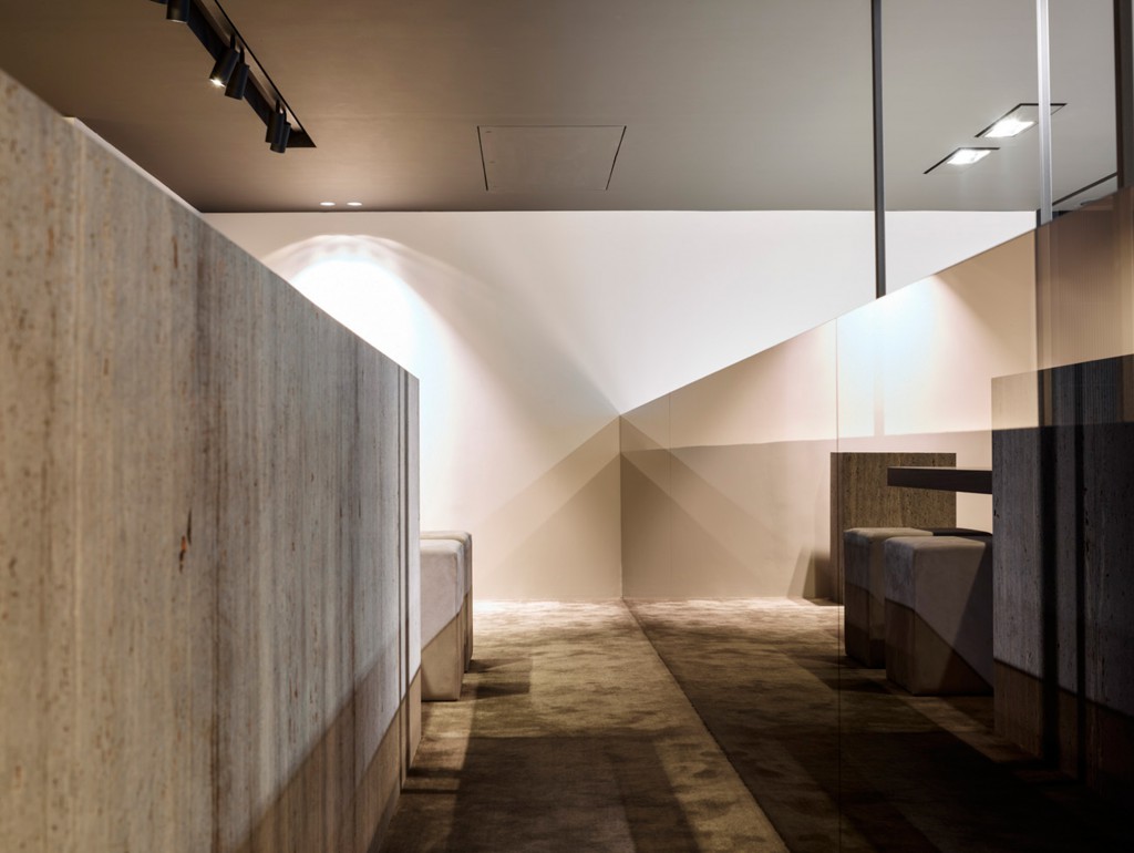
His interiors are urban, almost an extension of the outside world. They are rigid and precise like a city grid yet refined in their composition. With a limited selection of high-quality materials, Glenn Sestig is able to evoke visions of old-school grandeur and elegance; yet to call him a minimalist would be too easy. His is a muted kind of luxury, informed by modern life and the essentials of space and utility. The Ghent-based architect has put his stamp on shops, galleries, nightclubs, offices and private residences across his native Belgium. Yet in order to find the common denominator in his eclectic portfolio, one must look beneath the surface at the thought process that goes into each project he executes. Discussing recent projects with TLmag, Sestig reveals an architecture that is specific to the place and the moment.
Your work is characterised by an architectural approach to volume and perspective. What inspired you to apply these principles to interior design?
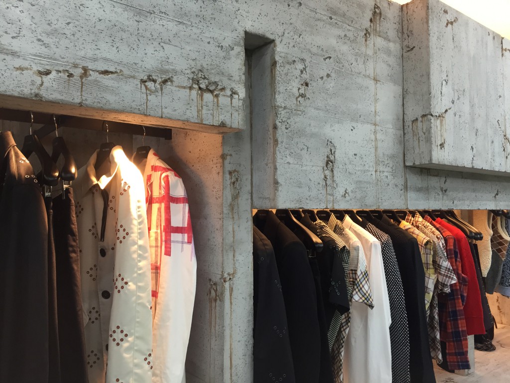
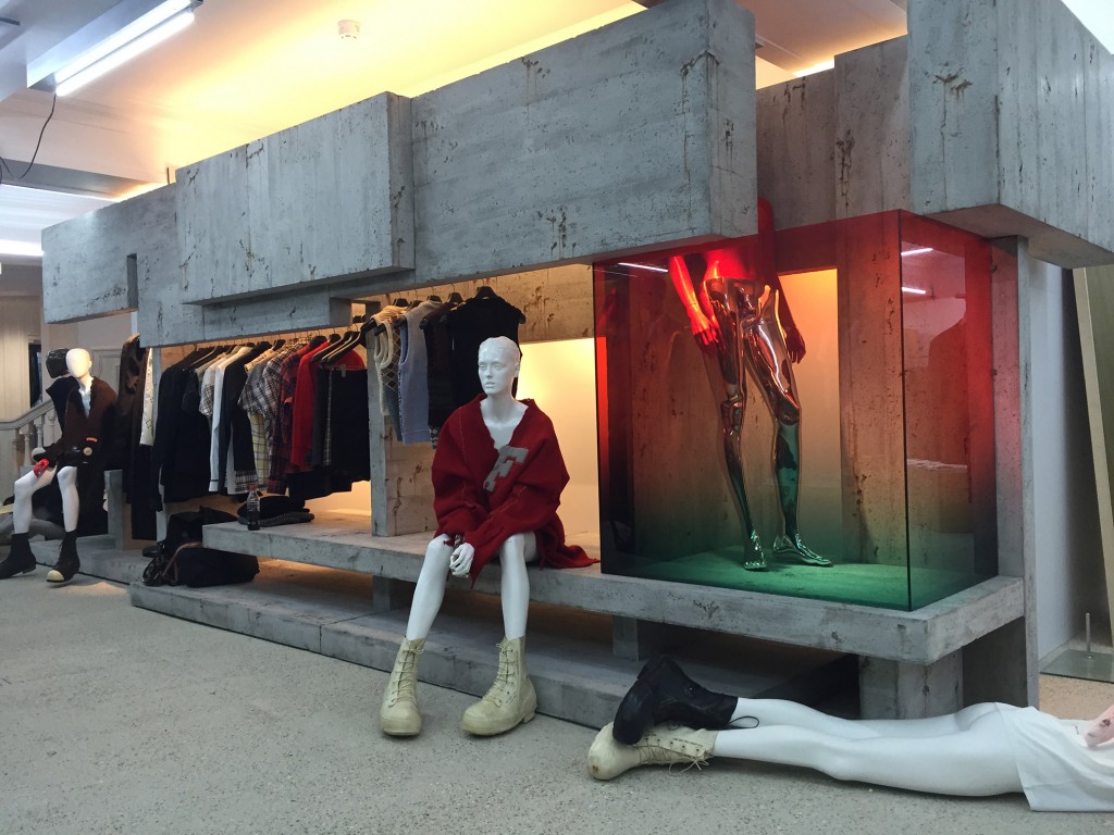
To me, architecture and the interior are a whole. You can’t do one without thinking of the other. That’s why I prefer to call it interior architecture. Mies van der Rohe, Le Corbusier, Frank Lloyd Wright – they all went for the full picture. In the same way, I will never take on the interior of a house that was recently designed by someone else. My work is very intuitive. In terms of volume and perspective, it can be perceived as minimal or even brutalist, like the shop corner at Dover Street Market in London that I recently designed for Raf Simons. It can also be glamorous, like the Hieronymus flagship store in Zurich where the volumes feel rounder because of the sophisticated materials. I approach each project as an architect. I create a plan that is simple and functional and then I add to it.
What is your earliest memory of design?
I remember noticing beautiful houses around my city as a kid. When I was only 12, my parents somehow allowed me to design my own room and the bathroom. I didn’t necessarily aspire to become an architect. I was first thinking about fashion, but at the time, architecture seemed like a safer option.
Do you feel there’s something intrinsically Belgian about your work?
No, not at all. I have more of a global point of view. I’m not a flag bearer in that respect. It is true that most of my work so far has been in Belgium but international projects are beckoning.
At Maison & Objet 2016, you presented a kitchen for Obumex. It is almost entirely made out of natural stone, which forms the basis of many of your designs. Why the love for this particular material?
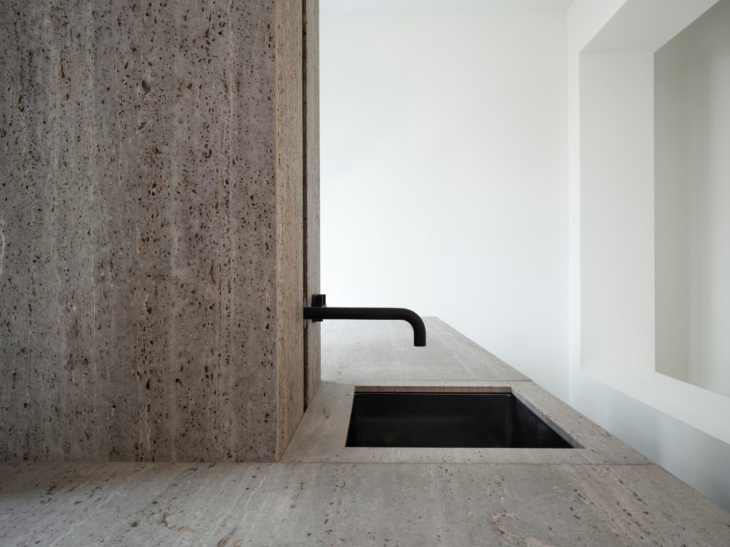
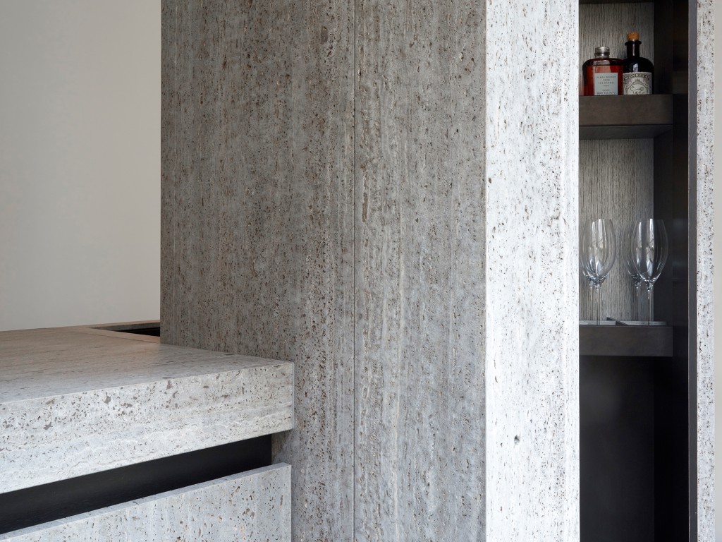
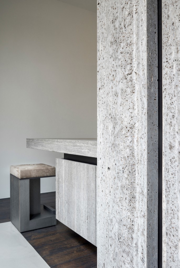
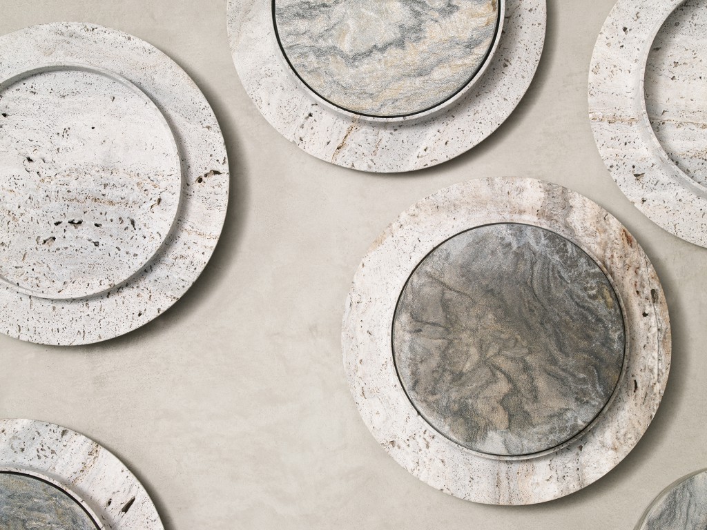
I have always been drawn to large surfaces and I like projects that progress quickly. Big slabs of stone immediately transform a space. For Signature Kitchen, I chose Iranian travertine, which is one of my favourite kinds of stone. The commercial version is in titanium but it may come in a red variety later on. Natural stone doesn’t come cheap but it’s a timeless material. Perhaps that’s why I like it.
Another Belgian name you have worked with is Raf Simons, first on a retail unit for his Kvadrat line of textiles and now for his fashion label. How involved was he in the design process?
Raf studied industrial design so he knows what he wants. He gave me some pictures of art that he liked and then we bounced some ideas back and forth. There was an idea on the table that I felt had been done before so I convinced him to do something completely different. I came up with the concrete construction for Dover Street Market while I was in Rio de Janeiro visiting the Museum of Modern Art. The concrete used in that building has been weathered over the years and rusty steel shows through here and there. I wanted to emulate that effect in the shop corner. It is made of real concrete but uses a 6mm-thick cast. That way, it can be moved around easily.
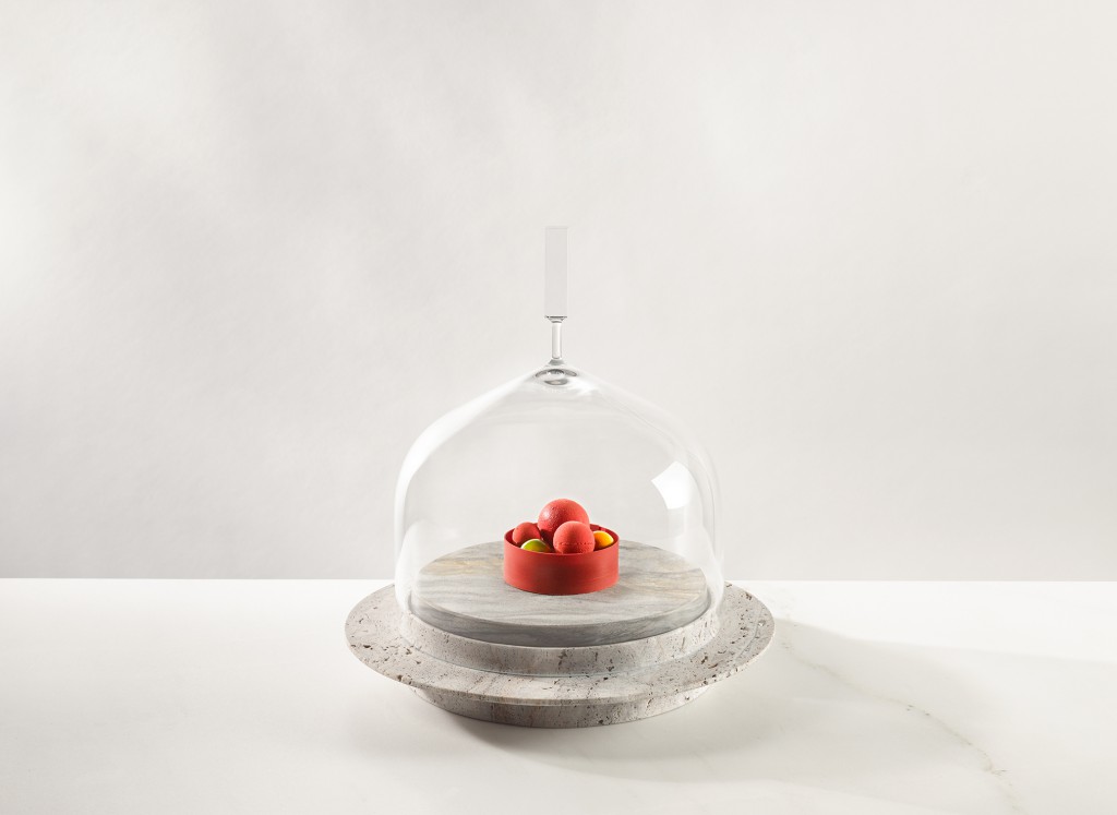
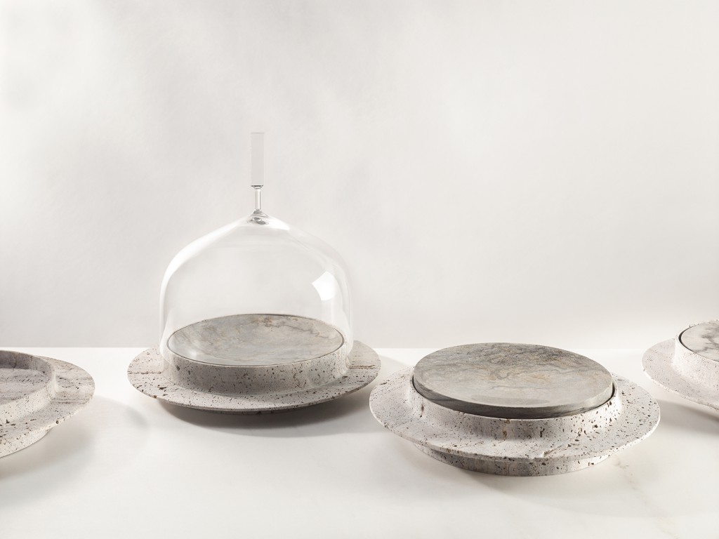
One of your ventures into product design is Pleasure Dome, a multifunctional glass bell produced in collaboration with Van Den Weghe. What else can we expect from you?
At the moment, I am working on a limited edition of Pleasure Dome with Lasvit for Biennale Interieur but nothing beyond that. The first product I ever designed was a custom-made lamp I made for a shop back in 1999. It later became the Regard lamp for Kreon. I have only done a few products since then but I would love to do more. I would love to do more of everything.
