Hella Jongerius: Breathing Colour
The Dutch designer discusses how her latest exhibition, at London’s Design Museum, is a manifesto for the full potential of colour
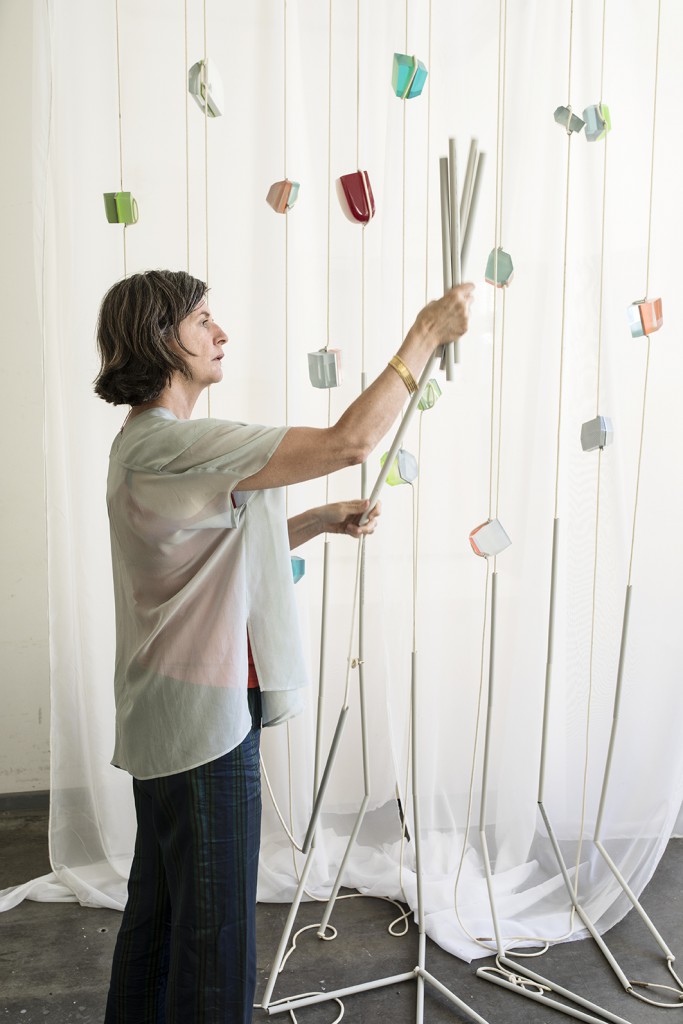
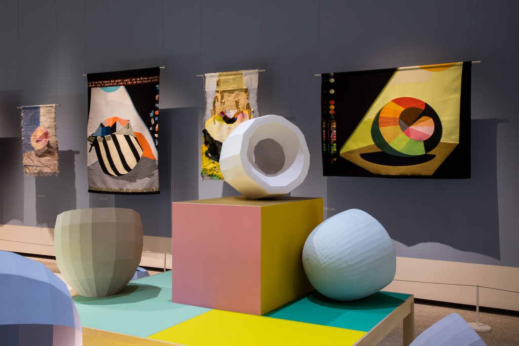
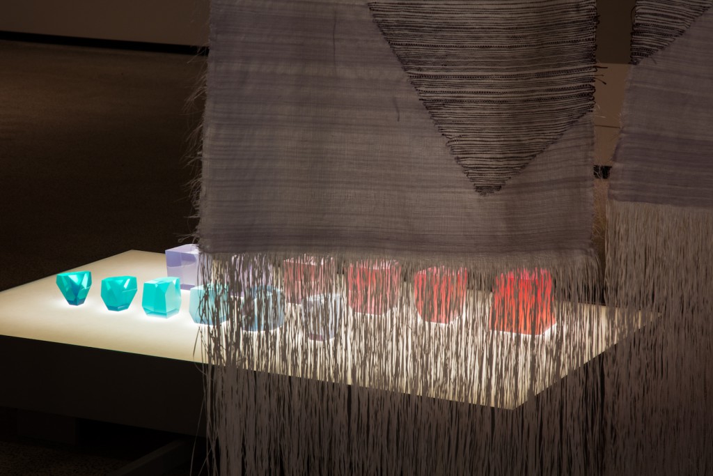
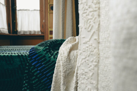
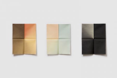
In Breathing Colour, an installation-based show at London’s Design Museum, Hella Jongerius takes a deeper look at the behaviour of colour. Materials, shapes, shadows, reflections: through a series of studies, the Dutch designer asks her audience to consider how light can have an influence on both colours and materials, the role of a shadow, the relationship between form and colour.
In this interview, Jongerius discusses the subjectivity of colour, the limitations of supposedly unlimited industrial tools like the Pantone chart and the importance of textiles in a digital world.
TLmag: You’ve said your aim with this show is to “pit the power of colour against the power of form.” Can you explain that?
Hella Jongerius: In my work I think about how coloured objects affect other objects and how all the objects behave in a certain setting. How important is size or volume for a colour and how do coloured objects influence one another? The different materials have an impact on each other and certain colours can accentuate horizontal shapes, while others are better for vertical forms. And then the lighting conditions or colour temperature also changes a space. There are many facets that require research beyond these questions, because the relationship between colour and shape is a puzzle with many solutions. There’s no truth, it’s subjective, but I try to understand the matter.
TLmag: Speaking of subjective, what makes a colour beautiful?
H.G.: Colour touches on so many different aspects of design: words, shapes, materials, physics, space, light. Experiencing colour is completely dependent on its physical, visual, artistic and cultural context. Beautiful colours for me are made with high-end pigments, which result in colours that breathe with light —taking on new hues under different lighting conditions.
TLmag: What are your main goals with this exhibition?
H.G.: I want to make a plea for colours that breathe. When we look at how colours are mixed for industrial production, we see a great difference between the industrial way, and the way artists make their colours.
Industrial colours need to be stable in all lighting conditions and of course the selection is limited for financial reasons. Industrial limitations take away the quality and richness from the colour world we live in. The colour recipes that industrial designers like me must rely on are produced by companies who strive for stability and uniformity. However, instability can enrich products and improve the user experience.
TLmag: What do you miss in industrial colours?
H.G.: I miss the dash of red in most industrial recipes for green that gives the colour its intensity; I miss a true black in plastic granulates. I miss colours that breathe with the changing light. I miss the changeability, the options, that will allow us to read and re-read an industrially produced colour, like we do with works of art. Breathing Colour is a call for colours that respond, and that will allow being influenced by the nature of the light hitting them.
The most important aspect in the quality of a colour is its pigments —this is the recipe that lies behind the colour. Perfectly arranged, immaculate industrial colour systems don’t offer us the full potential of colour. With this exhibition, I hope to build an archive and create a tool for interpreting colour. I want to show a broader perspective than the industrial palette and demonstrate how powerful colour can be in transforming shapes and objects.Breathing Colour is a manifesto for colours. I rebel against the flatness of the conventional colour industry.
There are many colour systems with thousands of hues. Why isn’t this rich enough in your opinion?
The all-encompassing RAL, Pantone and NCS colour systems offer millions of colours, categorised, structured and sorted for us. We can choose from a large amount of varying hues. As a tool, this can be helpful for designers and interior architects. But how can we ever intimately relate to colour and its subjective effect in this scenario? The largest part of the effect of a colour is made up of its quality. The perfectly sorted colour systems with their immaculacy seem to neglect this aspect.
TLmag: You’ve done a lot of research, working like a designer, an artist but also like a scientist. Is there a specific topic you’ve stumbled upon in your physico-chemical research that visitors of the exhibition will also learn about?
H.G.: I will share one example: metamerism is a phenomenon in colorimetry that makes two colours appear to match even though they might not actually do so. This can happen especially when viewed in different lighting conditions. I think everyone once bought a piece of furniture or clothing in a certain colour, and experienced a shock, when unpacking it at home. A colour might look great under the fluorescent lighting in a shop but it might look very different in plain daylight. Some colours look dull in the morning but come to life at dusk.
TLmag: Are you also presenting colour studies and research from the past years?
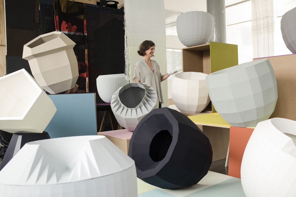
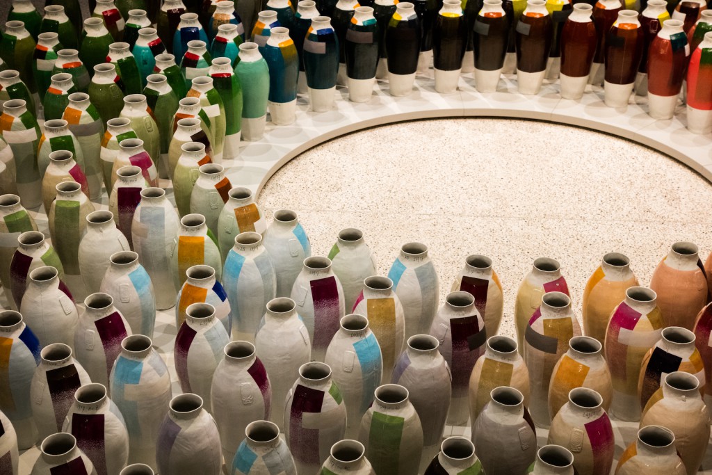
H.G.: We are presenting the 300 Coloured Vases as a reference to earlier work. This series of 300 unique vases was produced in 2010 as the result of research on minerals and oxides —a glazing technique from the past, which is no longer used because of difficulties to get reliable and stable colours. The vases lacquered with copper oxides result in a green group, the combination of cadmium and zirconium creates the orange hues, the tin oxides with iron produce beige ochre hues and the manganese dioxide enriched lacquers develop purple tones.
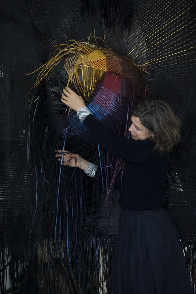
The Colourful Blacks are also in the exhibition. 16 different shades of black, created in a specific mix of handcrafted pigments and produced and distributed by artisan paint manufacturer kt.COLOR. Each paint of the HLL Colours collection is made exclusively with ivory black, chalk, and classic artists pigments, such as ultramarine blue, ultramarine green, cobalt green, natural umber, ruby red, and magenta.
TLmag: Why do you research?
H.G.: As a designer, I feel a responsibility to act like a filter between industry and consumers. That’s why it is important for me to investigate the contemporary potential of textiles. I observe what could be produced by the industry, which products are missing and which new functions are needed in our society.
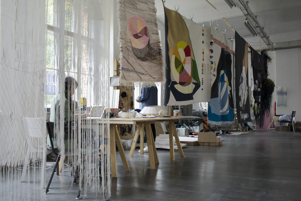
Working as a textile designer for 17 years, I base my work on acquired knowledge and existing archives. But only through experimenting do I achieve the results I’m looking for. My research always aims at ultimately producing industrial products. Experimenting in my studio, searching in a hands-on design approach, I try to come up with new ideas that could be translated for the industry. I aim to create unexpected yarns and fibres that will bring new functions and tactile experiences, to offer new perspectives on textiles and build a bridge between traditions and industrial processes.
The result is not just an autonomous project, but will result in a colour and structure library that can inspire industrial and future textile work.
TLmag: Why are textiles and materials important?
H.G.: We live in a digital world, where touch is essential. The surface and colour of an object defines how we interact with it, how we use it at first and over time. A sense of touch and feeling things strongly influence the relationship between object and user.
After all these years of experimenting and researching: would you call yourself a colour expert?
I feel like an absolute beginner when it comes to colour. Even though I have learned a great deal about colours, I still can’t really get my head around the subject. Colour is one of those truly wonderful subjects that will always keep you feeling like a beginner. It is this quality that makes colour so worth it – just like life itself.
Breathing Colour is open at The Design Museum until September 24, 2017
