Kengo Kuma: “All Architecture Should Be Integrated”
For architect Kengo Kuma, harmony with the environment and materials equals with sustainability. In an interview, he talks about his current train station project in Paris alongside with integration of buildings to the environment.
Kengo Kuma sits behind a small table and explains his methods of forming a space with a glass of water and a magazine lying on the table. The magazine becomes wall and floor, the glass forms a corner with the publication. As a master of layering spaces and materials and fusing inside with outside, the architect intends to create harmony in built environments where many other architects design buildings that strikingly contrast with their surroundings.
“Beauty always comes from total integration,” he states. “Some architects try to achieve a beautiful building, but they misunderstand beauty as a contrast with the environment. I don’t believe in the beauty of a building. Beauty is integration.”
Kuma has just arrived from Hangzhou, China, where he celebrated the opening of the Folk Art Museum of China Academy of Art the day before. The newly-opened art museum climbs up and is directly connected to the mountain. Altering floor levels of the museum flow parallel and cross each other on the slope.
Similarly to the museum, many other Kuma’s buildings also grow from and into their environment: Hiroshige Museum creates a dialogue between the museum and its immediate environment by using wood from the neighbouring mountain, paper from the nearby villages and stone from the area. For FRAC Marseille, Kuma’s office used recycled glass from the region. In Aix en Provence Conservatory of Music, rhythm, light and shadow play a crucial role – just as in music. The surrounding rocks inspire the form of V&A Dundee, an art and design museum currently in construction in the Scottish town. Eventually, the museum will become a connecting element between the river and the city.
Topographies of Integration
For integrating a building into its environment, Kuma often uses natural, local materials and work through a series of three-dimensional models. His method of layering spaces and using natural materials often make the spaces more user-friendly and familiar to the human size and body.
“Our philosophy is that we always meet in front of a model. We always make a model of the site and the neighbouring area,” the Japanese architect explains. “Two-dimensional information, the plan, is not enough at all, and neither is video. From the topography we can feel the flow of light, wind, water. That makes the discussion more concrete and more precise.”
“The reason why I like wood is that it is very familiar with the body. The longest dimension of a piece of wood is about three meters. It’s not that different to our body size, and we can carry wood very easily without machines”, he describes. “Concrete is not so friendly to the body, and if we can make every environment of wood, the total environment can be very friendly to a human being. A space is not a visual object, but the space and the body are in a kind of a collaboration. They are experienced together.”
Light as Material
Kuma’s office, Kengo Kuma and Associates, employs over 150 architects in Tokyo and Paris, and is known for numerous large-scale projects around the world. The office recently won a competition to design the new Saint-Denis Pleyel train station in Paris.
Unlike a museum, a train station is an everyday environment with various functions and a constant flow of people.
“A station should not be a separated box, but a kind of a meeting place for different experiences – the trains, walking and some shopping as a cultural experience,” Kuma states. “In a station, those different kinds of programs should be combined.“
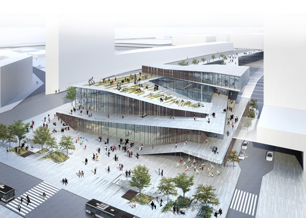
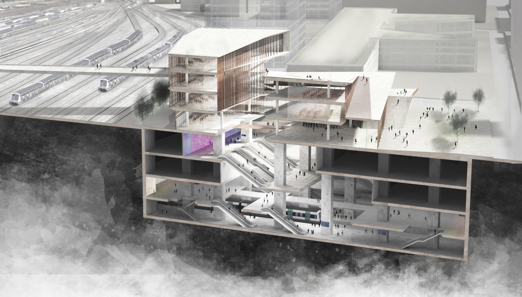
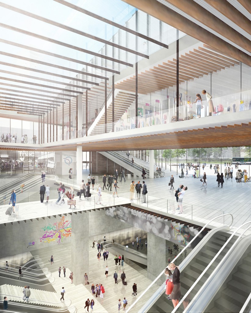
The Saint-Denis Pleyel station grows four floors above the ground and dives four storeys underground, and is punctuated with an atrium enabling light to reach through all the floors on the ground. On the outside, sloping walkways spiral up the building.
“A station should have a central public core that can integrate different types and speeds of people. The void of the atrium can work like that.”
Integrating a new building to an existing city is quite a disparate task than integrating a building to nature. For Saint-Denis Pleyel, Kuma and his team tried to use local iron reminding of trains, but as the architect laughingly admits, it proved to be too challenging to use.
“Natural light is the key to integration of the spaces of the four-storey building. If there is no natural light, it’s a typical underground commercial space, and I think a station should not be like that,” he states.
“The space comes naturally from the choice of material. Sometimes we have a big void and sometimes we have a small space naturally coming from the material and the condition of the place.” •
Portrait Steve MacDougall, Courier.
Images Kengo Kuma & Associates. Saint-Denis Pleyel Emblematic Train Station.
Kengo Kuma was interviewed during his visit in Brussels during Brussels Design September 2015, where he was invited as a speaker for Lunch with an Architect conference.
