Linde Freya Tangelder: Towards A More Human Design
Every year, the Biennale Interieur, together with magazines Knack Weekend and Le Vif Weekend, select a Belgian ‘designer of the year’. This year, the accolade goes to none other than Linde Freya Tangelder AKA destroyers / builders.
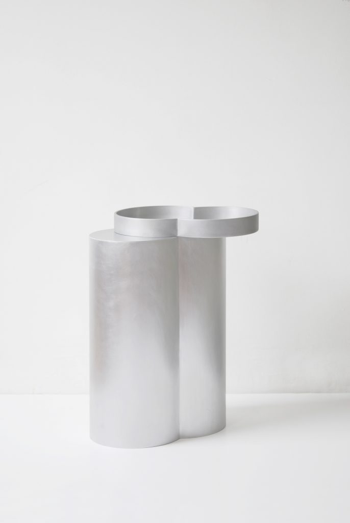
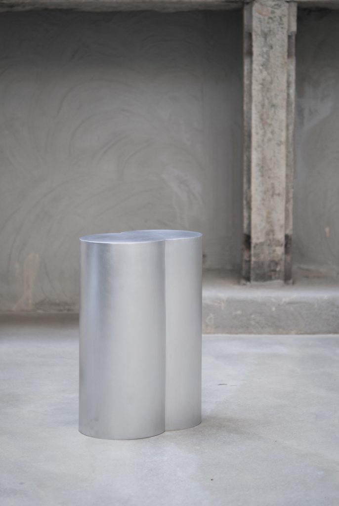
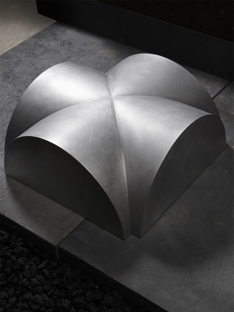
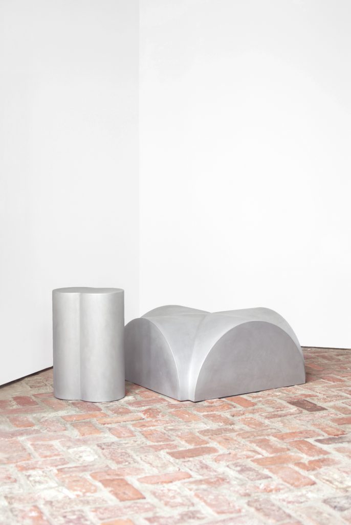
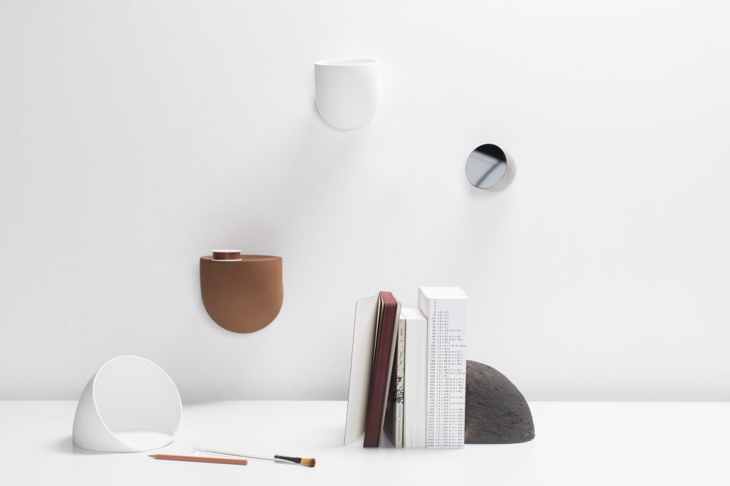
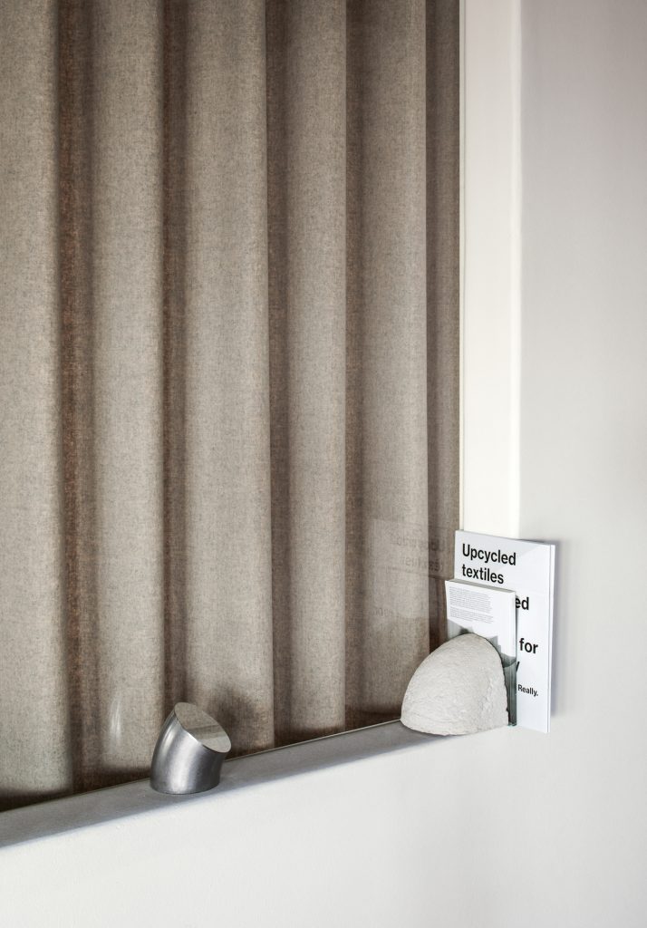
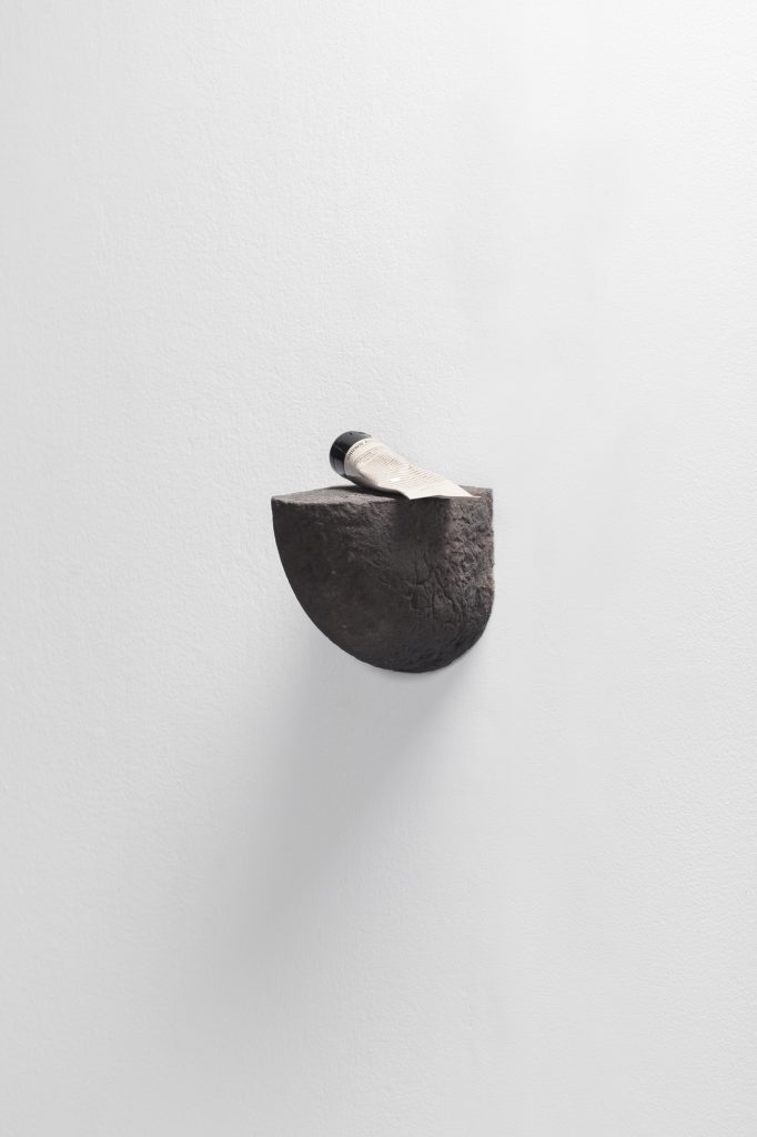
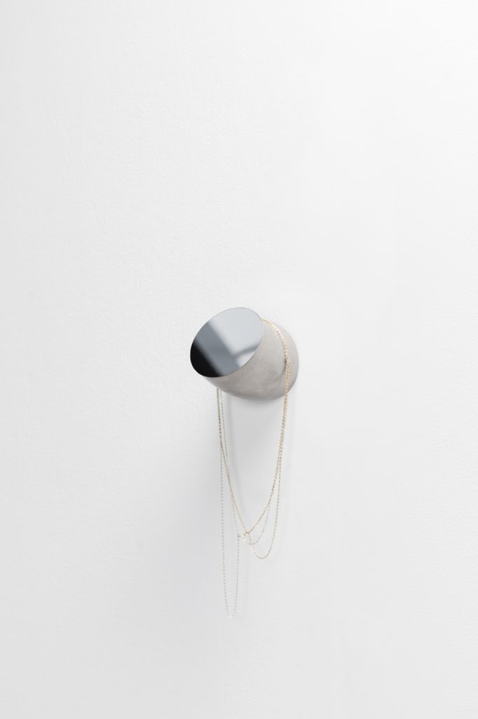
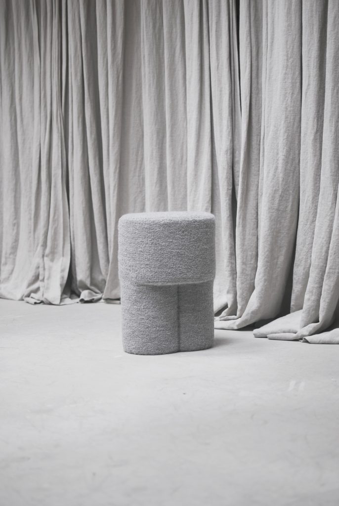
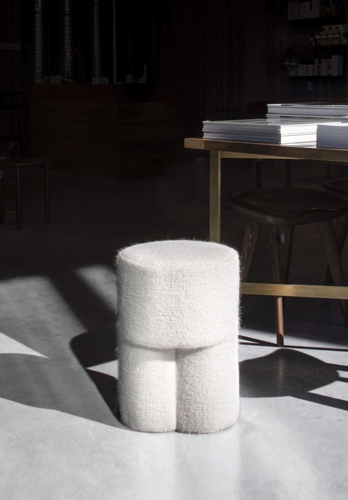
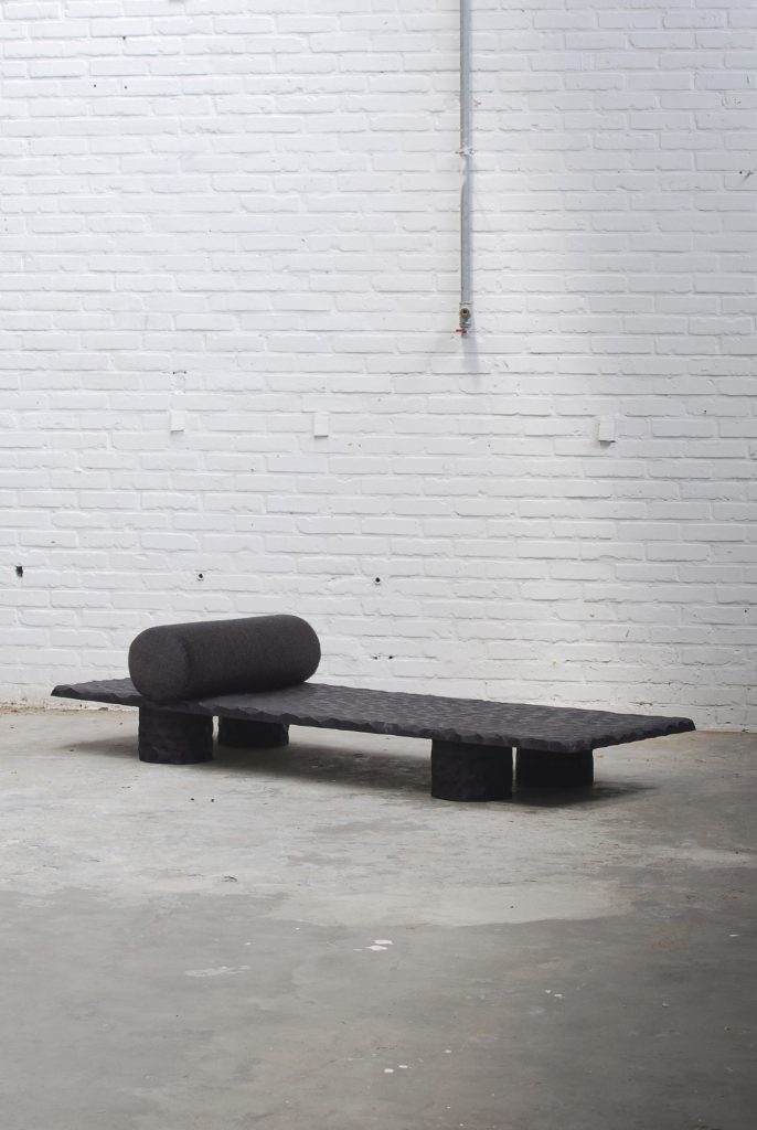
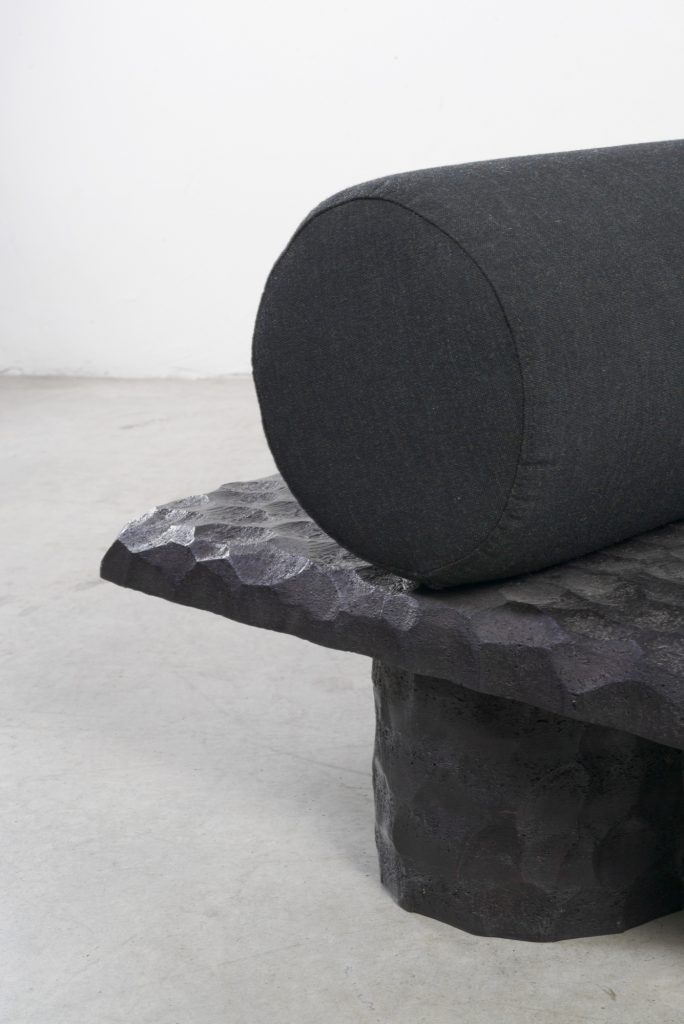
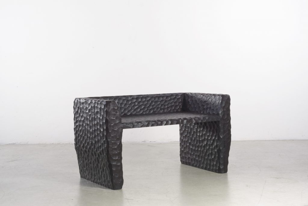
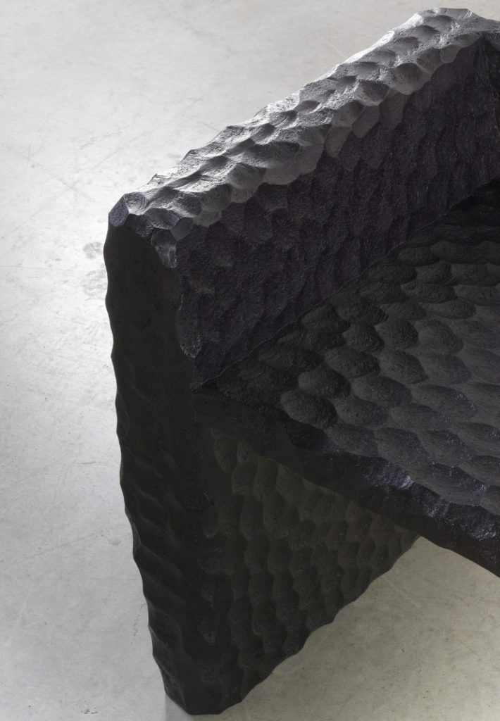
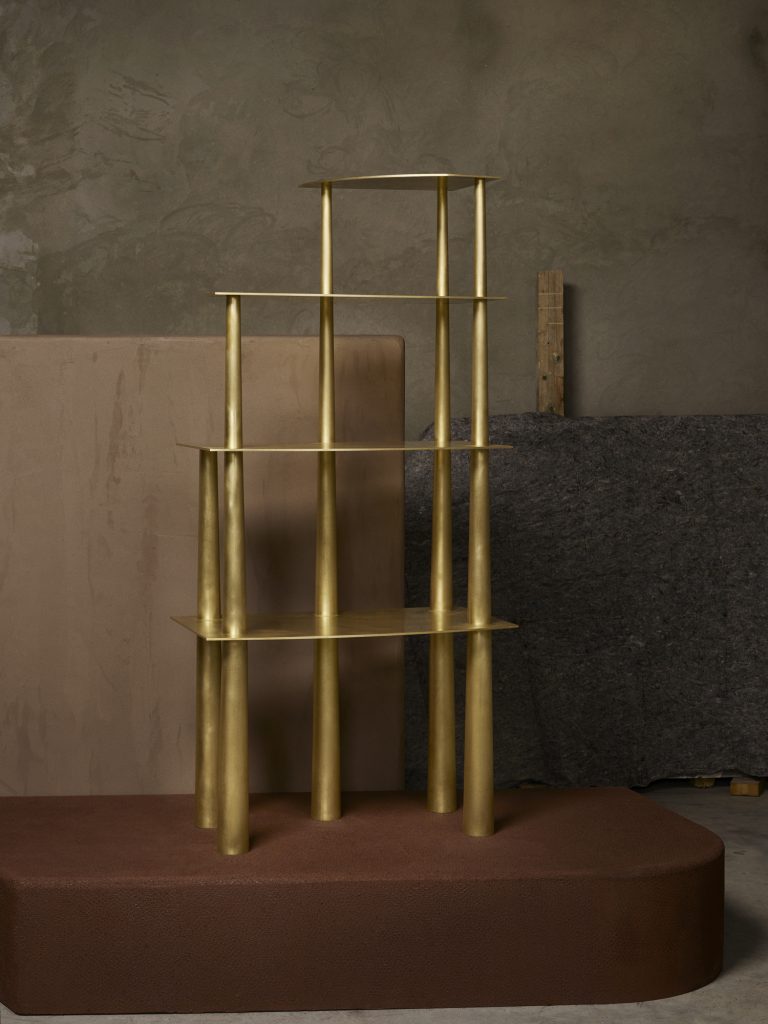
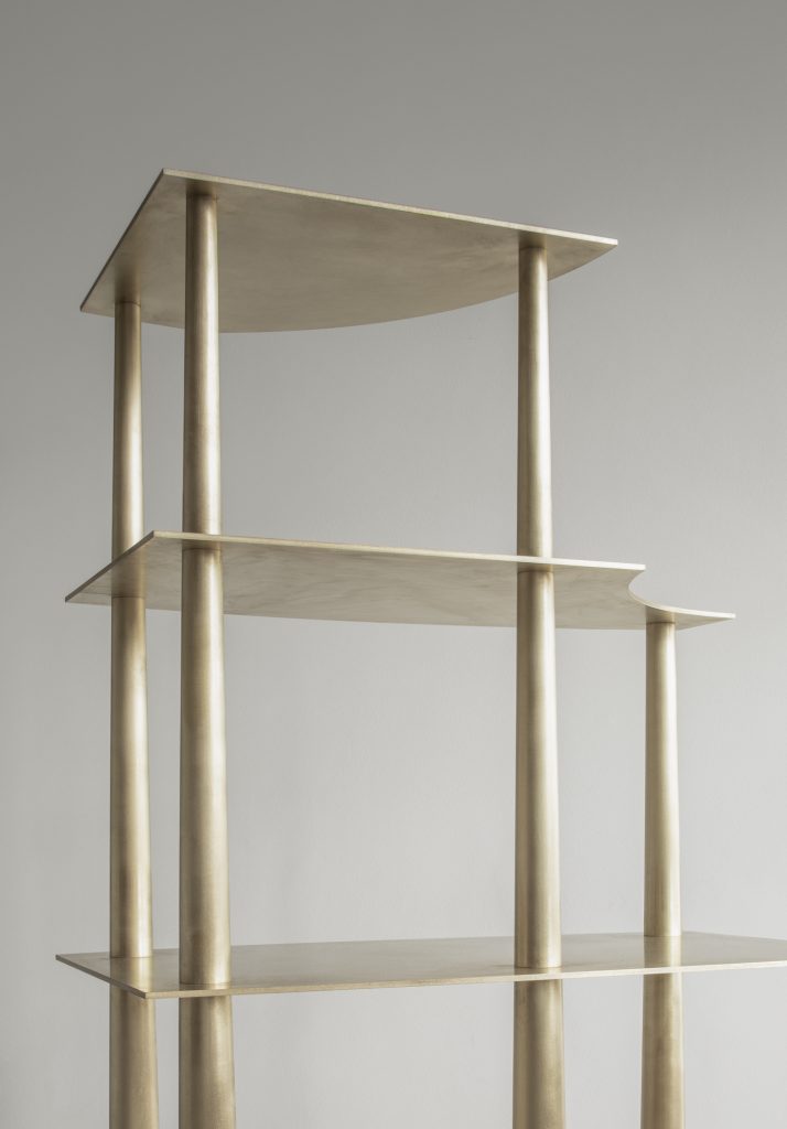
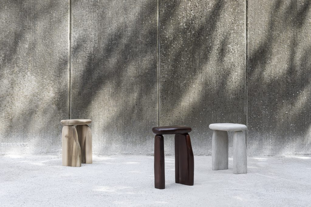
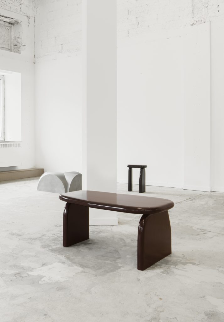
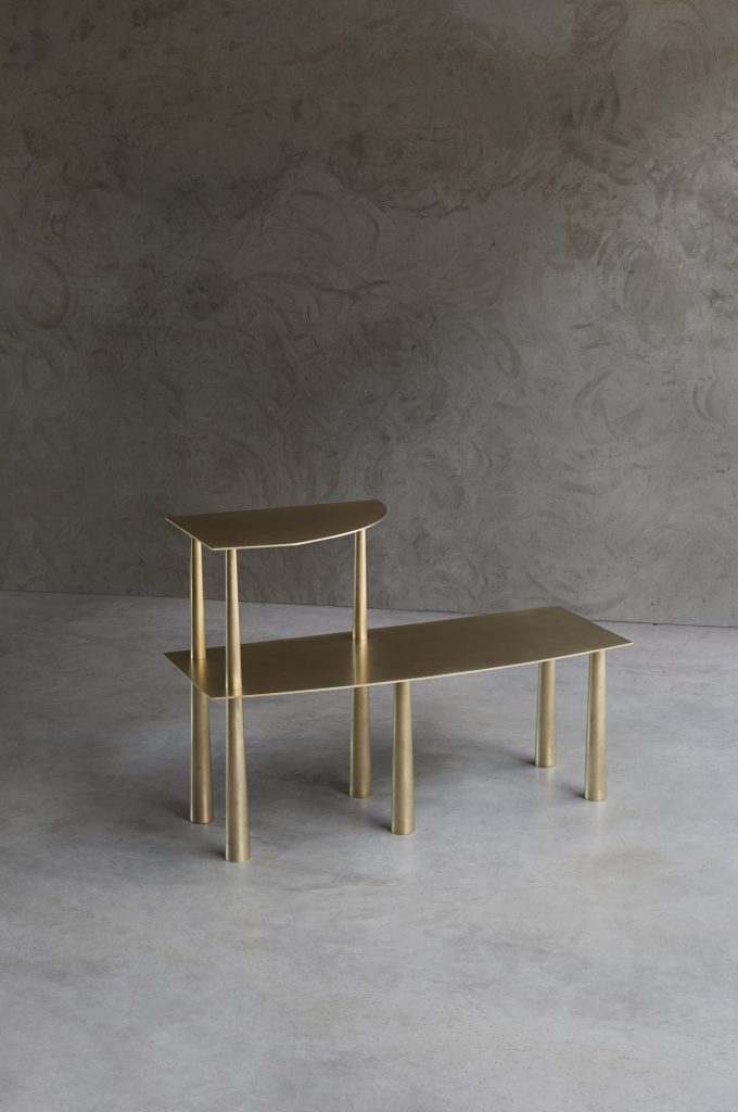
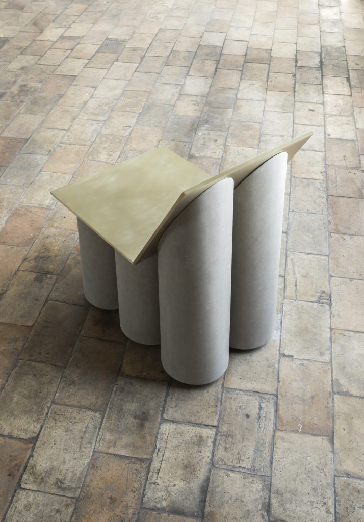
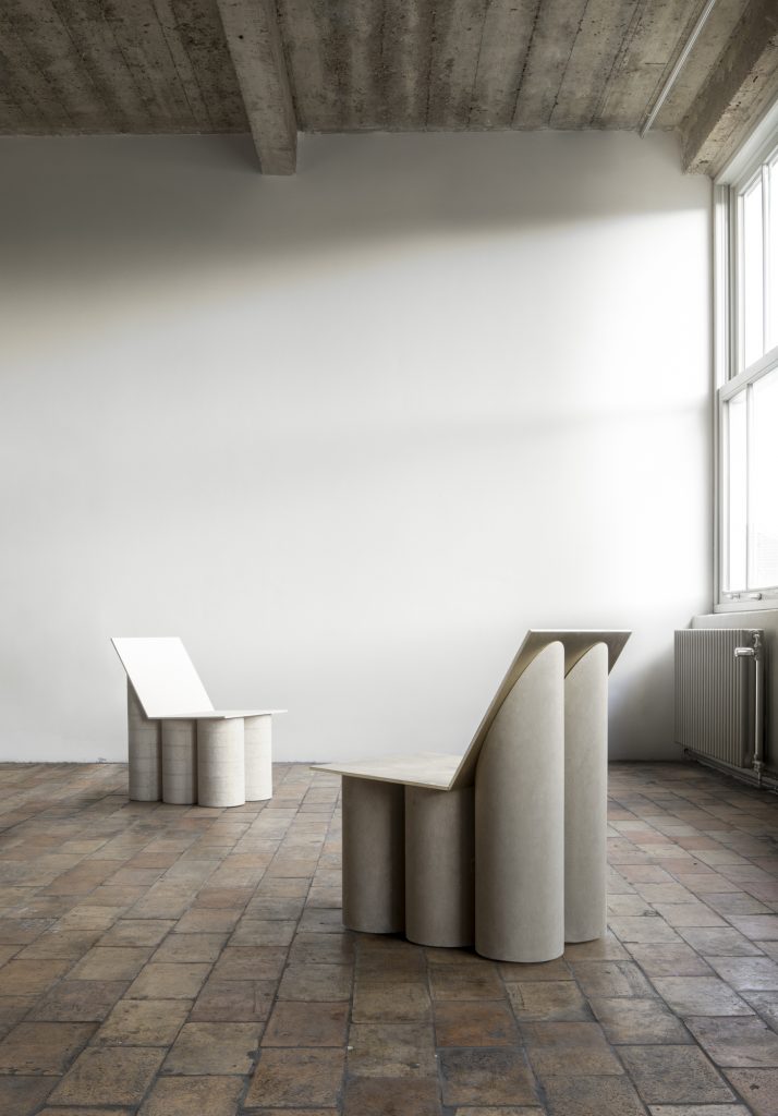
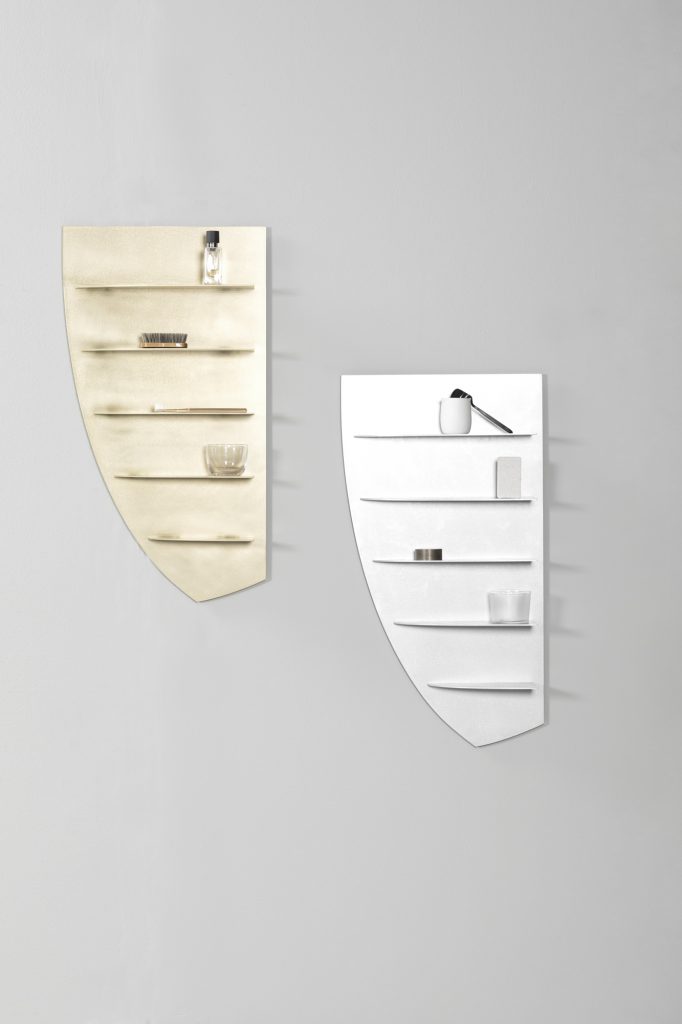
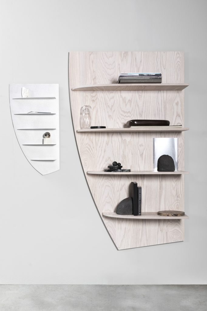
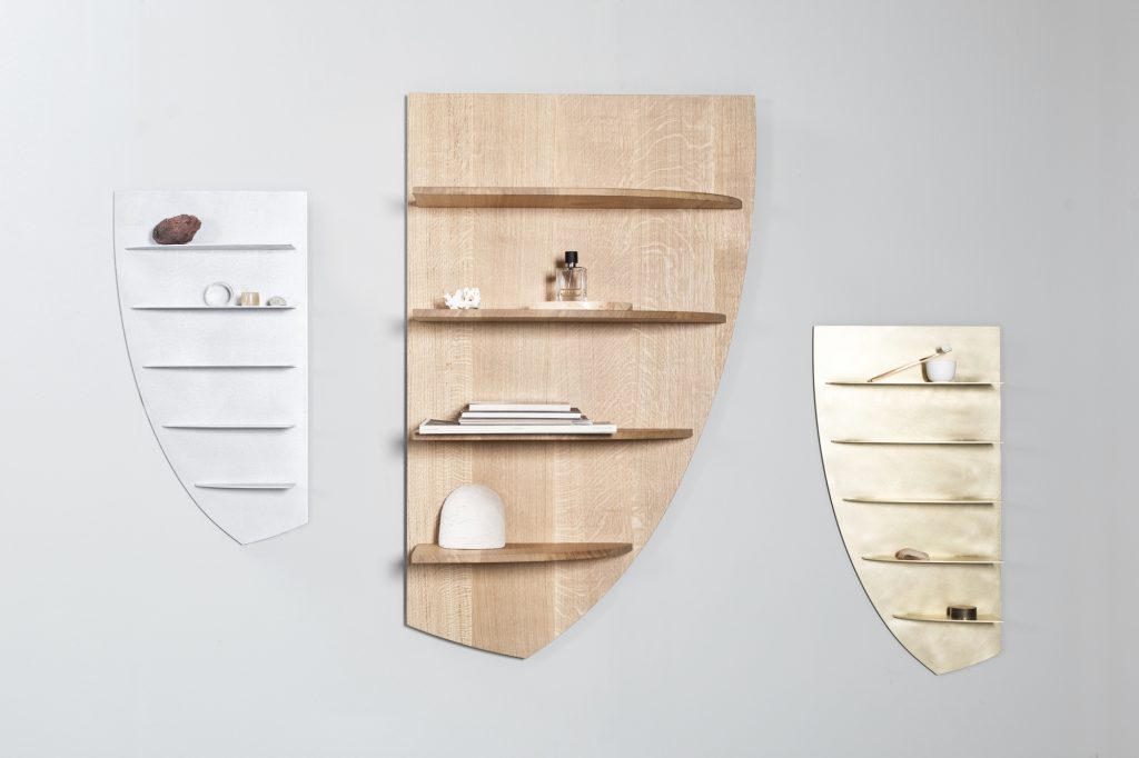
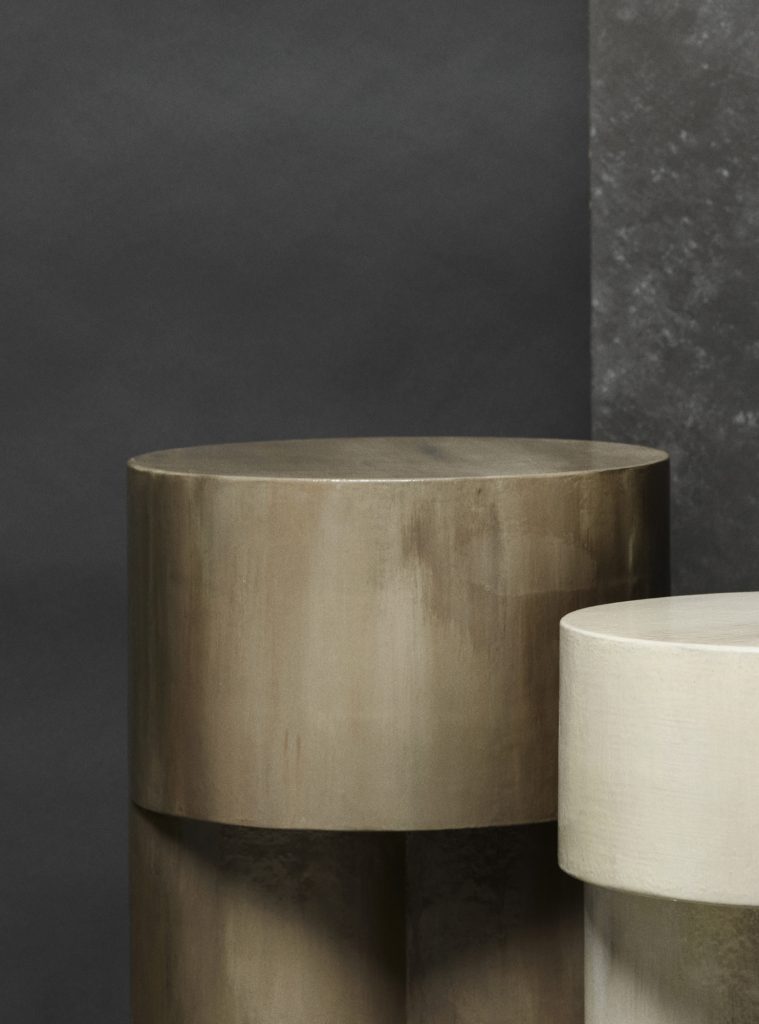
In the same year that she graduated from Design Academy Eindhoven’s ‘Man and Wellbeing’ Bachelors programme, Dutch designer Linde Freya Tangelder moved to Belgium and realised her own studio into being. Over the course of the last five years, her Brussels & Antwerp based studio, destroyers / builders, and her creations continue to evolve as she experiments with what human traces can be registered in raw and natural materials and textures. Displaying the individualistic characters of stone, wood, and metal — with aluminium being a personal favourite — Tangelder’s architecture-like designs combine these strong materials with a striking, minimalistic use of form through traditional production methods.
2019 has proven to be a fantastic year for the young designer, with a collaboration with Valerie Objects, her work being featured at Orlando Brussels and Aybar Gallery in Miami, as well as being selected for FAR, the first exhibition of the new, contemporary arm of the reputed Milanese Nilafur Gallery and her work is also. Alongside her studio practice, Linde is also part of designer collective BRUT (together with Ben Storms, Bram Vanderbeke, Charlotte Jonckheer and Nel Verbeke), where she organises themed collections and exhibitions both locally and internationally (most notably in Milan during at Milan Design Week). The group describe themselves as being representative of a ‘young generation of Belgian designers’, who place importance on ‘collaboration and collective involvement within the contemporary design landscape’. Catching up after an intense one-weekend exhibition, Linde talked to TLmag about making ‘human’ design, how she found her place in Belgium and what comes after winning ‘Designer of the Year’.
TLmag: Speaking from my own experience, after going through a design programme for a few years you realise how much your ideas on design, and the design world evolves. I was wondering if you had this same kind of experience, and if so how it changed?
Linde Freya Tangelder (LFT): I have to admit that I’m a bit stubborn. I knew from the very beginning that I wanted to have my own studio and work on my own [design] language — and that’s what I did. I did see this shift in attitude happen to the people around me, though. In our first year, nearly everybody wanted to have their own studio, but the closer we got to graduation, the more people preferred research and/or collaboration, as well as working in a larger (pre-existing) team over “just” making objects. So, for a lot of people, the whole study changed their view on the field and the way they wanted to work. But for me, even though it was an endless playground of possibilities and had opened my eyes a lot, I still stood by my initial goal of opening my own studio — and making more human objects.
TLmag: Human?
LFT: Yes. I think it’s really important that within my objects there are traces of the human hand that are visible, and people can become aware of the reality of the objects that they use and view. Whether I’m the one that made them myself (like I do with all my prototypes) or whether they’re made in production, I make it a point to make sure that each object has a translation of this human touch.
TLmag: How do you ensure those traces within production?
LFT: It’s not like you force a machine to copy the motions of a human hand, it’s just that you have to find ways to translate that and not lose the details. For example, in my aluminium pieces, I sand and hand-brush the materials myself. The result is never the same, and it makes the material a bit cloudy. When these pieces are made within an industrial/production environment, the aluminium is really super smooth and anodised. There, I discuss with the people on site what ways there are of reworking it that feel familiar to the original. Now, you almost can’t recognise which pieces are in production and which pieces aren’t.
TLmag: These human traces within design also link back to the name of your studio, destroyers / builders, right?
LFT: I always feel like, in general, in order to create something new you have to break down something old sometimes or transform the old. The whole process is a bit like it like this. When making something new, there are a lot of things that have to be thrown away in-between or broken down since the first model. It’s a process of really re-shaping and remodelling time and time again.
TLmag: You made the decision to move to Belgium as you were graduating, and founded your studio here as well. Did you find something in the Belgian design scene that you were missing in the Netherlands?
LFT: I don’t think it’s a coincidence that I now found my place here, because the way I work, with collectable pieces, is really thriving in Belgium. I feel that in the Netherlands, design is much more research-oriented; they’re always a few steps ahead of the rest of the world in terms of design and architecture. In Belgium, it may be a bit slower — but that’s also because it’s a bit more traditional here, which is not always a bad thing. Here, it’s interesting to be able to connect (collectable) design to the art scene and having that space to work with. That connection between art and design that I’ve found here, I haven’t seen back home. Ultimately, I think that my practice fits very well to Belgium, and in Belgian aesthetics even. So, for me, it’s a good place to be.
TLmag: What would you define as Belgian aesthetics?
LFT: It’s a bit more interesting to describe than Dutch design, for sure. But I feel that it’s just very… eclectic. People aren’t afraid to place and play with different styles alongside each other. It’s edgier, or maybe even a little bit more luxurious. Even though it’s a mix, it’s all connected. I also think that because the country is right in the middle of France and The Netherlands, the design here is a mix of the influences that those two countries have.
TLmag: In collectable design especially, works are often exhibited as if they’re artworks. Visitors can look at them, but their function, whether it be a chair to sit on, or, you know, shelves to put stuff on, is mostly lost. Is that an interesting element to play with as a designer who focuses specifically on this sort of presentation?
LFT: The function of an object is something that comes later in the process of designing for me. I don’t like to impose a function on something I’m making, not until I’ve done samples and scale models at least. Once I’ve decided that something is a shelf, it will stay a shelf. I like to think that, between function and aesthetic, function and design, there is room for some hidden qualities. I think that that also moves people who are seeing these pieces at fairs or exhibitions to learn more about a project, object or my way of working.
TLmag: Earlier, you said you were really set in having your own studio and working for yourself. Recently, you’ve also become a part of BRUT collective. How did this more collaborative effort come about?
LFT: BRUT collective we started two years ago at a fair for collectable design in Turino (Italy). Being a designer is quite solitary, it’s so individual that you sometimes get a bit too much in your own head. At the fair, three of us met and spoke about our experiences, and talked about what it would be like if we came together and shared our space and thoughts with one another. I think It’s really important for all of us, because even without saying something; if you look around and see that there are four other practices around you that are busy and doing stuff their way, it opens up your perception; ideas start to flow; all the possibilities that are available while working in this field become achievable. We’re also currently figuring out if we can present in Milan (for the third time in a row) next year. There are a lot of projects that we want to take new steps in, like scenography or site-specific installations, but sometimes it’s a matter of what works out best.
TLmag: Finally, I’d like to congratulate you on winning Biennale Interieur’s ‘designer of the year’ award! Aside from it probably being a really great feeling to be recognised for doing a good job, what has the award meant for you?
LFT: That’s a really good question. I think, in in a way, this prize has given me a sense of relief. But, on the other hand, there’s also a lot more responsibility that comes with it. It’s kind of the same feeling that you get once you start to get more clients as a designer — it’s great that there’s a sense of trust in what you can do, but also there’s an underlying expectation to it.
TLmag: Have you set any goals for what you want to achieve as we head into the next decade?
LFT: From the beginning of destroyers / builders I’ve set out for it to revolve around the way I treat materials. What I’d really like to start doing is to extend my practice into a bigger space, where the human element can be felt all throughout the interior. I’d love to do this from a client-based perspective, or even work with a fashion brand for the interior of their stores for example. I think it would be interesting to play with that thin line, and create something larger and more cohesive.
Running from the 13th December, Linde will be presenting a new exhibition in Kortrijk. The showcase coincides with the official opening of Lille as World Design Capital 2020, which is just a short journey from Kortrijk – the home of Biennale Interieur.
Cover Photo: Linde Freya Tangilder by Alexander Populier.
