Pierre Yovanovitch: A Double Take
The two most recent projects from the French interior architect go from the personal —a fresco in a chapel at his home— to the global —his debut solo show in the US, titled Oops!
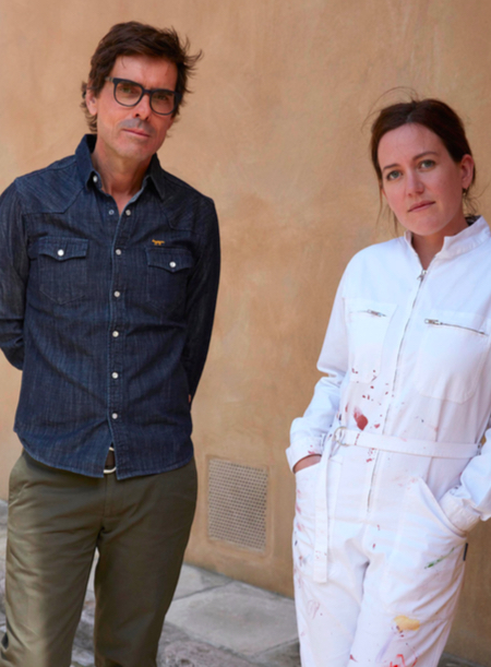
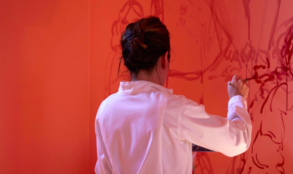
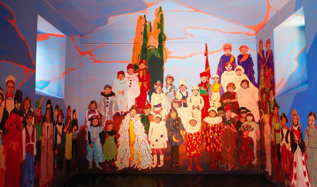
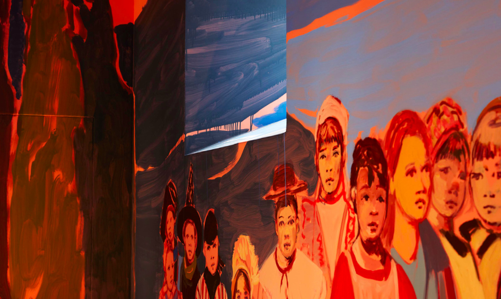
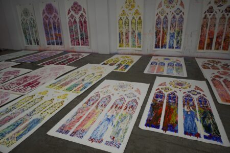
At a dinner party, interior architect Pierre Yovanovitch was telling a fellow guest, artist Claire Tabouret, about the chapel at his home in Provence. She told him that one of her dreams was doing a fresco painting. The collaboration that turned into Les enfants de la chapelle, a fresco featuring 85 children on a wall in a private space open to the public during the summer of 2017, started there.
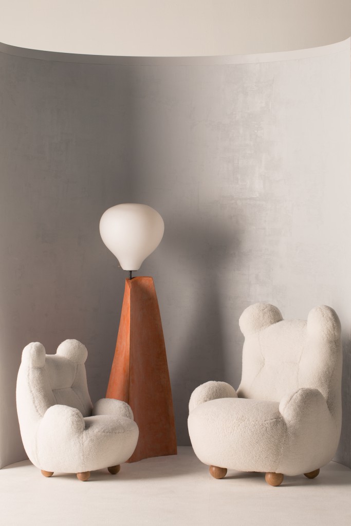
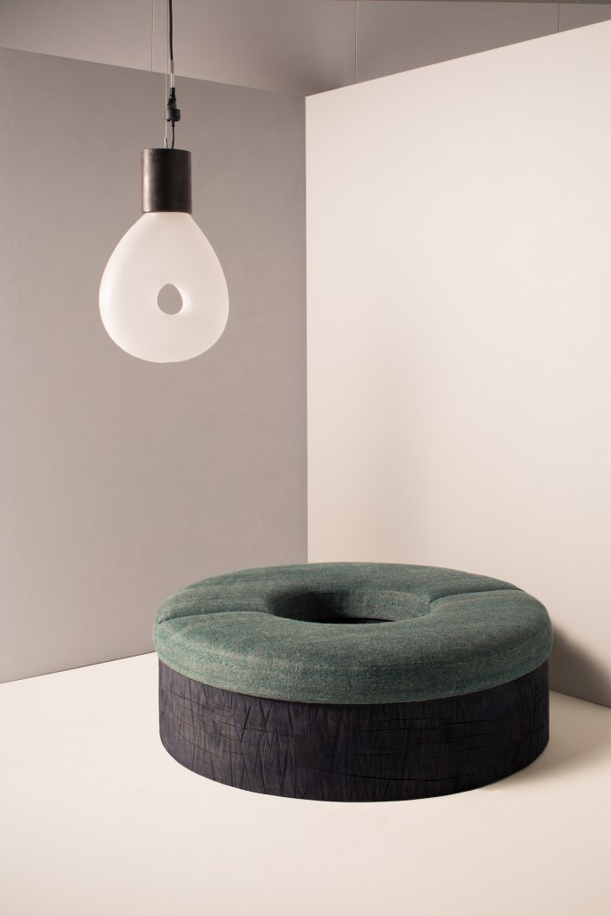
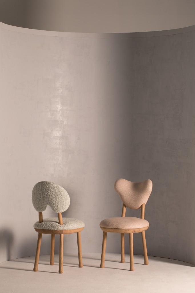
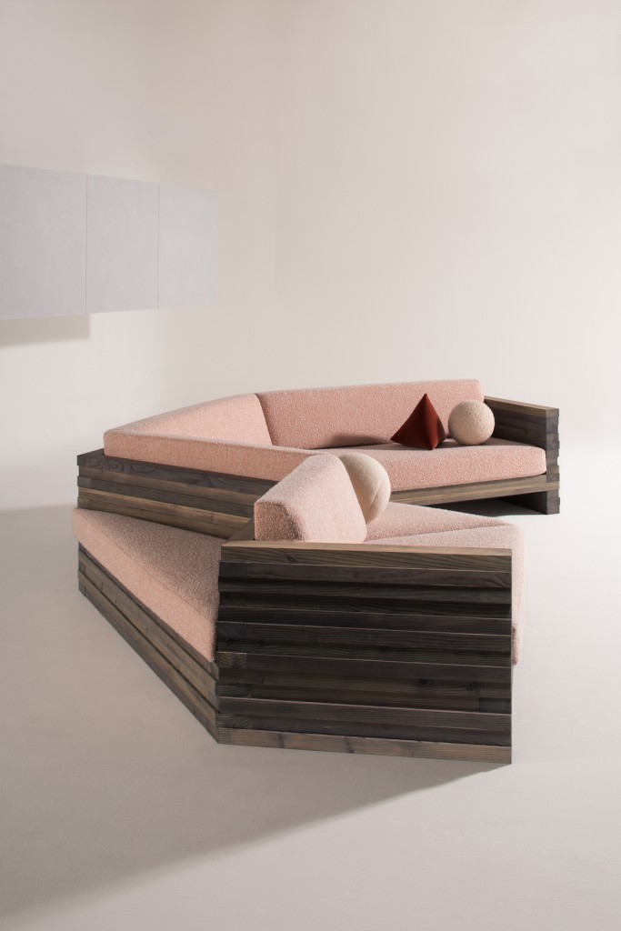
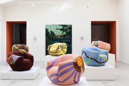
A few days ago he opened his first solo show in the United States, at New York’s R & Company. With his debut range of tongue-in-cheek pieces of furniture, work by Tabouret herself and a selection of items from the company’s archives —most notedly, mid-century Brazilian furniture—, there’s nothing nothing haphazard about an exhibition titled Oops!
In this interview with Yovanovitch, which took place in the days prior to the opening of his show, we discussed the intimacy of the first project and the breadth of the second.
ON LES ENFANTS DE LA CHAPELLE
You actually owned a piece by Claire Tabouret before commissioning the fresco, and it’s hanging at your home in Provence. What was it about Les camisoles that moved you then?
I find all of her works moving, but it was this one in particular that I found to be a perfect fit for the chapel, in that it evoked the history of the chapel and the lineage of the property owners of the estate that came before me.
The castle went through a rather intensive renovation process. When finding a thread between the vintage and the new, what part do our traditional notions of authenticity play in your architectural vision?
I have respect for the historical. Whether it’s vintage furniture or a 17th century chapel, I believe things that are strong enough to stand the test of time are not meant to be destroyed for the sake of design. I feel as though my job as an interior architect is not to manipulate historic works, but to enhance them with contemporary elements.
You’ve said the chapel is a spiritual place, but removed all the original religious imagery. How do you define its spirituality now?
Claire truly created a place of solace, true to what I believe was the original purpose of the space. The colours and characters depicted in her painting are so dynamic and stunning that it really draws the viewer in and invites them meditate on one’s own life.
The fresco provides 85 possibilities to linger upon. What have been some of the most interesting visitor interactions with the piece so far?
I made the fresco open to view by the public during set hours, as I want everyone to be able to enjoy it. One day, I came to greet a visitor of the chapel and saw that the woman was crying. I asked if she was okay and she said she was taken aback by the depth and beauty of the fresco and wanted a moment there to herself. It made me so deeply proud to have allowed a stranger to be moved by the art in the same way that it moved me.
As a beautiful coincidence, when Claire removed the mats from the floor she saw the children were somehow rooted into the ground. Is it also a coincidence, or is there a political reasoning behind the painting —especially now, when we in Europe are being confronted with the impact of displacement on refugee children and their interruption of what could have been a sheltered moment in their lives?
The subject of the painting was not meant to be a direct reference to politics… however, it is interesting that the painting seems particularly relevant now. The children are more of an homage to the lineage of proprietaries of the estate.
ON OOPS!
Why “Oops!”?
The word “Oops!” was really the first thing that came to mind when Evan Snyderman from R & Company called me to ask about doing a show together – as in “Whoa, okay, lets go for it!” I wanted my debut solo show in the US to be playful and not overly serious. While I took the process of crafting the pieces for the show very seriously, I wanted to make sure the show came across as approachable and, above all, interesting.
What are the visual and narrative threads between the custom furniture and lighting pieces you created for this exhibition?
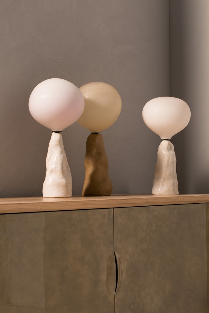
My approach in putting the show together was to mix both vintage design and contemporary works. I wanted to set the stage for showcasing a few of R & Company’s incredible permanent collection pieces and also wanted to push the envelope a bit by presenting innovation in my own designs. There is also a playful element to all of the pieces I created. The E.T. Lamps as well as the James and Marsha Floor Lamps, for example, are named after alien movies for their extraterrestrial qualities.
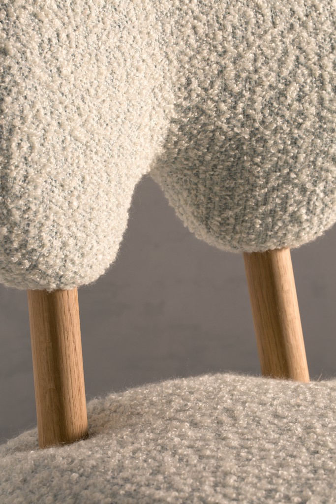
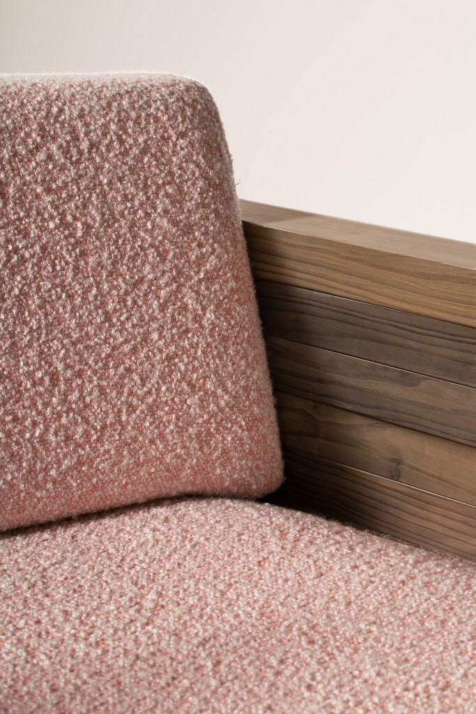
There is a great tactile quality to the materials and forms you’ve developed for the furniture —looking at the catalogue I nearly wanted to grab my computer screen and squeeze some of the chairs. How important do you think that quality is in such digital times, because we seem to be consuming design on our phone and computer screens?
Really, texture and materiality is at the core of my work. Whether in my interiors projects or my furniture pieces, I think the key to creating singular work is to pay close attention to the things that can be easily overlooked from a screen.
How did you select Claire’s pieces for this occasion?
I loved the idea of having two complimentary works side by side in the entrance of the gallery. Plus, the colours of the Makeup paintings enhance the colour palette of the show, so I’m very pleased with how well they fit into the exhibition.
How did you pick the Brazilian pieces from the archives?
I love mid-century Brazilian design and was instantly drawn to these pieces when I found them in R & Company’s archives. The choice of these works was primal in that way, and was not particularly a reference to current production in any way.
You collaborated with so many specialised craftsmen for this project. What is your directive process like when working with them?
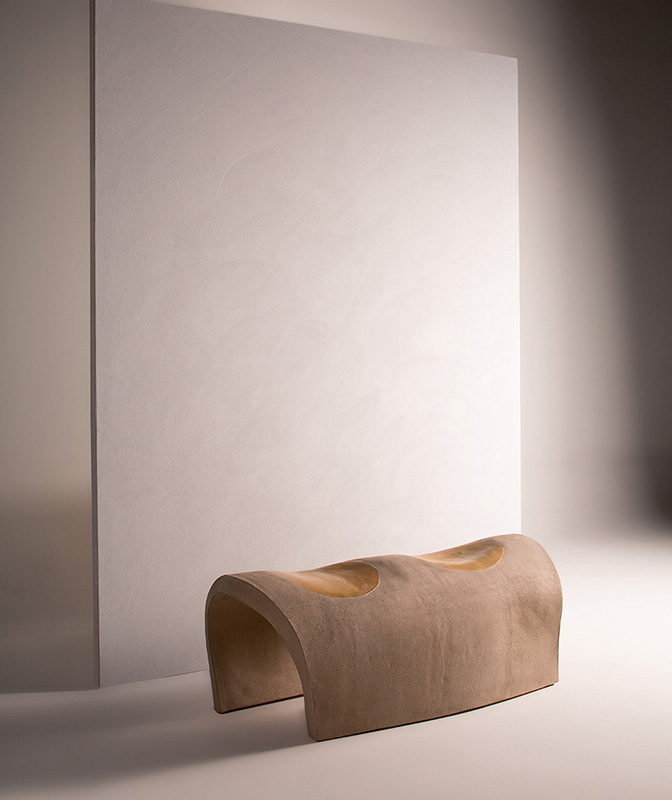
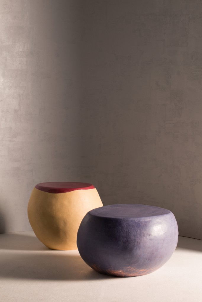
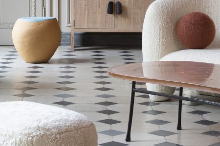
The craftsmen I worked with for the show are all people I’ve chosen to collaborate with, as I wholeheartedly trust their exceptional understanding of material. Armelle Benoit, for example, who I worked with on the Pebble tables and Johnny Guitar bench among other pieces for the show, is one of the most talented ceramicists in the world. Firing a piece of ceramic such as the Johnny Guitar bench in a large kiln without destroying the structure is a very difficult process, but Armelle and I had discussed my vision for the bench in advance and she saw it through to fruition despite lots of trial and error.
Oops! will be on view at the R & Company gallery from September 7 to October 19, 2017
