Experiential Retail Aesthetics: The Roots of Yesterday Create a Bridge to the Future
Crafting bespoke interiors for iconic heritage brands requires an appreciation of the company’s history while not being afraid to innovate and adapt for the present day.
The visual experience ideally reflects the brand’s timelessness yet underscores its contemporary vision. Here, references to the elegance of Parisian style, sweeping vaults, or the free-flowing style of the 1960s and 1970s are met with bold concepts, vibrant colour schemes, and delectably Instagrammable spaces that reveal Studio MVW’s seamless ability to tap into the cultural past while adapting to the expectations of a 21st shopper.
Pierre Cardin Home Showroom (Shanghai): Space-Age Chic
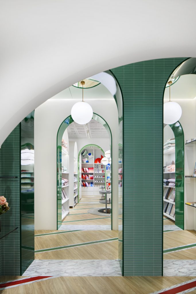
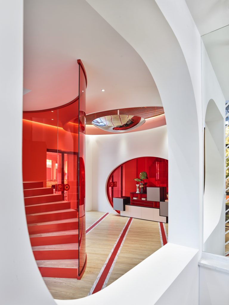
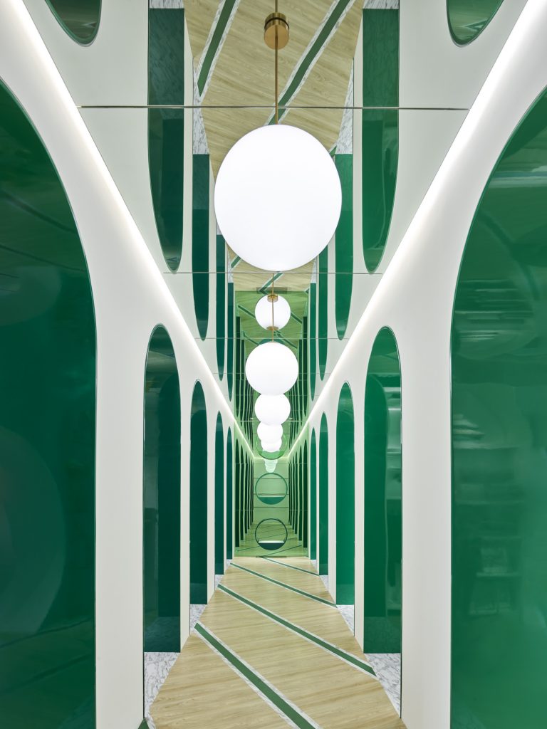
Sculptural space-age styling and a bold colour palette define the first Pierre Cardin Home Showroom in Shanghai. Designed by Studio MVW, the avant-garde retail space was inspired by Pierre Cardin’s chic futuristic vision. A fashion icon since the Fifties, Pierre Cardin is known for his revolutionary designs and experimental outlook. Inspired by geometric shapes and motifs, his work embraces imagination and innovation, blending circular movement and structured lines. An example of Cardin’s interest with shape and form can be seen in one of his most well-known designs, his sci-fi style ‘bubble dress’ (1954), which combined earthly elegance with out-of-this-world colourways. The bubble theme continued when, in 1989, Cardin became the second owner of the iconic Palais Bulles (the Bubble House), perched on a rocky cliff above the Mediterranean Sea in the South of France. When the original owner passed away, Cardin swooped in and completed work on the monumental house which was designed by Hungarian architect Antti Lovag to mimic early cave dwellings. Cardin translated his passion for geometric shapes, symmetrical cuts and curves into the interiors, and the Bubble House, with its series of pod-like domed structures, was to become a place that inspired him constantly. Virginie Moriette and Ming Xu took inspiration from the Bubble House and from Cardin’s passion for sci-fi when developing the Shanghai Home Showroom. The result is a dynamic 500-square-metre interior which offers visitors a dynamic retail experience and an insight into Pierre Cardin’s creative world. Bold colours and rounded forms define the retail journey which begins with a curved red Bubble House-style entranceway, leading to a dramatic white-walled interior defined by bold accents of green and red. Globe lighting – both ceiling-hung and incorporated into custom-designed merchandise stands – echoes Pierre Cardin’s fascination with bubbles. In an elegant nod to the iconic archways of Parisian shopping arcades, the showroom’s central corridor is composed of a series of white archways inset with reflective green lacquer panels. The shade of green used by Studio MVW was inspired by Pierre Cardin’s first showroom interior, which still exists today on the rue Faubourg Saint-Honoré in Paris. The succession of arches inset with mirrors serves to create different perspectives depending on where you look. This further engages guests to discover the space. Typical French wooden flooring is inset with diagonal green and red lines, adding more dynamism and energy to the interior. Mirrors reflect the diagonal forms, giving further depth. Leading off the corridor are three bedrooms filled with Pierre Cardin homeware, plus three more merchandise rooms featuring clothes, socks and dining ware. To the rear is an elegant, well-proportioned marble and brass inlay Parisian-style bar area plus three meeting rooms. Studio MVW’s custom-designed display furniture has been used throughout – inspired by a series of 1970s Pierre Cardin sculptures that blended the decorating function with an artistic personality. Said Cardin: “My furniture is sculpture. I like to work as a sculptor; it’s my life, my passion, my happiness and my joy. The reason of my work.” Studio MVW also incorporated grid motifs and geometry detailing into the display cabinets and the loose furniture to further emphasise Cardin’s space-age style. In all, the interior pace expresses beauty, flexibility, harmony and balance, allowing the imagination free reign. The composition of forms and colours creates a spontaneous joyful design, and an experience full of surprises due to the different perspectives experienced throughout
Moser Flagship Store (Shanghai): Reflected Traditions
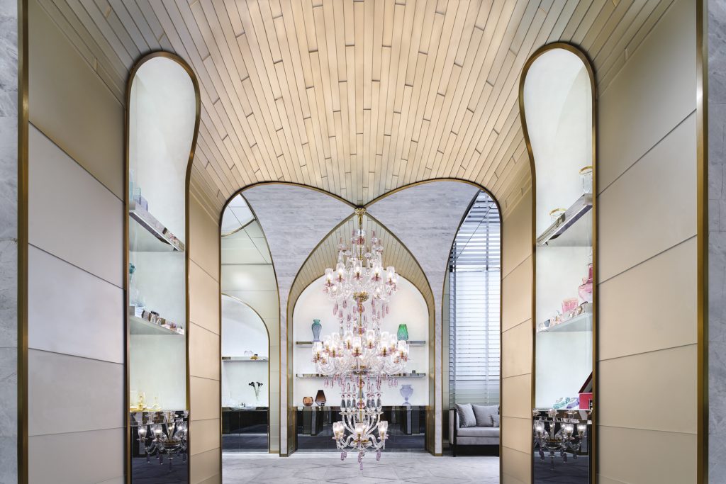
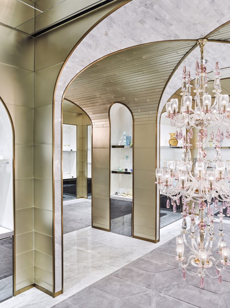
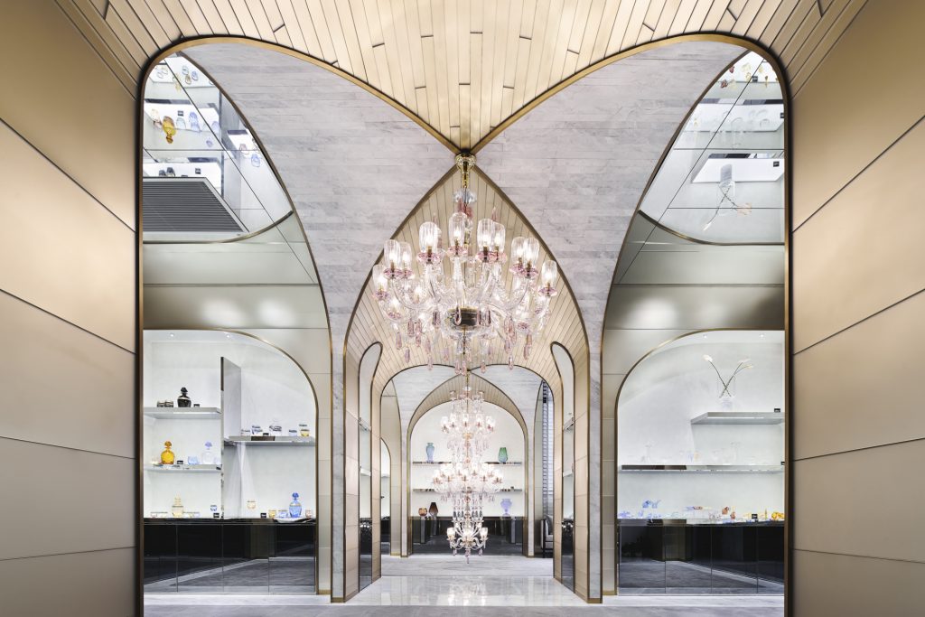
When Czech crystalware company Moser entrusted Studio MVW with the mission to design its Taikoo Hui flagship store in Shanghai, one of the key directives was to create an interior combining a timeless vision with a contemporary appeal. Building on their experience in borrowing designs from different cultures and fusing past and present influences, Virginie Moriette and Ming Xu embarked on the development of a very singular, sculptural space. Built on the typically Czech architectural feature of the cross vault, wherein an arched form is used to provide a space within a ceiling or roof, the new flagship store resembles an ageless cathedral-like jewel box, blending shapes and materials in the most harmonious, yet unusual way. The sweeping curves of the vault act as a framework to create unique geometric effects and reflections enhanced by the richness of materials used – glass, mirror, crystal and brass. The store creates a feeling of solemnity while maintaining – ing texture and warmth, to which the use of stucco in the merchandising area as a polished, non-uniform backdrop also contributes. A spectacular Moser crystal chandelier in rose pink tones acts as a central focal point, embodying the quintessence of the brand’s heritage and know-how. The space is divided into four areas showcasing the variety of Moser’s crystal collections and its long history. But the store certainly goes far beyond its functional dimension to become part of the show – as flagship stores should – and to not only contain but exalt the beauty of the jewels it has been entrusted with.
Shanghai Tang Flagship Store (Hong Kong): Cultural Heritage and Contemporary Concepts
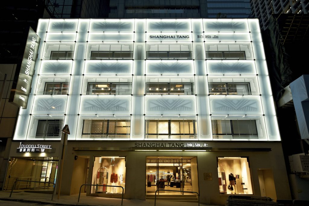
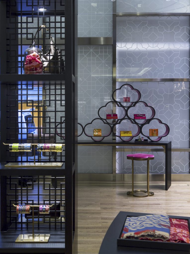
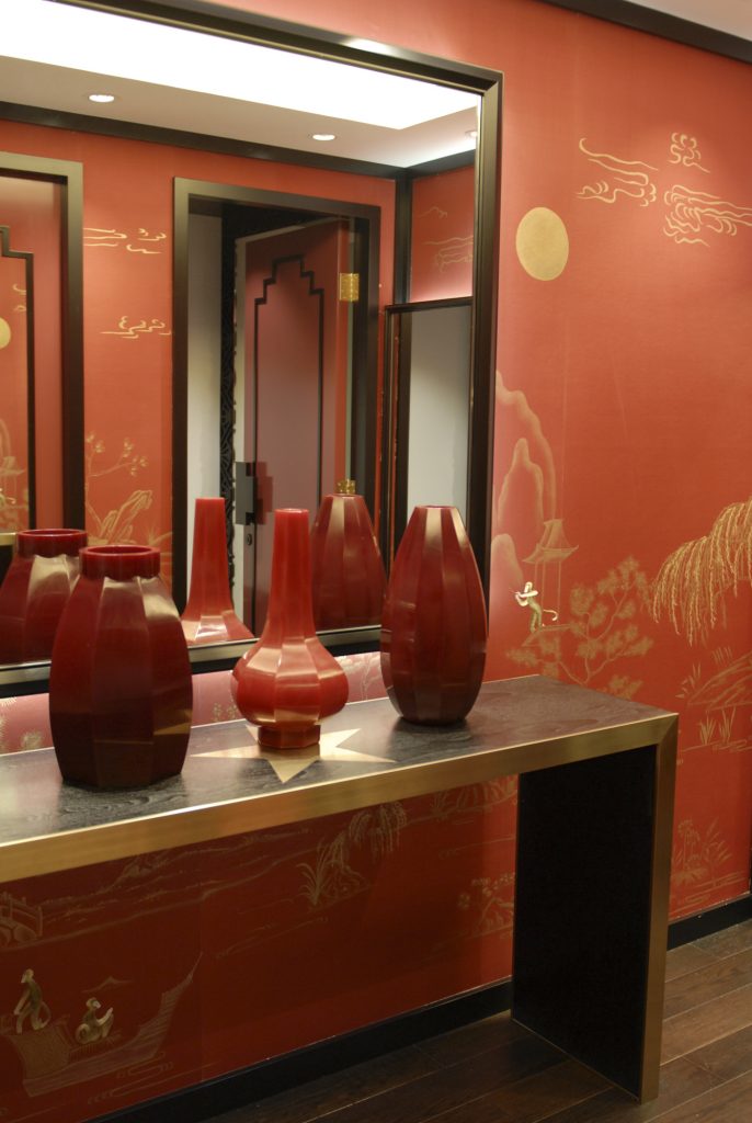
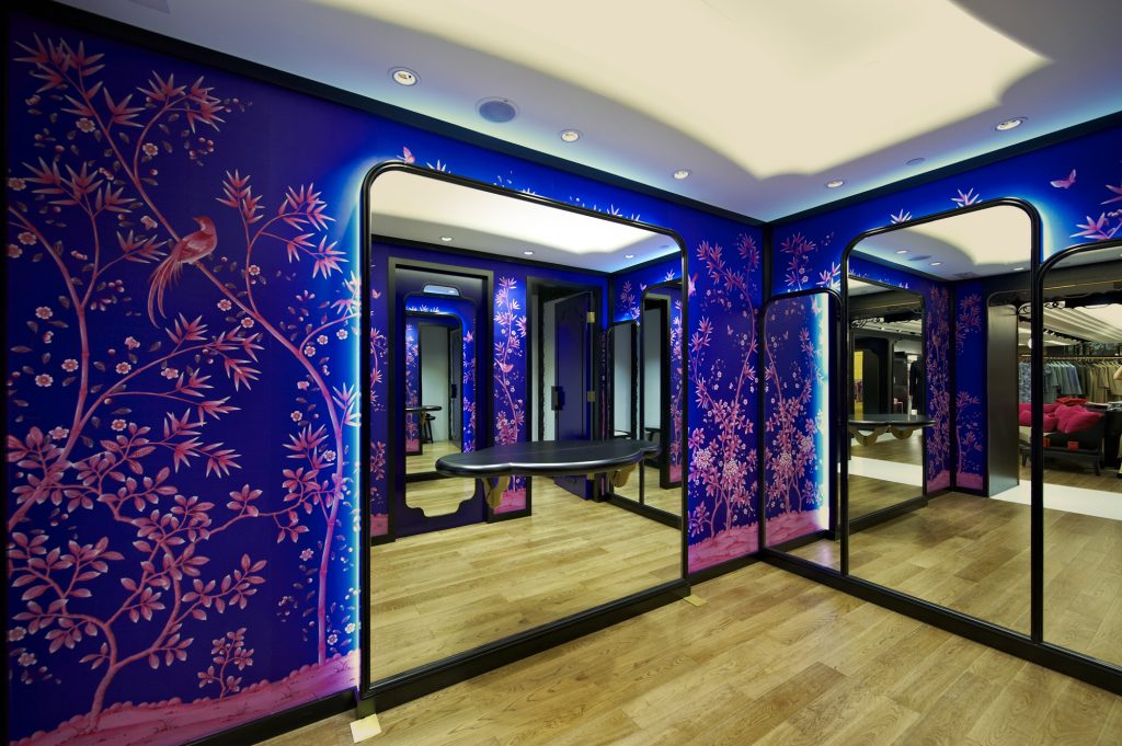
It is difficult to pinpoint the ingredients of good collaboration, but results do not lie – and the designs of luxury lifestyle brand Shanghai Tang entrusted to Studio MVW certainly point to fruitful, creative cooperation between the two firms. For its Hong Kong store, the brand chose Duddell Street, a location close to its iconic first store located on Pedder Street from 1994 to 2011, and to the high-end fashion boutiques of Central. With a three-storey retail space of 15,000 square feet, this is the largest Shanghai Tang store in the world. But beyond its size, one of the building’s most remarkable features is its façade. Crafted from etched glass and brass, it pays a contemporary tribute to the Art Deco style of 1930s Shanghai, bringing visual excitement to the street. Through an elegant fusion of modern Chinese aesthetics and Art Deco style, the design of this impressive HQ communicates the values of a brand drawing inspiration from its Chinese roots and willing to translate its heritage into a contemporary language. An approach completely in line with the philosophy of Studio MVW, who found with Shanghai Tang the opportunity to develop this into a physical space. The retail experience starts as soon as shoppers enter into the impressive entrance. The grand foyer boasts a majestic, custom-made, 2.5-metre high and 2-metre wide Shou crystal chandelier – a symbol of longevity – hanging from the entrance hall’s double-height ceiling and brought out by the wooden lattice and sepia-coloured mirrored walls surrounding it. 2. The womenswear and menswear departments are defined by an atmosphere of intimacy and low-key luxury achieved through custom-made furnishings, mixing Art Deco and Chinese styles, as well as a careful selection of materials: marble, brass, leather, wood, silk panels – with patterns and pops of colours, including the brand’s signature fuchsia. Designed as whimsical fantasy lands for “little emperors,” the children’s department offers a vivifying, playful take on retail, with their imperial yellow hues, tea caddy shaped changing rooms, and oversized motifs. The store also features the Imperial Tailoring Ateliers, providing the brand’s legendary bespoke service and communicating its heritage and know-how. The experience is enhanced in the fitting rooms, decorated with hand-crafted wallpapers as well as Art Deco mirrors and wall bracket lights. The lifestyle dimension of the brand is not overlooked. It materializes in the home departments in both stores, which include a dining area with bone china and crystal stemware, a bedroom showcase, and a fragrance bar. A total experience for Virginie Moriette and Ming Xu, who had the chance to intervene at all levels of the project, that echoes visitors’ comprehensive experience of the brand and of its inimitable universe.
This article is part of TLmag Special Edition: MVW Studio.
Cover Photo: Pierre Cardin Home Showroom / The avant-garde retail space was inspired by Pierre Cardin’s chic futuristic vision
