Fully Reloaded Travel: nendo Brands Proteca
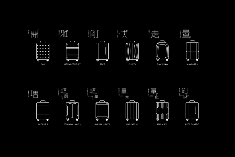
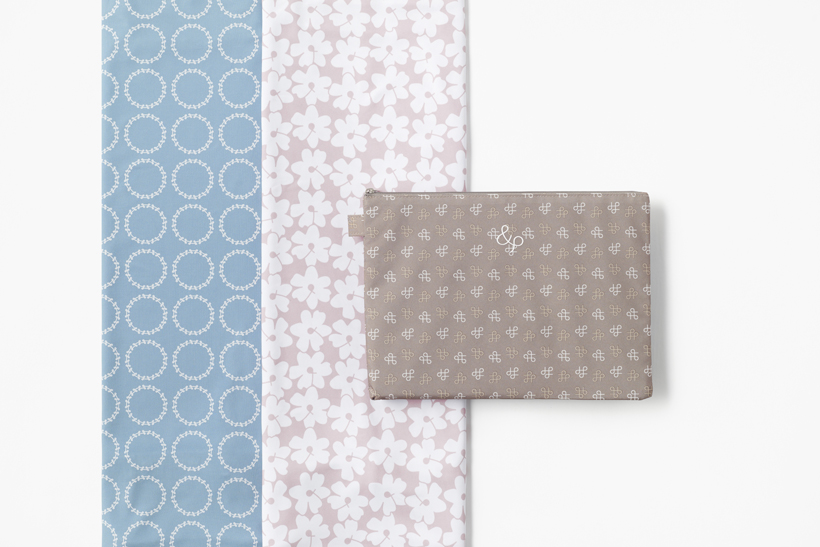
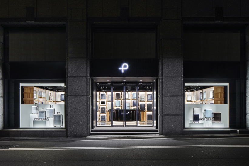
With holiday travel in toe, we spotlight TLmag 24-featured nendo‘s total overhaul of Japanese suitcase label Proteca. Marking the brand’s 10th-anniversary, the design firm reconfigured everything from graphics, showroom displays, a new website, tv ad spots, catalogues; but perhaps more importantly a new 360 product and Tokyo flagship. The total rebranding ensured a new simplified, user-friendly identity. In true nendo fashion, new technical and functional attributes were given centre stage in all communication material.
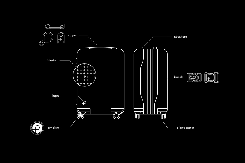
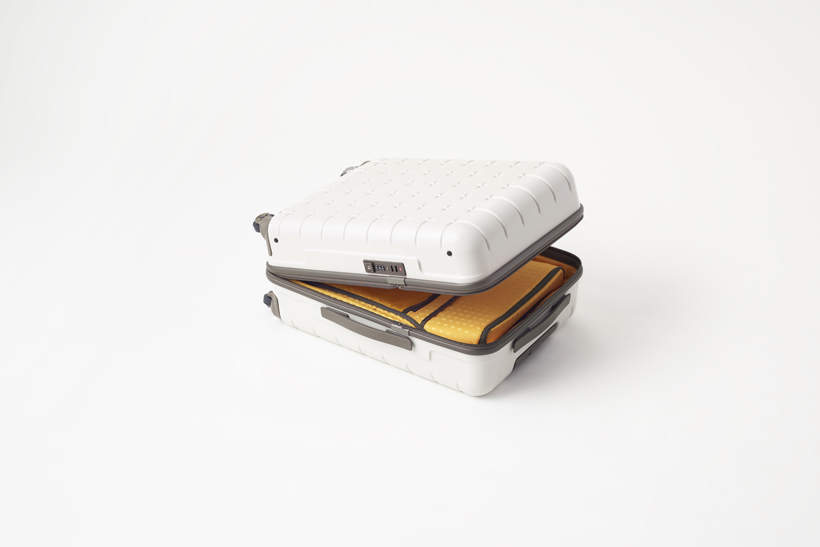
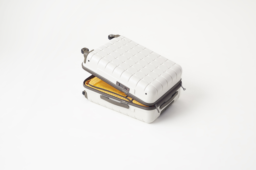
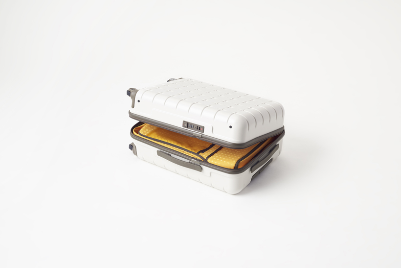
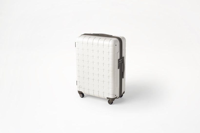
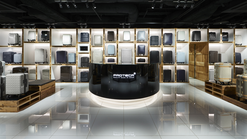
Proteca’s new highly simplified logo emulates much of this holistic approach. The design depicts the smoothness of movement but also notions of connection, safety and product lifecycle. The 360 suitcase runs on far more silent casters and features a rigid shell. Clear colour iterations furthers an ethos of returning to origin; sustainable material make-up. In this case, polycarbonate. A return to the efficiency of a total wrap-around ultra-durable zipper allows users to open the product in any direction. The same simplicity and flexibility follows through an uncompartmentalised core, and pockets that can be accessed even when the suitcase is in a standing position. nendo also designed Proteca’s new Tokyo flagship with stacked boxes concept, easily as transportable. A black backdrop lets the clarity of colour variation show through the products themselves.

