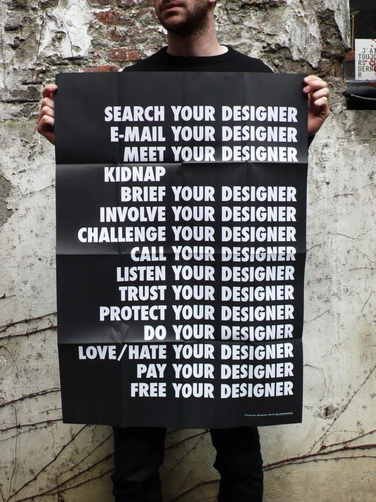
Kidnap Your Designer (with Belgitude)
Designer duo Caroline Dath and Damien Safie do some graphic-based kidnapping from their Brussels studio
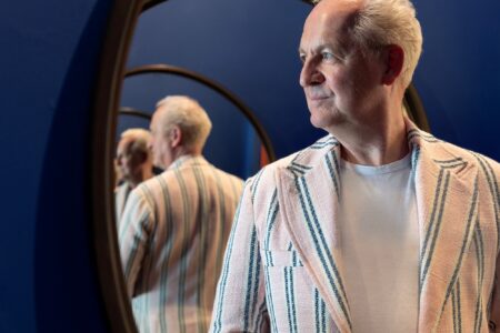
Kidnap Your Designer’s Caroline Dath is from Liege; Damien Safie, her partner, comes from northern France. For more than a decade, the pair have worked together developing a graphic studio that, while tinged with a certain Belgian identity —Belgitude—, avoids commercial clichés and shortcuts. We met them in their studio, an inspiring place, hidden in the back of a courtyard on rue de Flandre, in Brussels.
TLmag: You celebrated your studio’s tenth anniversary last year. How did you come up with the idea to launch your business, back in 2006?
Caroline Dath: I worked alone on this project during my studies at Brussels’ School of Graphic Research (ERG). That’s where Damien and I met. I had the concept, the name for the studio and a few clients, but I already knew I wanted to join forces. I need to have my ideas challenged, to create exchanges.
TLmag: What is the meaning of the studio’s name?
CD: It came to me rather spontaneously, in a flash. (Laughs) More tangibly, it refers to the precise moment the client decides to collaborate with us, a pivotal moment that will strongly impact how the adventure plays out.
Damien Safie: We both agree about the importance of setting up a pleasant creative space and about building a special relationship with our clients. For us, good design must be reflected upstream. We never offer ready-made solutions; everything is made-to-measure. That’s why it is so important to take the time to understand the client’s universe and the context of the project.
TLmag: And what do you mean by ‘context’?
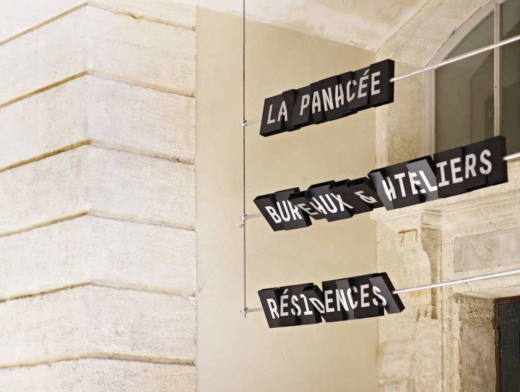
DS: We collect a lot of information before we produce anything. This phase of preparation is an integral part of our work processes. Our event-based projects are spread out over several weeks, while our signage projects [Editor’s note: labels, panels and information for the public at theatres and museums] are spread out over several years. It’s an aspect of our work that we have recently been exploring and that we find very exciting.
TLmag: Is this a way for you to develop the studio?
DS: Yes, but even more, to not get bored. We try to find a good balance between our visual identity creation projects, event, editorial assignments, and signage.
CD: Collaborations are also very important for us. Exchanges and the synergies that they bring are essential.
TLmag: Tell us about these synergies.
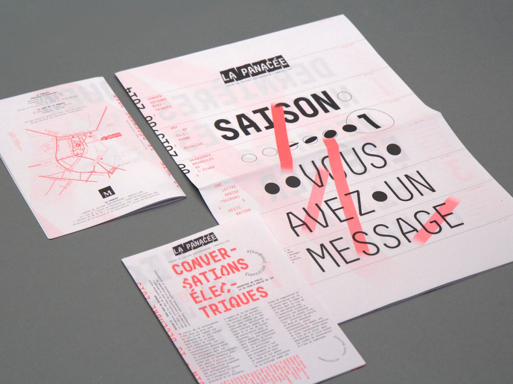
CD: Nationally, our work for architectural offices led us to signage projects for museums and cultural institutions. In Charleroi in particular, we were selected within the framework of the new Palais des Beaux-Arts. Abroad, in the context of public procurement, unless you already work with local players, it is difficult to break in. The world of graphic design is quite protectionist. A few years ago, thanks to contacts made on the spot, we were fortunate to create the visual identity of the Panacée, a centre of contemporary culture in Montpellier.
TLmag: Speaking of collaborations, you also created the We Are Graphic Designers collective. What was your goal?
CD: Six years ago, we wanted to join forces with some other studios to, on the one hand, protect our rights in the event of an abuse —such as unpaid calls for tenders or even “unauthorised” competitions that don’t respect the work of the studios— and, on the other hand, to promote the quality of graphic design and its artisanal side, through exhibitions. But at that level, everything still remains to be done.
TLmag: We Are Graphic Designers is a Belgian collective. In terms of the studio, is ‘Belgitude’ a concept that speaks to you?
DS: You have to keep in mind that the Belgian graphics scene is very small. It’s difficult, in my opinion, to really identify a Belgian footprint —except perhaps in a certain attitude and in the economy of means. To compensate for a lack of budget, we use very Belgian weapons: humour, quirkiness and some references to surrealism.
TLmag: What inspires you? And which are the countries leading the way today in terms of graphic design?
CD: We feel ourselves very close to contemporary art, especially conceptual. We follow the work of Belgian artist Francis Alÿs, of Dutch visual artist Helmut Smits and of Lucille Calmel, a digital artist and performer with whom we worked previously on a book. As for which countries are setting the tone, we like what is being done in Switzerland, the Netherlands and, recently, France.
TLmag: The projects follow one after the other, without ever looking the same; what remains is a footprint, your signature. How would you define it?
DS: Typography is very much a part of our work. Our graphic design can be seen as raw and rather radical. We also have modernist affinities. For us, the message is as important as the form. In our projects, both carry a certain symbolism.
CD: Behind a project that can seem very minimal, there is a lot of research, as much on the composition as on the layout of the graphic elements. We also think about the end purpose of the projects entrusted to us. A few years ago, when WBDM asked us to work on communication media related to a presentation at the Milan Design Week under the common interregional label Belgian is Design, we questioned their original request, in order to lean towards a less paper-intensive, and thus more ecological, project. We simplified the project around an understated ring that symbolised the pooling of the fashion talents from the north and south of the country. The idea was to create an object that was playful, attractive, and met the needs of the journalists.
TLmag: Ecology is a trend, much more than it was 10 years ago! Compared to when you started out, have the ideas and techniques changed in a fundamental way?
DS: I wouldn’t talk about technological changes. What is different are the means of disseminating. The internet and the boom in smartphones have changed data. There is less printing.
CD: In the events industry, the era of flyers is well and truly over. Our clients are looking for more qualitative, targeted products, so it is important to develop graphic objects with a real added-value, with carefully studied and original media that people want to keep.
DS: Our research process remains centred around exchange, and on a more experimental work that is our own and that defines our style in a more general way.
