Kvadrat’s My Canvas: A Curator, a Designer
We spoke with curator Njusja de Gier and designers BCXSY about their work for My Canvas, Kvadrat’s London Design Festival homage to Giulio Ridolfo’s star fabric
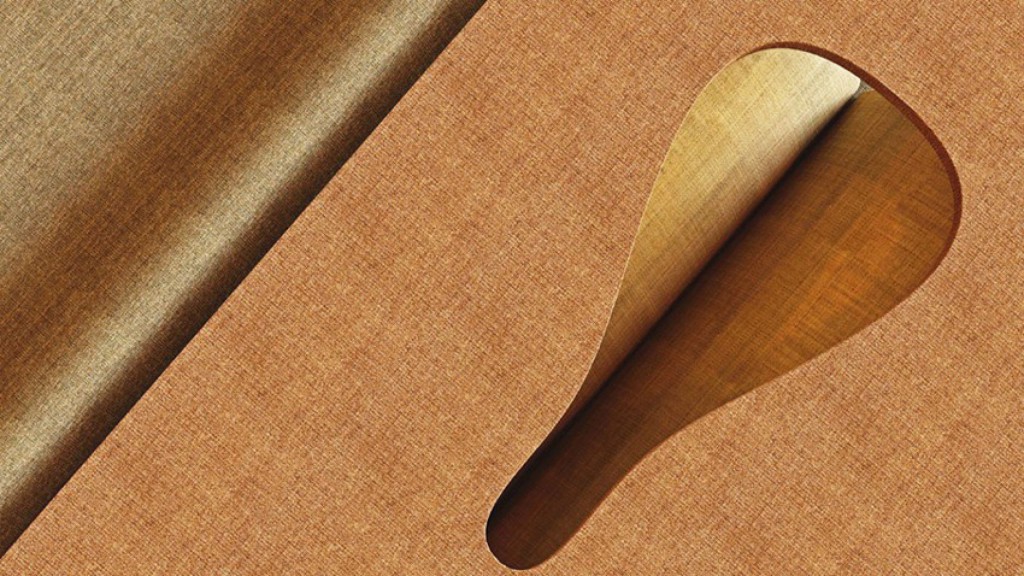
Following a (new) tradition that highlights the richness and creative flexibility of its textiles, Kvadrat asked a cadre of designers from around the globe to reinterpret one of their star textiles. After selecting the likes of Hallindal 65 in 2012 and Divina in 2014, during this year’s London Design Festival the Danish brand placed master colourist Giulio Ridolfo’s Canvas fabric on the spotlight. The result is My Canvas, “a celebration of creativity [that aims] to push boundaries in materiality and techniques and make one rethink the use of textile.”
The exhibition was jointly curated by Constance Rubini, Jeffrey Bernett, Hans Maier-Aichen
and Njusja de Gier, and we asked the latter about the selection process and the reaction to the pieces. We also discussed My Canvas with team members from the other side of the equation: we had a chat with BCXSY, an Amsterdam-based design duo, about their catwalk-inspired motorised piece.
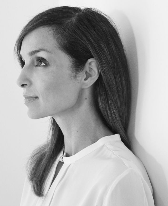
A CURATOR: NJUSJA DE GIER
TLmag: For a piece of textile that has been so often described as elegant, most of the guest designers went for the humorous and the playful in this exhibition. Was that influenced by your brief, your selection process or did they all reach that intersection on their own?
Njusja de Gier: The brief we gave to the designers was completely open: you can get as much textile as you need and you can design what you want, as long as the textile is the main element of the piece. The playful element was reached by all the designers by themselves. Maybe it was driven by the complete freedom we gave them, and that there were no commercial boundaries limiting the imagination. We literally wanted to offer the participants a blank canvas.
TLmag: How did you select the 19 designers in the group?
NDJ: We were with four curators: myself, Jeffrey Bernett, Hans Maier-Aachen and Constance Rubini. Between us we have a big network. We also are visited exhibitions and are following people for a while, focusing on designers with an approach in arts and crafts more than industrial design —which has influenced the character of the pieces a lot.
TLmag: We’ve been discussing the need for tactility in design in an increasingly digital world, but you decided instead to bring the digital to a very tactile experience. Why did you choose to work with ZEITGUISED’s project?
NDJ: I was completely in love with it. As times are changing and digital is such an integrated part of our lives, I felt it fitted in today’s zeitgeist, to embrace digital and see how they would solve the task creatively. I think it has become an intriguing and mesmerising piece.
TLmag: On the other side of that scale is Stabil’s very tactile project. What did you find intriguing about the proposal?
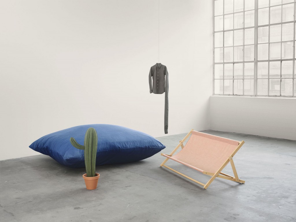
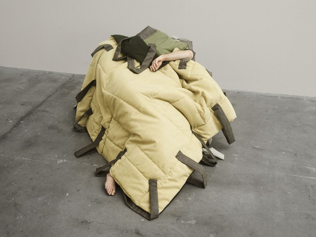
NDJ: Their inspiration is based on magnifying daily objects, and with that playing with the social aspect. The cushion is 4×4 metres, and the beach chair is made for three people. Due to the size of the pieces, they invite for a social interaction among viewers, to connect with each other.
The cactus is also interesting: you would expect something stinging, and yet when you come close it is soft… so every piece is a little alienating.
TLmag: I find it beautiful that the most seemingly benign of the pieces, Christien Meindertsma of Pig 05049 fame, is actually one of the darkest. What attracted the curatorial team to her work?
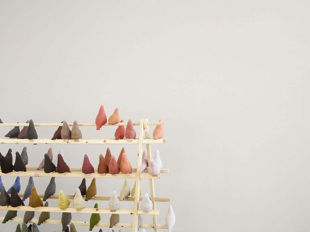
NDJ: The pigeons dark? It is actually a very sweet piece. Christien made a little holder for small notes in every pigeon, and invited the visitors to leave each other messages, so it is actually very social and inviting.
TLmag: The darkness would be in the reference to Meindertsma’s original project, based on entrapped WWI messenger pigeons.
NDJ: Yes, it is unusual for us to allow in an already existing piece, but we thought that using all the colours of Canvas for the installation would put it in a whole different light. Also, Christien added the possibility of people sending each other notes to the Canvas version of the pigeon. Also, the pigeons are displayed on a fence and are no longer entrapped.
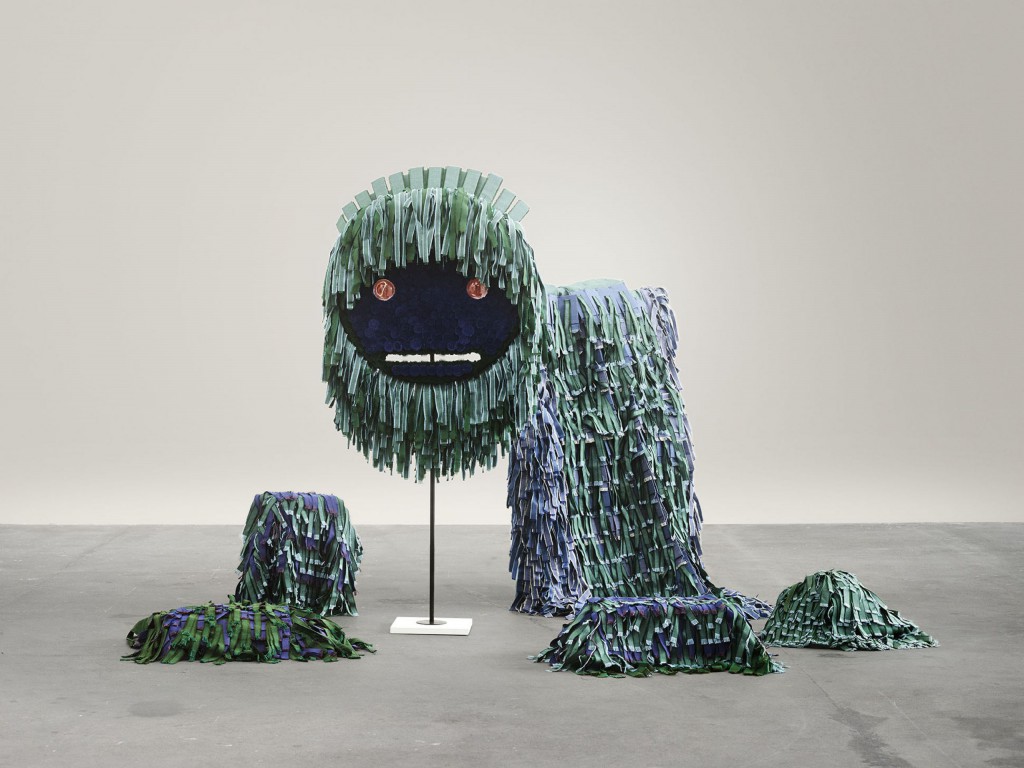
TLmag: How did the audience react to the Lion Dance performance?
NDJ: The Lion Dance is one of the most instagrammed pieces: people love it. It is a very beautiful and playful piece, and people can relate to the cultural background. I think also people can see there was a lot of work that went in: each strip of textile took 20 minutes to make. Chen and Kai spent 540 hours alone just creating the textile strips!
TLmag: And speaking of reactions, how did Ridolfo himself react to this great variety of projections of his original design?
NDJ: Giulio was very moved to see all the pieces: normally his textile is a cover and now his design is the protagonist. He loved all the different interpretations of all the contributions, and he was very proud of the creativity.
TLmag: How was this experience different from the work the brand did with, say, the Divina interpretations a few years ago?
NDJ: I think every design project so far is giving a view of the state of design at that point in time. Also, the textiles have been so different, and that also makes the approach and possibilities different for a designer. What surprised me the most was that even though Canvas is a very elegant textile with a subdued colour scale, the exhibition is very colourful and playful.
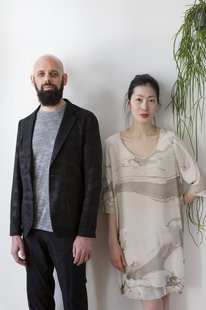
A DESIGNER DUO: BCXSY
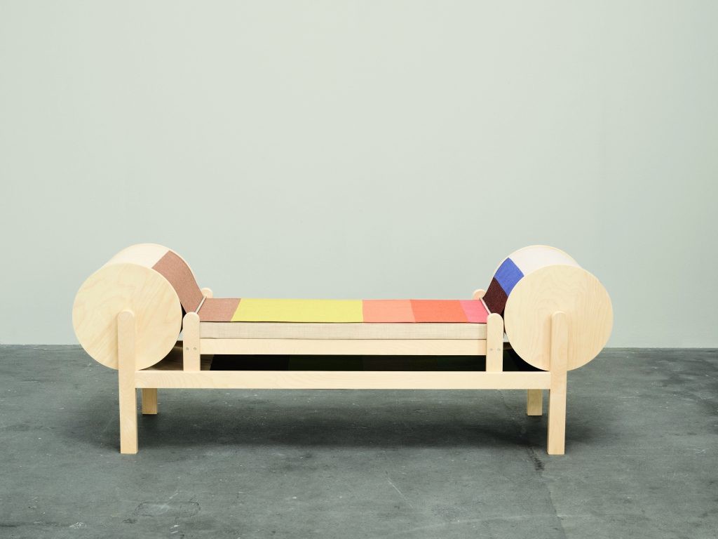
TLmag: With your project, Catwalk Bench, you turned a very precise, serious form of craft –haute couture– into a fun object that brings out a smile. How did that distillation process work?
BCXSY: When thinking of haute couture we immediately thought of a catwalk. Haute couture was just a part of the inspiration: the textile being very three-dimensional, as it seems to have a real depth, even though it’s very flat, and the richness and dynamic of colour, as it appears to change when you look at it from different angles, inspired us to try and incorporate movement within our design.
TLmag: Although it does look like a conveyor belt, the piece reminded me of a mechanical loom, something that references the painstaking aspect of creating textiles by hand. Was that your intention?
BCXSY: We didn’t look for an illustration of a specific machine. To be honest, we haven’t really thought of a mechanical loom, though we really like that association. Our aim was more to create an illustration of the idea and movement, which is as minimal as possible. This is why we made so many efforts to hide the motor inside the structure: if you’d inspect it without being familiar with the piece, the only thing that could suggest a motorised operation is the little electricity socket at the bottom of one of the back feet.
Nevertheless, the shape communicates its function very clearly and even while it doesn’t run, most people who saw it immediately understood what the principle was.
