
Diamonds are the Bouroullecs’ Best Friends
With the new Losange collection at Galerie Kreo, Ronan and Erwan Bouroullec revisit a shape that’s been integral to their career
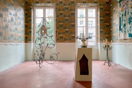
There’s something familiar about the understated Losange vases on display at Paris’ Galerie Kreo: the diamond-shaped porcelain containers bear a slight resemblance to Ruutu, a 2014 Iittala collection. Both names mean “diamond” —one in French, the other in Finnish— and both came from the drafting boards of Ronan and Erwan Bouroullec, confessed rhombus enthusiasts.
But beyond the shape, that’s where the similarities between the two projects end: each collection is an exercise in material experiments, the former submitting to the fickle whims of the oven while the latter admires the extenuating precision of working with glass. These collections are also an exploration of the unrestricted nature of the Bouroullecs’ market appeals: while one is intended for limited collection, the other is aimed for mass consumption —and unlike some of their designer peers, they’re equally enamoured with each side.
We spoke with Ronan about the joys of industrial production and the brothers’ awe of craftsmanship, the reappearance of the rhombus and, of course, those Prada bags.
TLmag: You worked on one of the four nylon accessory proposals for Prada’s recent menswear collection. Why did you decide to honour the art portfolio folder?
Ronan Bouroullec: We got a call at the end of November, because Miuccia Prada wanted to work with two architects and two designers on this subject. It was very quick, with less than a month to develop something, and Christmas in the middle. I was supposed to say that I didn’t have the time, but when I was about to reply I had a very quick idea: this folder, something I used a lot as a student and as a young designer.
[For Prada Invites], the subject could be developed in a more advanced way, so it’s an art folder in three sizes, but the big difference is that there’s an accordion inside, which keeps your items safe. And all that is done with the delicate craftsmanship of Prada. It’s a very simple object with small details, such as the colours of the elastic and the quality of their specific nylon.
And when you see it, you don’t know which period it comes from… but it ends up being quite different and quite new —and for me, that’s very Prada.
TLmag: One of your other recent projects is the Losange collection at Galerie Kreo. Seeing the Ruutu vases and your Nanimarquina Losanges collection, what is it about the diamond shape that works so well for you as designers?
RB: After 20 years of work, I’ve discovered certain geometries that we could apply to different materials, with specific effects, a specific sensuality. I first discovered the shape for Iittala’s Ruutu vase; the goal at the time was to speak about glass and its colours. The diamond shape was interesting, because you could do large pieces with no depth —so you could place them in front of your window and they’d almost be flat, playing against the light.
Now, I was surprised that the shape wasn’t used much in glass, in this dimension… but I understood afterwards that it was extremely complex to blow, which is probably the reason why they don’t exist as much. We used the extraordinary and fantastic abilities of the blowers for these pieces. With the special edition we did, nice pieces in a larger format, it became a new language for the glass, a new sort of poetry.
We do many different things, from the industrial to the extremely crafty. I’m almost 50, so I am more and more interested in craft and the vibration that you can find in it, which is difficult to obtain sometimes in industry. It’s something more linked to drawing, to the quality of imperfection. That’s why I have always been in love with ceramics: the fact that the same piece, with the same green glaze will be a bit different… that is magical. Also, it’s something that seems to be alive, with no need for a perfect homogeneous colour.
With the difference in each piece [in the Losange collection] I wanted to speak of something that almost grows by itself. We worked for a long time with a great ceramist —a craftsman with a small atelier in Burgundy— to define the very deep green and the very light blue. They’re not flat and perfect, but instead extremely imperfect, with a spectacular depth.
TLmag: Actually, now that you mention the greens and the blues, Clément Dirié spoke of seeing some Giorgio Morandi in the vases, with the composition created by the four different heights. Is that so?
RB: It’s true that there’s some Morandi. I love the beauty of simple, elementary objects —that’s probably why I’m a designer. It seems that I ran after the delicate nature of a Morandi painting. And just like in a Monet painting, there’s this vibration where the perimeter is not perfectly defined, it’s a bit blurred, the colour is not plain.
I have a window in the studio, with good light, and when I work on an object I position it at certain points and observe it throughout the day, to understand how the light works on it. Being a designer is a very disciplined thing, because you have to have a certain sensitivity to questions of light and vibration. Other times you have to deal with weight, fragility, ergonomics, price. I am fascinated by the fact that a piece will be produced by the millions. I try to find the same sensuality in a chair that costs 50 euros and in this vase that costs 10 times that.
TLmag: Speaking of light, I’m intrigued by one aspect of the Nuage Promenade canopy you presented last December in the Miami Design District. How did you handle the south Florida weather when conceiving the glass elements?
RB: It’s a specificity of our discipline to be generalists and not specialists. We’re not specialists in ceramics, not specialists in glass, not specialists in Miami. (Laughs) It’s a question of empathy and intuition. I went twice to Miami to try to understand something I had never felt before, this extremely hot sun, this specific light —almost white. Also, I wanted to understand what happened in this street. I was quite surprised by how that street works in general, because two years ago, there was nothing there [at the Paseo Ponti]. I had no idea what Miami was like. I was surprised in a good way.
The scale was new for us. The subject was complex, because we wanted to create shadow without disturbing the shops around it —it was important to respect the perspective and to allow the shop logos to be seen. But it was a big pleasure: I think it probably creates a link between the different architectures of the surrounding buildings, between the shadows, the colours of the glass, the bench, the water. I think it works. After it was installed, I spent some days there and some people stopped to look at it, some didn’t. I think it needs a bit of time to integrate to the street.
TLmag: Looked from above, the motif is a circle, but seen from an angle, it looks like a honeycomb. Was this an intentional push for outdoors socialisation in a place where people would love to run indoors?
RB: This project is part of a general research I did three years ago. We were invited to do an exhibition in France. It was supposed to be a retrospective, but I was tired of showing the old hits, like a band that has to play the same songs. I proposed an exhibition in Rennes. We grew up in Brittany and I proposed some research about the city in general, to understand what happens to buildings on the street. Streets are conceived as a good way to go from one point to another, but you miss what happens when you put in a fountain, a bench. These things are not just industrial products, but ways to generate interesting passages.
We did an exhibition about that, [called Urban Rêveries], where we proposed fountains, benches, canopies, light. The social aspect of these objects could help people stop and not run between two points. In Miami, you stop and get a bit of a fresh sensation with the shadow and the water, so I think it works.
TLmag: That long-term examination is perhaps a large part of the relationship you have with Didier and Clémence Krzentowski from Galerie Kreo —they do allow you to do as much research as it takes for your shows there, even if it takes years. How important are they for your practice?
RB: As a designer, I like the fact that a good idea could be reproduced. I’m very interested by industry. But of course, I have some frustrations, because industry is about price, lightness, delivery. It’s fascinating and interesting, but at the same time I need another atmosphere.
Galerie Kreo provides us a way to experiment, to spend a year working on an exhibition, to do tests about different depths of green. I find that we’re in a sad period for crafts in Europe, with many of them disappearing. It’s part of our responsibility as designers to continue and feed these marvellous abilities with new perspectives and new research. [With a gallery] you have the economic possibilities to maintain these activities. Spending days and days working on a specific colour has a cost. But I’m deeply interested in reproduction. I’d be happy to see a new generation of craftsmen developing differently, being able to produce larger quantities at a lower price.
Losange is on display at Galerie Kreo until February 2
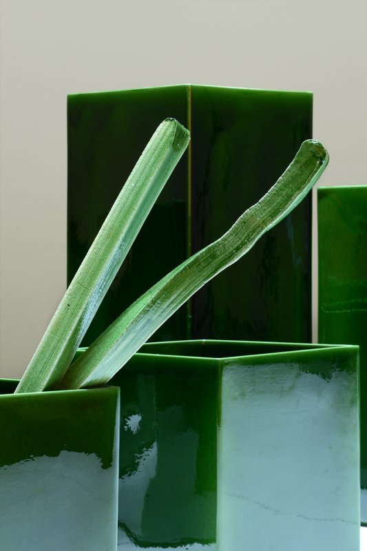
Image by Morgane Le Gall
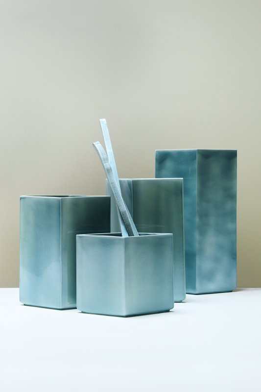
Image by Morgane Le Gall
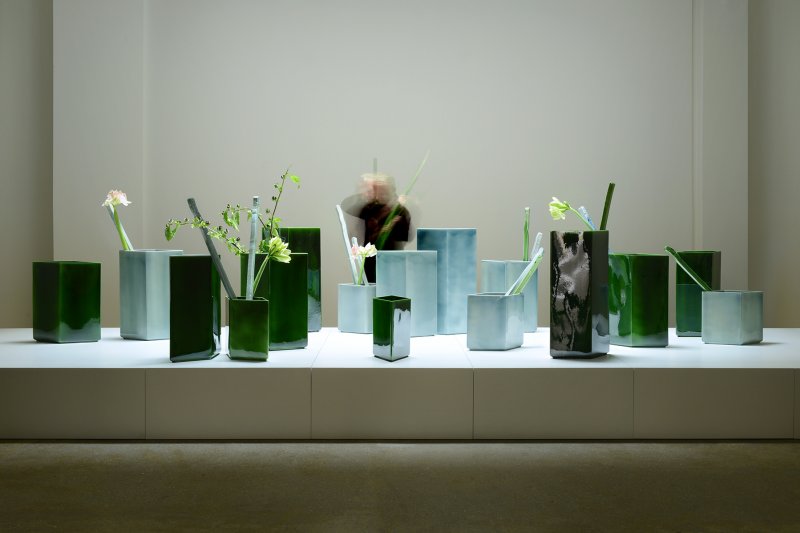
Image by Morgane Le Gall
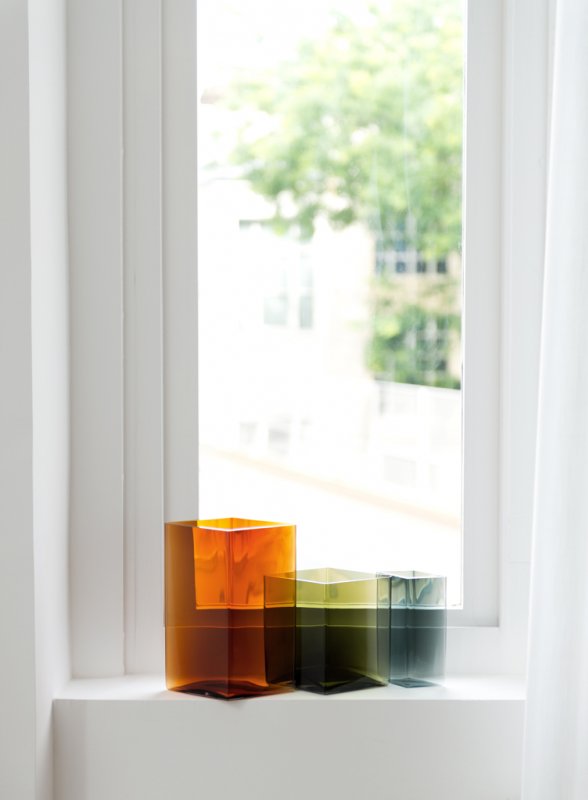
Image by Studio Bouroullec
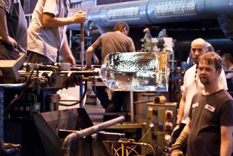
Image by Studio Bouroullec
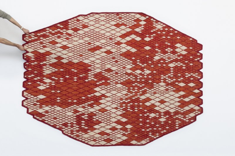
Image by Studio Bouroullec
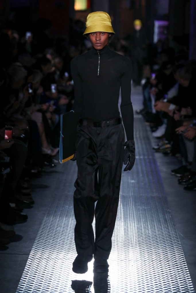
Image courtesy of Prada
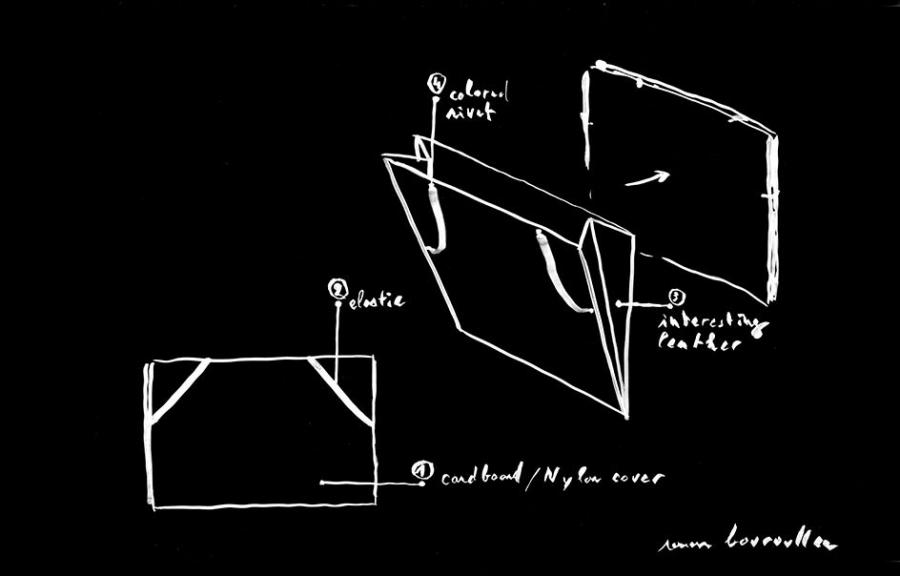
Image courtesy of Prada
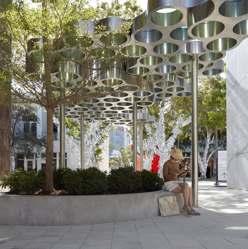
Image by Paul Tahon and Ronan+Erwan Bouroullec
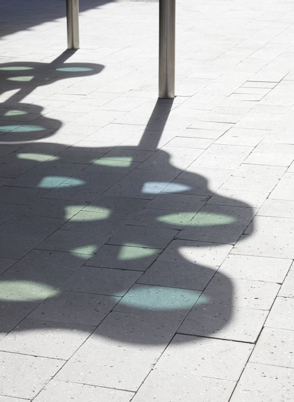
Image by Paul Tahon and Ronan+Erwan Bouroullec
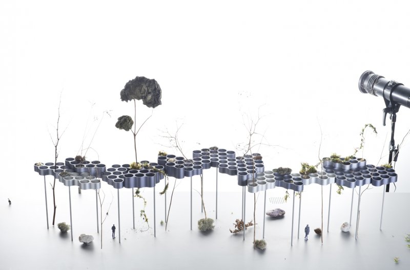
Image by Studio Bouroullec
Image by Studio Bouroullec
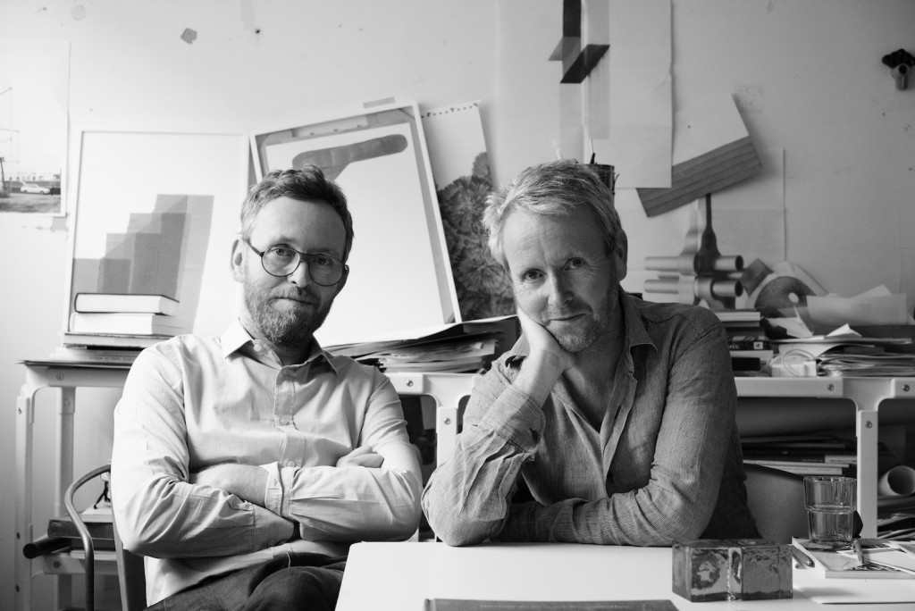
Image by Alexandre Tabaste

Articles you also might like
French designer Ferréol Babin makes his New York solo debut with In a Landscape, on view at Friedman Benda through April 18, 2026. The exhibition introduces a significant new direction in the designer’s practice: painted furniture that fuses his longstanding love of natural materials, specifically wood, with the improvisational language of landscape painting.
The third edition of ceramics brussels runs from January 21-25, 2026 at Tour & Taxis and features 75 Belgian & international galleries.
Manu-Facture: The Ceramics of Lucio Fontana, at the Peggy Guggenheim Collection in Venice, is a groundbreaking exhibition that reveals a lesser-known side of the artist. The exhibition presents over seventy experimental ceramic works that fuse art, craft, and design.
Willie Morlon received the Grand Prize of the Jury Van Cleef & Arpels in Toulon for the Design Parade Toulon, 2024. This summer, Morlon presents Wunder Haus, a dedicated exhibition as part of the 2025 Design Parade Toulon.